Jay Cordes is a data scientist and co-author of "The Phantom Pattern Problem" and the award-winning book "The 9 Pitfalls of Data Science" with Gary Smith. He earned a degree in Mathematics from Pomona College and more recently received a Master of Information and Data Science (MIDS) degree from UC Berkeley. Jay hopes to improve the public's ability to distinguish truth from nonsense and to guide future data scientists away from the common pitfalls he saw in the corporate world.
Check out his website at jaycordes.com or email him at jjcordes (at) ca.rr.com.
The 2024-2025 NBA season can be summarized as the year of a blockbuster trade, a serious setback for a young superstar, and an ageless LeBron. The shocking midseason trade that sent Luka Dončić to the Los Angeles Lakers in exchange for Anthony Davis was much more welcomed by Lakers fans than Dallas fans.Not surprisingly, Dončić quickly adapted to his new team, delivering amazing performances, including a 45-point game against his former team after fighting back tears during a touching pre-game video tribute. Meanwhile, Victor Wembanyama’s promising sophomore season was abruptly halted due to a diagnosis of deep vein thrombosis in his right shoulder.Despite averaging 24.3 points, 11 rebounds, and 3.8 blocks over 46 games, his health setback sidelined him for the remainder of the season and made him ineligible for the defensive player of the year title he was closing in on. And lastly, at 40 years old, LeBron James just had the best season that any 40-year-old ever has, averaging 24.4 points, 8.2 assists, and 7.8 rebounds per game.His latest showing has put the final nail in the “old LeBron > old Jordan” coffin, and since Jordan retired at 40, this is the first time we can compare the full year-by-year statistical histories of the two GOATs.
Before we get to all that, let’s name our MPP (Most Productive Player of the year) and also look at the players with the best stats per game and per minute. As a reminder, when I talk about “productivity”, there are three major metrics that I’ll discuss:
Total Productivity: the sum of a player’s points, rebounds, assists, steals, and blocks in a season. This is my go-to metric because it’s simple, it aligns with what players themselves are trying to accomplish during games, and it correlates best with ESPN’s all-time nba player rankings.
Productivity per Game: the average productivity per game played in a season. Another good way to compare players, but doesn’t factor in season durability and can be inflated by “load management.”
Productivity per Minute: as you might guess, the average productivity per minute played. On the surface, this stat makes a lot of sense since a player can only be productive while playing, however, as we will see later, this isn’t a great statistic to compare players across decades since due to a variety of changes to the game and playing decisions, today’s players dominate the all-time per-minute comparisons to a statistically improbable degree.
Here are the top 10 most productive players of the 2024-25 season:
The most productive per game:
And the most productive per minute:
The takeaways: Jokic is #1 according to the raw stats and gets the MPP for the 2024-25 season (the third of his career). Notice that even Giannis Antetokounmpo ranked higher on two of the three metrics than the likely MVP Shai Gilgeous-Alexander (the Greek Freak came in behind SGA in total productivity due to playing 9 fewer games). Also, how is freaking LeBron James still in the top 10 at the age of 40?
Regarding the MVP Award, the best statistical argument I’ve seen in favor of SGA is this one from Nate Silver. First off, I agree that Shai is almost certainly on his way to the MVP due his team’s success. However, I have a few issues with the article. First, the majority of it is spent comparing SGA to the all-time great guards, even daring to compare his performance this year with His Airness. One thing that probably goes without saying is that in order to win the MVP, SGA doesn’t need to outperform great guards of the past, he needs to outperform Jokic. Silver does show that SGA slightly outperformed Jokic this year in a popular (but opaque) modern-day metric called EPM but doesn’t spend time explaining why that should be the metric of choice (it doesn’t inspire my confidence in it that according to EPM, my 10th most productive player of the year, LeBron James, is ranked at #56 just below Immanuel Quickly; either EPM’s ranking or my ranking is way off).
My bigger beef with Silver’s analysis is this chart showing that Shai’s 2024-25 season compares favorably with Jordan’s MVP years, implying that his per-game stats were better than MJ’s at his best. When I did my age-by-age comparison, not only did 27-year-old Shai (46.8 production per game) not out-perform 27-year-old MJ (50.3) on a per-game basis, SGA’s stellar year also wasn’t better than 26-year-old MJ (52.2), 25-year-old MJ (51.2), or 24-year-old MJ (51.3).
So what’s going on here? Notice the gray-highlighted stats for Jordan’s MVP years below:
Four of MJ’s five MVP years came when he was older than SGA is now, including one when he was 35. I don’t think Nate Silver was being intentionally misleading (after all, he was arguing that SGA’s stats were sufficient for an MVP, not that he was statistically better than Jordan). But I also don’t approve — the best way to compare players is to control for age. The sad fact is that it’s all downhill statistically once players reach their 30s:
Which brings us to LeBron. He’s dunking on father time. His top-10 season productivity of 2940 mentioned at the beginning of this article is 4.33x as much as the historical average for nba 40-year-olds shown above. And as this past season just replaced Jordan’s final year in the list of best-ever performances by age, the debate about old Jordan vs. old LeBron is officially settled, if it wasn’t already:
Also, looking at Kareem’s 40+ year productivity numbers, it’s clear that if LeBron stays healthy, he will be setting “best ever at age x” records as long as he chooses to play.
Since Jordan’s final season was at age 40, we can for the first time (and last time, I promise) compare his entire career to LeBron’s age vs. age.
As discussed last year, there is a clear pre-baseball (red) / post-baseball (gold) story. LeBron never reached the statistical heights of MJ’s mid-20s (4,000+ season productivity or 50+ per-game productivity). The one exception being that in his mid-30s(!), LeBron did match or surpass MJ’s best per-minute productivity.
So, if you’re like me and consider the GOAT to be the one who most closely approached God-mode omnipotence on the basketball court, MJ is the One. However, if you believe God’s most important feature is immortality, then LeBron is your guy. His consistency is crazy — consider the fact that his per-game statistical output at age 40 is only slightly lower than it was at age 22.
Let’s get back to this year’s stats and put them in historical context. As mentioned earlier, Jokic is my MPP, ending Luka Magic’s two-year win streak. Here are all of the historical MPPs in my dataset:
Jokic put up videogame stats this season, so how does it compare to the all-time best seasons?
While ranking 19th might seem low for such an epic season, keep in mind that this stat is “total season productivity” and he only played 70 games. The only one in the top 50 to play fewer games was Luka last year (3795 in 69 games). How about “productivity per game”?
By this metric, Jokic just turned in the 3rd best season in the modern era (honorable mention to Giannis Antetokounmpo who notched the 15th best season on the list). And per minute played?
I extended this list further than the top 25 to show how many of this year’s players posted stats on this all-time list (Luka at 1.31 and Anthony Davis at 1.29 also cracked the top 50). At the time Wemby was taken out of the lineup due to his condition, his per-minute productivity was just a notch below the likely MVP! Something else should strike you about this list: where are all the old-timers? There is something dramatically different about the NBA these days, because there are only two players from before 2014 anywhere in the top 50: Kareem Abdul-Jabbar in the 1970s and Michael Jordan in the 1980s.
In fact, if you look at the top 25 players all-time, in terms of average “per minute productivity”, most of the players are still currently playing (Jordan is the only retired player in the top 10)!
This is a surprising list. Who would’ve guessed that Joel Embiid has the highest productivity per minute in a league with Luka and Jokic? And Wemby is #2, also ahead of both of them?? This really shows the incredible potential of the Alien if he can come back healthy next year. And speaking of staying healthy: Zion is currently ahead of LeBron, just beneath the Greek Freak. Imagine their future impact if Zion and Wemby could somehow inherit LeBron’s durability.
Here’s the current list of all-time highest average productivity per game (and yes, I know it’s not fair to mix old-time players in a list with current players who are unlikely to be able to maintain their productivity until retirement, but it’s fun):
So far, Luka, LeBron, and Embiid are ahead of Jordan-level per-game averages with Wemby and Jokic just behind. Given the fact that MJ had the best-ever final season, it will be tough for them to stay at the top of this list, but keep your eyes on Luka, Embiid, and Wemby, whose best seasons may still be ahead.
One final list for you, the all-time leaders in average productivity per season:
Jordan tops this one thanks to his many 82-game seasons and Malone over-achieves at #2 thanks to his durability and 100,000 free throws (is this the one all-time record LeBron will never be able to capture?). You’ve gotta love this list when the three most common names that enter GOAT discussions are in the top 6 (Jabbar would be higher if I had stats for his entire career) along with the two biggest stars in today’s NBA.
Well, that’s it for now, I hope you enjoyed this year’s statistical wrap-up. Let me know what other numbers I should crunch!
(If you still haven’t had enough of this, I provide ChatGPT’s “Deep Research” on the statistical GOATs of the NBA. (Sorry about the broken image links, not sure what happened there.) Enjoy!)
Those who saw the Timberwolves finish off the Suns in the first round of the playoffs and witnessed Ant-man’s 40 point explosion and this moment in particular:
We all had the same question pop into their minds: Where was Michael Jordan, nine months before Anthony Edwards was born? I have yet to confirm Jordan’s presence in Atlanta in December of 2000, but if the Internet is to believed, it will be confirmed soon.
While I can’t yet demonstrate the DNA link between the two players, I can confirm that Ant’s playing style is the most similar I’ve seen to MJ since Kobe. Is there a way to see this in the statistics? Where does Ant-Man 2023 rank on the “MJ Similarity” metric (the combined absolute value of the difference between last year’s stats and MJ’s career averages)?
Surprisingly, Ant is Only the Third Most Jordan-Like Player, Statistically
Looking more closely at Ant-Man vs. Jordan’s statistical DNA, you may notice that at least in terms of the big three stats (points, rebounds, and assists), Anthony is very similar to Michael. He’s 90% Jordan. Next year, if he improves by 11% across the board and gets 29 ppg, 6 rebounds, and 6 assists, the stat line will be very Jordan-like indeed. However, it’s in the defensive stats where he is the least GOAT-like. In terms of steals and blocks, he’s only 58% Jordan. Dad’s still got a few things to teach him about defense, but on offense, Ant-Man is indeed a superstar.
While we’re on the subject of defensive stats, let’s look at the league leaders from last season:
2023-2024 Season Top Players Ranked by Blocks + Steals
Looking at only two stats is an overly simplified way of looking at Defensive Player of the Year, but I’ll bet they’re a good indication that the DPOY will indeed be our favorite Alien. Wemby dominated defensively this season, but how good were his stats from a historical perspective? If you look at the best Blocks + Steals seasons over the last 50 years, it turns out he’s still got some room to improve before he’s at the Olajuwon / Robinson level. He’s only tied for the 25th best season with some defensive slacker named Michael Jordan. However, he did notch the best numbers on this list in almost 20 years!
Top Blocks + Steals Seasons in the last 50 Years
Because of his combination of offensive and defensive statistics, I’ll still argue that Wemby is the future of the NBA over Ant-Man. Once again, here are the top 20 most productive players (MPPs) last season:
Most Productive NBA Players (2023-2024 Season)
Notice that Ant Edwards and Wemby are in a virtual tie as the 11th and 12th most productive players this season.
However, as Wemby played six fewer games, Ant-Man drops further down the list when you compare their per-game productivity:
Most Productive NBA Players per Game (2023-2024 Season)
The biggest difference between the two is when you look at the per-minute productivity. Wemby skyrockets to 5th most productive in the league and Ant Edwards falls out of the top 20 with his 1.09 FPPM stat.
Most Productive NBA Players per Minute (2023-2024 Season)
Time will tell which player improves more in the next few years, but it’s safe to say that at 20 and 23 years old, Wemby and Ant-Man have years ahead of them to reach their full potential. It’s a great time to be an NBA fan.
Victor Wembanyama, affectionately dubbed “Wemby,” entered the NBA last October amid sky-high expectations, even higher than his towering 7’4″ frame. Before even stepping onto the court, predictions about his career varied widely — from potential future GOAT, evoking comparisons to the likes of Kareem Abdul-Jabbar, to the cautionary tales of Shawn Bradley and Ralph Sampson, whose careers, despite their impressive heights and skills, were cut short by injuries and ended with unmet expectations. Wemby’s unique blend of size, agility, and skill along with his rail-thin build set the stage for heated debates. LeBron James can be given credit for creating an otherworldly nickname when he spoke about Wemby’s abilities at a press conference: “Everybody’s been a unicorn over the last few years, but he’s more like an alien.”
Wemby was drafted #1 by the Spurs, which meant he would play for legendary coach Gregg Popovich who has more wins under his belt than any other coach in NBA history. The fact that the two prior #1 picks in Spurs history were David Robinson and Tim Duncan only added to the pressure. If Wemby performed at any level below hall-of-famer, fans would be disappointed. So how did he do?
When analyzing basketball data, I like to keep it simple: in a nod to fantasy sports, I just add up the stats of all the major categories. A player’s production on a per-minute basis (FPPM or “fantasy points per minute”) and on a per-game basis (FPPG) are informative statistics, as well as the total for the season (FPPG x # of games = “total production”). If you recall my blog entry last year, I defended “total production” as a solid way to rank players because it was simple and objective and correlated well with popular lists of all-time greats such as the one produced by ESPN.
So, how did Wemby’s year stack up against the most productive rookie seasons in the last 50 years?
Most Productive Rookie Seasons (Last 50 Years)
By this metric, Alien had a great rookie season, ranking #18 and above some clowns named Julius Erving, Magic Johnson, and LeBron James. However, since he only played in 69 out of the 82 games, it gets even better when you look at his per game productivity.
Most Productive Rookie Seasons Per Game (Last 50 Years)
On a per-game basis, he ranks 5th behind David Robinson, Michael Jordan, Shaq, and George McGinnis(?). Hold on, who’s this guy again? I looked him up. It turns out that the reason he’s a “rookie” in my data at the age of 25 is because he came from the ABA fresh after winning the ABA MVP award. Okay, so technically, he was an NBA rookie, but this was not his first year playing professionally. So, to reiterate: Wemby’s productivity on a per-game basis in his first year was higher than anyone in the last 50 years other than the ABA MVP in his first NBA season, Shaq, the GOAT, and David Robinson, who came into the league as a 24 year old. Did I mention that Wemby is only 20 years old?
But wait, there’s more! Wemby played much of the season on “minutes restriction” to protect his ankle, after stepping on a ballboy’s foot. Notice that he’s the only player on any of these lists having played less than 30 minutes per game. He was so frustrated by his lack of minutes, he even checked himself into a game without the coach’s consent once. (Coach Pop just took him back out again.) So you know this one’s going to be good: what are the most productive rookie seasons per minute? (Minimum 10 games and 10 minutes per game)
Most Productive Rookie Seasons per Minute (Last 50 Years)
You’re reading that right. On a per-minute basis, Wemby was the most productive rookie over the last 50 years. Let this sink in: his overall total productivity was higher than LeBron James’s rookie year despite playing 10 fewer games and an average of 10 minutes less per game. Bottom line: Wemby is more on the Kareem path than the Bradley one.
Speaking of Kareem, you may recall from last year’s blog that his 1975 season was the most productive single season in my dataset (last 50 years):
Most Productive Seasons (Last 50 Years)
Notice that his productivity per minute (FPPM of 1.33) was actually lower than Wemby’s this year (1.38)! It’s probably too much to imagine that Wemby could keep up his frenetic productivity for 41 minutes per game and 81 games in a season like Kareem did. Or is it? Considering the fact that the 20-year-old Alien may be the worst version of Alien that we will ever see, he actually has decent a shot at topping this list someday, especially if he can avoiding stepping on any more ballboys.
So it appears that Wemby will indeed be the future of the NBA, but who is the present? Well, there’s a new entry on the “Most Productive Seasons (per Game)” list:
Most Productive Seasons (per Game, Last 50 Years)
And it’s a new #1! On a per game basis, Luka Doncic just had the most productive season in the last 50 years. Joel Embiid is the new #4, having gone statistically wild during his injury-shortened season. And Giannis barely gets a mention for putting in the 13th most productive season in the last 50 years.
On a per minute basis, Embiid almost took the top spot in modern NBA history, where he played Wemby-like minutes and still put up 30 points and 14 rebounds per game.
Most Productive Seasons (per Minute, Last 50 Years)
I extended that list to the top 25 seasons, for no particular reason.
Anyway, back to the question of who’s the player of the present of the NBA. My winner of the MPP (“Most Productive Player”) for 2023 is…
MPP (Most Productive Player) Award Winners
Luka Doncic for the second year in a row! The guy is a beast and at 25 years old, is at the peak of his game. He’ll undoubtedly be considered among the all-time greats when he’s done.
Speaking of which, here’s the current list of the players with the highest average career productivity in the modern NBA…
Highest Average Productivity (Last 50 Years)
Luka just passed up LeBron James! Of course, we’re not comparing apples to apples here, because eventually, even Luka will get older (and slower?) and drop down the list by the time he retires. But who knows, if he continues at his current rate for a few years, he could even spend some time above MJ! At that point, maybe he should consider retiring young and claim statistical GOAThood. Jokic is also no joke, sneaking into the #5 spot. I also see some 20-year-old who’s new to the list at #10 somehow, despite not playing that much. The potential for that guy is off the charts.
For completeness, here’s how I rank the top 20 MPP candidates this year:
Jokic and the Greek Freak performed similarly to Luka Magic, but his incredible productivity per game put him out of reach. Also take note: LeBron is still in the top 10 at 39 years of age! His durability and consistency is truly incredible. I understand the “LeBron is GOAT” arguments. I don’t agree, but I understand. It’s becoming more clear that old LeBron > old Jordan. We’ll know for sure next year when we see if LeBron can top 40-year-old Jordan’s 82 game season with 20 PPG, 6.1 RPG, 3.8 APG, and 1.5 SPG.
When comparing MJ against LeBron, There’s definitely a pre-baseball Jordan and a post-baseball Jordan to consider…
Michael Jordan statistics by age compared to LeBron at same age
Before taking time off to play baseball, Jordan’s total productivity, per-game productivity, and per-minute productivity topped LeBron’s every single year (except when MJ had a broken foot in 1985). These are the types of statistics that Jordan supporters (like me) point to. Young Jordan > young LeBron, even if you ignore important considerations like Championships, MVPs, and his Defensive Player of the Year title.
However, look at the years after baseball. Suddenly LeBron is more productive per minute and per game and is only sometimes less productive overall because he’s not in the habit of playing 82 games per season.
What’s interesting is that Jordan came back out of retirement again at age 39 and gave us a couple more seasons to compare against LeBron. The comparison doesn’t look too good for the 39-year-old version of MJ. LeBron, the oldest player in the NBA, is still killing it. He’ll outperform “old Jordan” again next year if he can stay healthy and average over 20 points per game at age 40. There’s something to be said about LeBron’s unnatural ability to play at an extremely high level for such a long time.
But there isn’t a human alive who could dominate offensively and defensively like pre-baseball Jordan. But an Alien? Time will tell…
In “Distrust – Big Data, Data Torturing, and the Assault on Science,” Gary Smith discusses the ills plaguing science and the public’s trust in it. The central theme is that science and scientific credibility are under attack on three fronts: internet disinformation, p-hacking, and HARKing (Hypothesizing After the Results are Known). These threats work together to compromise the reliability of scientific studies and to exacerbate the dwindling trust in its findings.
The internet has long been a double-edged sword; while it provides a platform for free expression and the collection of human knowledge, it’s also a petri dish for disinformation. Smith describes how falsehoods proliferate online, often accelerated by algorithms designed to prioritize engagement over accuracy. This phenomenon is particularly dangerous when tackling real-world challenges like COVID-19. Disinformation has led to widespread skepticism about science-backed interventions like vaccines. In this age of “fake news,” public trust in mass media has also taken a hit.
Real Science, Real Results
Gary Smith lauds the success of mRNA vaccines—a stellar example of science working as it should. With a 95% drop in infections reported in randomized trials, the vaccines developed by Pfizer-BioNTech and Moderna have proven to be nothing short of miraculous. Smith points out that these vaccines’ effectiveness is supported by solid data, contrasting the unsubstantiated claims made about hydroxychloroquine and ivermectin. This distinction between evidence-based medicine and wishful thinking underlines the importance of critical thinking and analytical rigor.
AI: A Story of Broken Promises
As usual, Smith brings a dose of reality to the overly optimistic world of artificial intelligence. After IBM’s Watson stole the spotlight by winning Jeopardy!, it was hailed as a future game-changer in healthcare diagnostics. However, the reality has been far less revolutionary. Smith dissects this failure, highlighting the critical weaknesses of AI. AI is not the impending super-intelligence it is often promoted to be, which is critical to understand as we navigate the ever-evolving landscape of AI technology.
[Side note: Gary and I have good-natured debates about the importance of ChatGPT. He argues that chatbots are “B.S. Generators” and that’s actually a fairly apt characterization. I used to work with a software developer who admitted that when he didn’t know the answer to a question the project manager was asking him, he would “blast him with bullshit, just BLAST him!” and by that, he meant that he’d just overwhelm him with technical-sounding jargon until he went away confused. Assuming that he wasn’t just choosing words at random, the technical jargon he blasted the manager with was probably something he’d heard or read somewhere. Sounds a bit like ChatGPT, doesn’t it?
However, there’s a difference. ChatGPT is using our prompts to find the most appropriate (and surprisingly grammatically correct) response. As Smith points out, chatbots don’t know what words mean or what the world is like, they’re just finding patterns in their training data and parroting back to us what people usually say. However, it’s not just nonsense; you could say that it’s giving us glimpses of the sum of human knowledge available as of 2021! Of course, information can be wrong on the internet, but ChatGPT is basically a linguistic interface that boils the entire web down to the essence of what you’re probably looking for. Contrast this with Google’s endless list of possibly helpful links or Wikipedia’s firehose of overly technical information… have fun trying to extract the answer for yourself! I think ChatGPT is revolutionary. It’s not actually intelligent, but it will save us countless hours and teach us things in the most efficient way possible: through question and answer sessions.
Regarding the downside of chatbot “hallucinations”, guess what: you should always be skeptical of what you read. If you Google the age of the universe right now, it gives you the speculations of a recent paper instead of the scientific consensus. Sometimes, when it’s important, you need to verify information. Chatbots are no better or worse than what people have said about your topic of interest on the internet. Most of the time, the “wisdom of the crowds” is fine. And it’s still up to you to figure out when it’s not.]
Smith often says that the danger is not that AI will get smarter than us, but that people will think AI is smarter than us and rely on it for things they shouldn’t. Smith uses the entertaining BABEL automatic essay generator as a cautionary tale about relying on algorithms. BABEL basically cranks out random nonsense, but uses a lot of big words, and gets scored highly by automated essay graders (yes, automated graders can be “blasted with B.S.”). It’s an amusing yet stark reminder that while technology has come a long way, it can still be gamed or manipulated. Smith uses this example to show the pitfall of over-reliance on AI for tasks that require nuanced understanding, an essential lesson for educators, data scientists, and policymakers alike.
The Disturbing Trend of Retracted Studies
Smith doesn’t shy away from criticizing the scientific community itself, particularly the increasing rate of retracted papers. The integrity of the scientific process needs an upgrade. Retractions can shake public trust and, as Smith notes, signal a deeper issue with ‘p-hacking’ and ‘HARKing.’ These practices distort data and hypotheses to manufacture significance, undermining the credibility of entire fields of research. Smith exposes the incentives that lead to shoddy peer reviews and phony journals.
The concluding chapter, “Restoring the Luster of Science,” is a manifesto for renewing public trust in science. Smith exposes the downsides of “filter bubbles,” where algorithms shape our realities by reinforcing existing beliefs and biases. He also wrestles with the ethical implications of regulating speech to combat disinformation without infringing on civil liberties. This chapter serves as a summary of the book’s overarching themes and offers a pragmatic way forward for educators and policymakers.
I was particularly happy to see his last three recommended actions to help restore the luster of science:
Courses in statistical literacy and reasoning should be an integral part of school curricula and made available online, too.
Statistics courses in all disciplines should include substantial discussion of Bayesian methods.
Statistics courses in all disciplines should include substantial discussion of p-hacking and HARKing.
I couldn’t agree more and in fact am currently working with Julia Koschinsky at the University of Chicago on designing a course that takes up the challenge: “Becoming a Data Scientist in the Age of AI – Developing Critical Skills Beyond Chatbots”.
Missed Opportunities
The book does leave a couple stones unturned. Smith understandably avoided the more thorny issues surrounding social media’s premature suppression of the COVID “lab leak” hypothesis (it got muddled up with the “intentional bioweapon” conspiracy theory) which could have added a nuanced layer to the discussion about regulating misinformation for public safety. The topic has been the subject of significant controversy and debate, particularly because it touches on complex issues involving science and politics. (Btw, the most entertaining defense of the hypothesis was undoubtedly this one by Jon Stewart).
The challenges that tech companies face with real-time content moderation, especially when dealing with rapidly evolving scientific matters where the truth is not easily discernable, are significant. There are ethical dilemmas related to freedom of speech versus public safety, debates about the responsibility of tech companies in moderating content, and questions about how we navigate “the truth” in an age overwhelmed by information and misinformation alike. There are no easy answers here, but it would be interesting to read how a thinker like Smith would navigate these murky waters.
I also think the book missed a golden educational moment concerning reported vaccine efficacy…
Look closely at Smith’s tables below…
You may wonder how an overall odds risk ratio can be 3.07 when none of the risk ratios are that low when grouped by age!
Smith would instantly know the answer, but most of us wouldn’t. The majority of comparisons we see between vaccinated and unvaccinated look more like his first chart, with a 2-4x benefit of vaccination…
It’s a straight-forward comparison of the probability of hospitalization for vaccinated and unvaccinated people? What could be wrong with that?
It turns out that it’s very misleading to directly compare vaccinated people vs. unvaccinated people, because it’s not an apples to apples comparison! I’ll take a wild guess and say that the population of vaccinated people are more concerned about catching COVID-19. Specifically, they are more likely to be elderly, overweight, or have pre-existing conditions. That means that these simple comparisons between the two groups are greatly understating the benefit of vaccination! The reality (when controlling for age, as in Smith’s second chart) is more like this…
The CDC did their best to control for all of the variables, but even their analysis is probably understating the benefit, given the 19x improvement shown in the randomized controlled trials.
Conclusion
Gary Smith’s “Distrust – Big Data, Data Torturing, and the Assault on Science” is a timely, critical examination of the various threats to scientific integrity and public trust. It serves as both a warning and a guide, tackling complicated issues with nuance and depth. For anyone interested in science, data science, education, or public policy, this book is an invaluable resource for understanding the modern landscape of disinformation, scientific misdeeds, and the quest for truth.
Despite the fact that LeBron James has now scored more total points than anyone in the history of the NBA, it appears that a consensus has been reached that his longevity and consistent greatness has never quite reached the Michael Jordan level. Recently, Jordan’s rookie card has skyrocketed in value, the MVP trophy has been redesigned in his likeness, and the majority of players asked have given him the nod, usually mentioning his playoff dominance (including two three-peats as champion and six Finals MVPs) or the intimidation factor his opponents experienced, playing against someone who was simultaneously the league’s best offensive player as well as the best defensive player.
However, as a data scientist, I can’t help but wonder how you’d rank players in a completely objective way. What if you just measured players based on their average performance during the regular season over their careers? They say there’s no “I” in team, but certainly the best player have collected all of the points, assists, rebounds, steals, and blocks that they could. Maybe calling it a ranking of the “best” players is too much, but you could certainly argue that it would be an interesting list of the most “productive” players. Would ranking players this way create a list similar to ESPN’s recent ranking of the 74 best players of all time or would it be completely different?
Unfortunately, I could only find complete data back to 1973 (NBA.com only had data back to 1996(?!)), so I missed Kareem Abdul-Jabbar’s first four seasons. However, I do have all of the stats necessary to compare LeBron and MJ and rank them among all of the players who had careers in the last 50 years. I know they say you can’t compare players across eras, but we’re going to do it anyway…
And yes, I know that more players averaged over 30 points per game this season than any season since the 1960s. When measuring productivity, it seems that with the modern higher-paced game, statistics would be easier to come by. I considered controlling for that, but I’m not so sure that it’s fair. What if modern-day players are generally just better than players were 20 years ago? My approach is: when in doubt, just keep it simple. It’s always okay to add asterisks later if something looks weird.
One last thing: in addition to adding up all of the points, assists, rebounds, blocks, and steals for every season played (“Total Production”), I also divided that by the number of games played in each season (for lack of a better name for the stat, let’s call it “Fantasy Points per Game”) and also by the number of minutes played (“Fantasy Points per Minute”). This will give us a few different ways to compare players. Total Production would favor durable players, FPPG would take durability out of it and measure what players do when they’re healthy, while FPPM would benefit players who may not play a lot, but definitely filled the stats sheets while they were on the floor.
Before we get to the “most productive players” list, there were quite a few interesting Top 10 lists that you may have never seen…
First thing to note is that Kareem of 1975 was a beast: 28 points, 17 rebounds, 5 assists, and 4 blocks per game, and played 81 out of the 82 possible games. And #2 all-time goes to Russell Westbrook’s massive triple double season in 2016. Then there’s a lot of Michael Jordan. Notice that he’s the only player who played all 82 games on this list and he did it three times. Except for his broken foot season, the guy just wouldn’t take a day off (except for baseball, sigh).
Hey, while we’re here, let’s take a little trip through history and see who was the most productive player (MPP) each season for the last 50 years…
In the last 50 years, these would be the top recipients of the MPP trophy:
Michael Jordan: 6
Kareem Abdul-Jabbar: 6
LeBron James: 5
James Harden(!): 4
Kobe Bryant: 3
Shaquille O’Neal: 3
Kevin Durant: 3
Larry Bird: 3
David Robinson: 3
Not a bad list. It’s interesting to see that Jordan’s statistical reign of terror was when he 24-29 (at which point the big men took over the productivity title) and when he was 28, his championship reign of terror began and he won the NBA Finals in his next six complete seasons (stretching over 8 years because of the baseball hiatus). This might be the strongest argument for his GOAT status: For a stretch of a dozen straight years, MJ was either the statistically most productive NBA player or the leader of the championship team (or off playing baseball, sigh).
Another interesting “most productive of all-time” list is to compare by age, from the most productive 18-year-old (Kobe) to the most productive 44-year-old (Kevin Willis, who played 5 games and averaged a whopping 2.4 points per game, this game is not kind to “old” players!)…
Look at that TotalProduction column. It ramps up to a peak at 28-29 years old and then it’s “over the hill” in terms of nba productivity! No 30 year old in history has surpassed 4000 total stats (although LeBron fought father time and got close at age 33). Also surprising is to see Karl Malone own the ages 36-39, where I would think LeBron would take over the list. The key is the Games column: Karl pretty much played ALL the games and was just as durable and age-resistant as LBJ.
The top seasons of the last 50 years in terms of FPPG…
Bob McAdoo, there’s a name from the past! He only played half the season, but I wonder how he feels being sandwiched between Michael Jordan and Michael Jordan? The guy was a badass: scored 34 points and collected 14 rebounds per game that season! Also, we see a couple more recent seasons in the list, which might help explain how so many players can be averaging 30 points per game these days: “Load Management”. If it’s true that teams are resting their stars more than they used to (and it appears that way), then it looks like the idea of ranking players based on total production during a season instead of per game statistics won’t give the modern player the boost we’d expect based on the higher scoring averages.
For completeness, here are the TOP FPPM seasons in the last 50 years…
So THIS is what the game has evolved towards. No seasons are on this list before 2016. It looks like the modern approach is: play 85% of the games and play 70% of the minutes so you can just go full throttle. Each of the Greek Freak’s last 5 seasons is on the list of the 10 most productive seasons per minute since 1973. We should probably just rename the stat “GF” in his honor.
And I’m assuming this would be the “MJ” stat…Pretty much.
Wow, if it weren’t for the fact that it’s based on one season, that’s a pretty good looking GOAT list right there. These are the players with the highest output per minute, who also played every single game in a season. I suppose if you want an exclusive MJ list, you could just do this…
Anyway, without further ado, here’s the list of the top 50 players, ranked by their career average productivity per season. Note: there are some partial careers here (like Kareem) and players currently active (like LeBron and Luka) who can rise or fall in this list in the future.
The Top Average Productivity Ranking (Last 50 Years)
Rank
Player Name
Avg Season
1
Michael Jordan
3,201
2
Karl Malone
3,179
3
LeBron James
3,149
4
L. Doncic
3,013
5
Kareem Abdul-Jabbar*
2,968
6
N. Jokic
2,929
7
Russell Westbrook
2,915
8
Larry Bird
2,856
9
Giannis Antetokounmpo
2,829
10
James Harden
2,816
11
Trae Young
2,793
12
Magic Johnson
2,776
13
Hakeem Olajuwon
2,762
14
David Robinson
2,719
15
Charles Barkley
2,694
16
Kevin Durant
2,685
17
Tim Duncan
2,625
18
Damian Lillard
2,616
19
Dominique Wilkins
2,568
20
Allen Iverson
2,538
21
Shaquille O’Neal
2,536
22
Isiah Thomas
2,534
23
Clyde Drexler
2,529
24
J. Tatum
2,527
25
K. Towns
2,525
26
D. Issel
2,519
27
Patrick Ewing
2,511
28
J. Embiid
2,500
29
Kobe Bryant
2,478
30
Julius Erving**
2,445
31
J. Randle
2,440
32
Alex English
2,439
33
A. Edwards
2,429
34
Anthony Davis
2,426
35
Donovan Mitchell
2,399
36
Kevin Garnett
2,386
37
Stephen Curry
2,373
38
Dirk Nowitzki
2,344
39
Rick Barry
2,331
40
B. Daugherty
2,308
41
Chris Paul
2,304
42
P. Banchero
2,297
43
Gary Payton
2,283
44
John Stockton
2,273
45
Antoine Walker
2,271
46
Dwyane Wade
2,269
47
D. DeRozan
2,264
48
D. Booker
2,239
49
J. Morant
2,228
50
N. Vucevic
2,198
*Kareem’s first four years were better than his average years, so his true productivity average based on known statistics would be a little over 3075. However, steals and blocks weren’t tracked over 50 years ago, so you could argue that he missed #1 here based on a technicality!
**I also just peeked at Dr. J’s lifetime statistics and his average total productivity, including his ABA years, actually puts him above Michael Jordan! However, there’s big asterisk: in three of his four ABA years, he played 84 games, which isn’t possible in the NBA. If you prorate his stats down for those years to 82 games, he drops into the #2 slot below Michael. Then again, they didn’t count steals and blocks in 1971… it never ends!
I looked at this list a month ago and LeBron was #2, so his injury-shortened season this year dropped him down a slot. If he can stay healthy, I expect him to regain that #2 slot next year. And look at Luka Magic and Jokic! Jokic is closing in on that “over the hill” age and can be expected to start drifting down the list in a few years, but Luka is only 24 years old! Considering the season he just had, he may be starting his own reign of terror in the league right now.
If we were looking at the complete set of historical NBA stats, Wilt Chamberlain would almost certainly be the regular season productivity GOAT. I have a friend who’s constantly pushing the “Wilt is GOAT” narrative online. Rather than argue with him about championships and stuff, I usually respond with “I have eyes”. If you’ll open your mind to subjective arguments for a second, pretend you’re an NBA scout and that Wilt’s highlight reel actually came from a college prospect you were thinking about drafting:
Be honest. How skilled does he look and how skilled do his opponents look?
The game has clearly changed, and modern players are much more skilled than the average player 50+ years ago. Evidently the “economics of pro basketball exploded” in the 1970’s, so it’s hardly surprising that the quality and skill of the average athlete would explode as well. You can argue Wilt was the most “dominant” player of all time. But not GOAT.
Anyway, I digress.
For the “LeBron is GOAT” people out there, here’s the list you want to see: top players by TOTAL productivity.
The Iron Men of the NBA (last 50 years)…
Rank
PlayerName
Lifetime Productivity
1
LeBron James
62,974
2
Karl Malone
60,408
3
Kevin Garnett
50,114
4
Tim Duncan
49,871
5
Hakeem Olajuwon
49,719
6
Kobe Bryant
49,566
7
Dirk Nowitzki
49,216
8
Shaquille O’Neal
48,186
9
Michael Jordan
48,012
10
Kareem Abdul-Jabbar*
47,491
11
Russell Westbrook
43,730
12
John Stockton
43,184
13
Charles Barkley
43,101
14
Patrick Ewing
42,679
15
Jason Kidd
41,503
16
Chris Paul
41,478
17
Carmelo Anthony
41,411
18
Paul Pierce
41,143
19
Kevin Durant
40,281
20
Robert Parish
39,863
21
Vince Carter
39,445
22
James Harden
39,426
23
D. Howard
39,089
24
Gary Payton
38,805
25
Pau Gasol
38,690
26
Dominique Wilkins
38,526
27
David Robinson
38,063
28
Clyde Drexler
37,937
29
Moses Malone
37,392
30
Larry Bird
37,126
31
Alex English
36,590
32
Dwyane Wade
36,306
33
Magic Johnson
36,089
34
Scottie Pippen
35,841
35
Ray Allen
35,824
36
Allen Iverson
35,535
37
Reggie Miller
35,391
38
L. Aldridge
33,315
39
Buck Williams
33,107
40
S. Marion
32,978
41
Isiah Thomas
32,939
42
Steve Nash
32,393
43
Kevin Willis
32,190
44
O. Thorpe
32,069
45
Z. Randolph
31,966
46
T. Cummings
31,905
47
Joe Johnson
31,807
48
Clifford Robinson
31,778
49
D. DeRozan
31,690
50
A. Jamison
31,391
*Actually, when adding Kareem’s missing first four years, even his known statistics would put him at the top here with 65,854. So LeBron needs another year or two before he can safely say that there is no asterisk and that he’s definitely the all-time total productivity leader of the NBA.
Maybe this is the way you rank the players, but I don’t think people generally agree with that. Actually, we can quantify how close these lists approximate what people think of as the GOAT by looking at the correlation between these lists and the ESPN list (the gaps in the ESPN list below are players who didn’t play in the last 50 years).
(1) The Average Productivity list correlates better with the ESPN list (0.56 correlation > 0.43 correlation), which makes sense. People usually think of basketball as a sprint, not a marathon.
(2) Karl Malone is #2 on both my lists and #17 on the ESPN list. Is he underrated? Statistically, I suppose so, but I also know why ESPN has him lower than you’d expect. I remember the experience of watching him play. Let’s just say that the hardest all-time record LeBron to break may be Malone’s free throw record. Basically, he found a stats-hack and rode that puppy for years. Not entertaining, but effective, I’ll give him that. It’s also possible that ESPN penalized him for his trademark hand behind the head dunk.
(3) My ranking is not kind to players who have a lot of injury-shortened seasons. I’m actually a little surprised Jordan comes out on top in spite of two very short seasons: broken foot and returning from baseball. Those two seasons brought his average down a lot and don’t forget that he even played for the Wizards at age 40! Other players with a handful of injury seasons like Moses Malone get thrown far down the list.
(4) Kawhi Leonard! ESPN has him at #25 and I’ve got him at #167. What’s going on there? This is clearly a case where winning rings is highly respected in the sports community, but they’re not reflected in the regular season statistics my number-crunching is focused on. In the case of Steve Nash, MVP trophies carry a lot of weight in the ESPN rankings as well.
(5) As I look down the list for underrated players, it’s mostly players who are currently playing and may regress towards the ends of their careers. However, there are a few exceptions worth noting: Dominique Wilkins (my rank = 19, ESPN rank = 46), Clyde Drexler (my rank = 23, ESPN rank = 57), and Alex English (my rank = 32, ESPN rank = 67). These guys seem to have filled up the stat sheet much more than ESPN recognizes. Here’s a comparison between Dominique Wilkins (ESPN rank 46) and Kawhi Leonard (ESPN rank 25)…
It’ll probably take a second to make sense of what I did here. I joined Dominique’s career stats with Kawhi’s career stats by age. For example, how did 23-year-old ‘Nique compare with Kawhi at 23? If you look at the PlayersAge column and find 23, you’ll see that Dominique had 17.5 ppg, 5.8 rpg, 1.6 apg, while Kawhi had 12.8 ppg, 6.2 rpg, and 2 apg. In terms of my summary statistics, they were dead even in terms of stats per minute. However, Dominique played 4 minutes more per game on average, so his stats per game was higher. And he played 16 more games (the full 82), so his total productivity is much higher (+622).
It turns out that this same pattern pretty much holds for every year in common between the two players. The only year in which Kawhi had higher total productivity was when they were both 32, Dominique played only 42 games and put 168 fewer points on the stat sheet than Kawhi. Over their careers on average, the players are even per minute, but Dominque is +912 in total annual productivity. Basically, Dominque = Kawhi + minutes + games. My list doesn’t consider championships, so it’s like “where’s the love for ‘Nique and Drexler?”
Let’s be honest though, you’re not reading this blog to see the comparison of Dominque vs. Kawhi. It’s this one…
In terms of overall averages, there’s actually not a lot of statistical daylight between these two! However, LeBron made up huge chunks of his productivity deficit in two years: (1) when they were 23, MJ broke his foot and played limited minutes in 18 games and (2) when they were 32, MJ came back for the last 17 games of the season in “baseball shape.”
However, it’s fair to say that in terms of total productivity, Jordan gets the clear nod. In the 13 ages they played in common, MJ was more productive in 9 of them. The only other season LeBron was more productive than MJ was the year after the baseball return. So you could say that MJ went 10-3 against LeBron in a head-to-head productivity competition.
However, there is something for LeBron fans here. Notice the FPPM and FPPG statistics. There is a significant difference between BB (“before baseball”) and AB (“after baseball”). MJ beat LeBron in both of these stats in every single season BB (except for the broken foot season when there was a cap on MJ’s minutes, much to his frustration). However, LeBron has been beating MJ in both of these stats every single season AB. The only reason Jordan comes out ahead in overall productivity after baseball is because he played 82 games per season. After baseball, Michael transitioned a bit from Air Jordan to Chill Jordan, but still came to play every game. That said, kudos to LeBron for coming to work every single season.
It’ll be interesting to see if LeBron can keep it up and outperform MJ’s Washington Wizard years. In particular, Jordan’s final year at 40 years old was pretty remarkable: 82 games played with 20 ppg, 6.1 rpg, and 3.8 apg. In fact, it puts him on top of this list, which you’ve probably never seen:
These guys left the game with their heads held high. As a kid I remember being pretty upset about Dr. J retiring, thinking “this guy is still great, why is he leaving?” It’s rare for a star to be able to swallow their pride like Vince Carter did and try to push their rickety 40-year-old bodies to keep up with the young guns.
For symmetry, here are the most productive rookie seasons of the last 50 years…
David Robinson spoiled Jordan’s potential “best first year and best last year” flex. He came into the league as a 24-year-old after his active duty in the Navy was complete, ready to dominate. He even surpassed his idol Ralph Sampson’s first year stats (Sampson is the reason Robinson wore the #50). Also of note, Dr. J’s “first year” here is his NBA rookie year. He was in the ABA from 1971-1976.
I’ve probably worn you guys out with the endless stats here, but I’ve got a couple last good ones for you. I like the idea above of head-to-head comparisons “by age”, so a question came to mind. What if I compare ESPN’s top players to each other in a round-robin tournament in which all of them matched up against every other one and I calculated their “productive season win %” (recall that MJ had a 10/13 = 77% win rate against LeBron – it’s in the list below).
Match-up results…
PlayerName1
PlayerName2
Win Percentage
Kareem Abdul-Jabbar
Kobe Bryant
72.73
Kareem Abdul-Jabbar
Larry Bird
77.78
Kareem Abdul-Jabbar
LeBron James
66.67
Kareem Abdul-Jabbar
Magic Johnson
83.33
Kareem Abdul-Jabbar
Michael Jordan
50.00
Kareem Abdul-Jabbar
Shaquille O’Neal
84.62
Kareem Abdul-Jabbar
Tim Duncan
92.86
Kobe Bryant
Kareem Abdul-Jabbar
27.27
Kobe Bryant
Larry Bird
38.46
Kobe Bryant
LeBron James
31.58
Kobe Bryant
Magic Johnson
46.15
Kobe Bryant
Michael Jordan
15.38
Kobe Bryant
Shaquille O’Neal
41.18
Kobe Bryant
Tim Duncan
50.00
Larry Bird
Kareem Abdul-Jabbar
22.22
Larry Bird
Kobe Bryant
61.54
Larry Bird
LeBron James
38.46
Larry Bird
Magic Johnson
77.78
Larry Bird
Michael Jordan
25.00
Larry Bird
Shaquille O’Neal
76.92
Larry Bird
Tim Duncan
46.15
LeBron James
Kareem Abdul-Jabbar
33.33
LeBron James
Kobe Bryant
68.42
LeBron James
Larry Bird
61.54
LeBron James
Magic Johnson
69.23
LeBron James
Michael Jordan
23.08
LeBron James
Shaquille O’Neal
72.22
LeBron James
Tim Duncan
76.47
Magic Johnson
Kareem Abdul-Jabbar
16.67
Magic Johnson
Kobe Bryant
53.85
Magic Johnson
Larry Bird
22.22
Magic Johnson
LeBron James
30.77
Magic Johnson
Michael Jordan
11.11
Magic Johnson
Shaquille O’Neal
50.00
Magic Johnson
Tim Duncan
45.45
Michael Jordan
Kareem Abdul-Jabbar
50.00
Michael Jordan
Kobe Bryant
84.62
Michael Jordan
Larry Bird
75.00
Michael Jordan
LeBron James
76.92
Michael Jordan
Magic Johnson
88.89
Michael Jordan
Shaquille O’Neal
71.43
Michael Jordan
Tim Duncan
80.00
Shaquille O’Neal
Kareem Abdul-Jabbar
15.38
Shaquille O’Neal
Kobe Bryant
58.82
Shaquille O’Neal
Larry Bird
23.08
Shaquille O’Neal
LeBron James
27.78
Shaquille O’Neal
Magic Johnson
50.00
Shaquille O’Neal
Michael Jordan
28.57
Shaquille O’Neal
Tim Duncan
38.89
Tim Duncan
Kareem Abdul-Jabbar
7.14
Tim Duncan
Kobe Bryant
50.00
Tim Duncan
Larry Bird
53.85
Tim Duncan
LeBron James
23.53
Tim Duncan
Magic Johnson
54.55
Tim Duncan
Michael Jordan
20.00
Tim Duncan
Shaquille O’Neal
61.11
Which can be summarized neatly like this…
Player Name
Avg Win %
Kareem Abdul-Jabbar
75.43
Michael Jordan
75.27
LeBron James
57.76
Larry Bird
49.73
Tim Duncan
38.60
Kobe Bryant
35.72
Shaquille O’Neal
34.65
Magic Johnson
32.87
Kareem and Michael are in a virtual tie for first place in this “tournament.” Keep in mind that each of these players is matching up against other players only for the ages they both played, so this is a complicated statistic to calculate. In fact, for the SQL geeks out there, enjoy the gory details behind this query at the bottom of this article.
One last thing. For those of you curious what such a “round-robin tournament” list would look like right now with some of today’s stars, you’re welcome…
Player Name
Avg Win %
LeBron James
81.80
Giannis Antetokounmpo
59.85
Kevin Durant
59.47
K. Towns
56.81
N. Jokic
55.79
L. Doncic
52.14
James Harden
51.99
Russell Westbrook
51.69
L. Ball
50.00
Damian Lillard
47.50
Trae Young
47.22
J. Morant
44.79
Anthony Davis
42.80
Stephen Curry
41.24
J. Embiid
36.62
K. Irving
23.05
Okay, enough already with the stats overload. Go take a nap! (And let me know what I overlooked and need to include in my next blog).
– J
“The SQL Query”…
–TotalProduction Summarized!…………………………………
WITH Players AS (
SELECT * FROM nba WHERE PlayerName IN (‘Kareem Abdul-Jabbar’, ‘Larry Bird’, ‘Kobe Bryant’, ‘Magic Johnson’, ‘Michael Jordan’, ‘Shaquille O’Neal’, ‘Tim Duncan’, ‘LeBron James’)
),
PlayerCombinations AS (
SELECT
P1.PlayerName AS PlayerName1,
P2.PlayerName AS PlayerName2,
P1.Age AS Age1,
P2.Age AS Age2,
P1.TotalProduction – P2.TotalProduction AS TotalProductionDiff
FROM
Players P1
CROSS JOIN Players P2
WHERE
P1.PlayerName <> P2.PlayerName
AND ROUND(P1.Age, 0) = ROUND(P2.Age, 0)
),
WinCount AS (
SELECT PlayerName1, PlayerName2, COUNT(*) AS Wins
FROM PlayerCombinations
WHERE TotalProductionDiff > 0
GROUP BY PlayerName1, PlayerName2
),
LossCount AS (
SELECT PlayerName1, PlayerName2, COUNT(*) AS Losses
FROM PlayerCombinations
WHERE TotalProductionDiff < 0
GROUP BY PlayerName1, PlayerName2
),
TotalCount AS (
SELECT
W.PlayerName1,
W.PlayerName2,
W.Wins,
L.Losses,
W.Wins + L.Losses AS Total
FROM
WinCount W
INNER JOIN LossCount L ON W.PlayerName1 = L.PlayerName1 AND W.PlayerName2 = L.PlayerName2
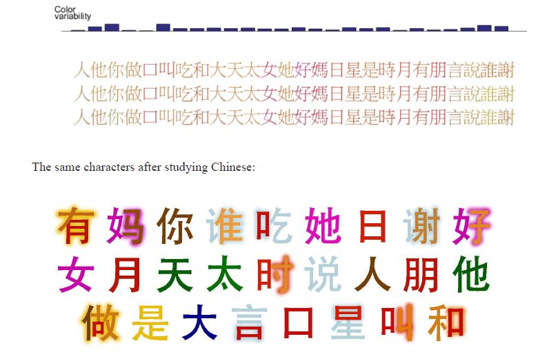
The first time I suspected my daughter was a mutant was when she was 8 years old and said something about being excited to be the age of her favorite color teal. I had heard about synesthesia, which is a rare hereditary perceptual condition in which senses are combined in surprising ways: sounds may trigger physical sensations, music may be associated with colors, or letters and numbers can have particular colors “projected” onto them. I showed the wiki page to my wife and told her that I thought our daughter was a “synesthete” and she was rightly skeptical. We saw in the article that most synesthetes think that A is red, so I shouted out to my daughter in the other room: “What color is A?” and Jacqueline shouted back “Red!”
An online test that asks you to pick the precise color for letters and numbers in random order three times and measures the consistency of your answers. She took it and passed with flying colors…
Jacqueline’s color consistency across three trials
Evidently, she’d had it her entire life, because she remembered blue and green being important parts of turning two and three as well.
Synesthesia and Memory
The first sign that this strange color phenomenon could be a superpower was when Jacqueline won the pi memorization contest in 5th grade. It wasn’t so much how many digits she memorized that seemed unusual (80 digits), but the speed with which she memorized them. She came to class with only 40 digits memorized, but when a competitive boy pried that info from her and then told her he’d beat her by ten digits, she quickly doubled her number of memorized digits and ended up winning the contest in a landslide.
Studies have suggested that synesthetes tend to have enhanced memory and Jacqueline’s history seems to support that. For kicks she memorized the titles of all 100 tracks on Radiohead’s 9 studio albums, forwards and backwards (more on Radiohead later). Probably most unusual is her quick memorization of piano pieces (her teacher doesn’t know how often she’s memorized new pieces the day, or even the hour, before her lesson, shhh!) BTW, synesthetes also tend to be creative people, and that’s true of her as well (she created all of the synesthesia-related visualizations below).
Mutant superpowers evidently can also lead to laughs, such as the time she went to school dressed up like the Terminator for Halloween (the Summer Glau version from the Sarah Connor Chronicles TV show). A kid challenged her, saying “If you’re the Terminator, then what’s pi?” She said that when she quickly recited the 80 digits from years ago, he literally jumped back in shock.
Synesthesia and the Brain
So, why would I think you care about any of this? Well, it turns out that synesthesia provides a unique window into how the brain works. From just a few observations about Jacqueline’s colorful world, we can deduce surprising things and even a few that would be practically impossible to know otherwise.
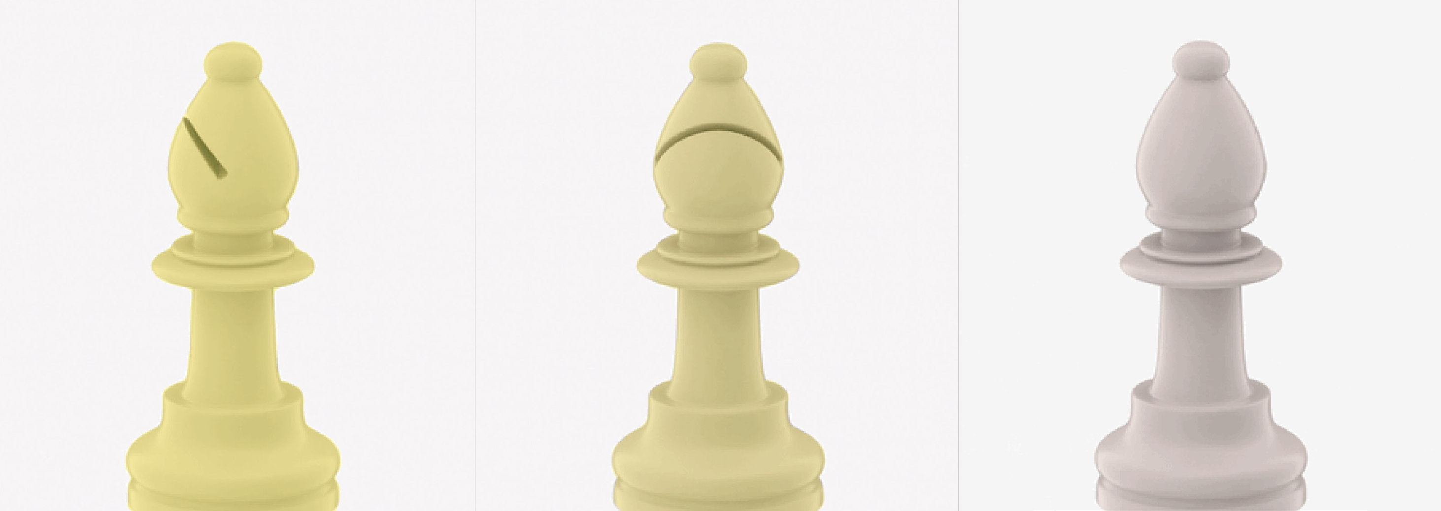
Bishops have color (sometimes)
Jacqueline started learning chess a year ago, and the pieces soon gained projective color: Kings are yellow-orange, Queens are primrose, Rooks are dark green, Bishops are yellow, Knights are light brown, and pawns are light red. That’s interesting in itself, but isn’t the most surprising.
What’s surprising is that when I showed her a bishop with the slit of the hat hidden in the back, she said it lost its color. As you rotate it, she sees it turn bright yellow, and then a slightly dimmer yellow when the slit is in the front (when it looks like Elmo with his chin up).
This one simple experiment tells us many interesting things:
An independent subconscious mind exists. Obviously Jacqueline knew it was a bishop, whether or not I turned it, but her subconscious mind was categorizing it based only on the slit and would “change its mind.”
The subconscious isn’t really any better at classifying images than regular modern machine learning approaches. In A.I. research, a constant source of frustration is how brittle neural nets are in classifying images. One seemingly trivial change in a picture can cause machines to no longer recognize something that’s obvious to human beings. It turns out that the human brain has the same problem! Hiding a small feature (the slit in the bishop’s hat from the “training data” from chess.com) led the subconscious to no longer recognize the bishop, even with all of the other similarities between the chess pieces. The only reason we’re better at classifying images than computers is because our conscious mind has the ability to overrule the subconscious and use reasoning like “rotating an object doesn’t change it” to continue to recognize objects even when our hard-wired image recognition fails.
Our brains don’t use either/or categorization. The fact that the bishop had different shades of yellow depending on how closely it resembled the digital bishop Jacqueline was familiar with shows that the mind categorizes it as “more bishop/less bishop” rather than “bishop/not a bishop”. This is also similar to how neural nets work.
Synesthetic colors can develop and change over time and could give clues about the purpose behind the phenomenon. Jacqueline participated in several studies over the years and was surprised by the fact that a recent study showed that she chose different colors for a few letters than she did when she was 8. She says that she can still think of those letters as their old colors (unlike most other letters, which she can’t imagine being any other color), but they’re kind of a strange mix of the two colors.
For example, C is a mix of yellow (the color she chose as an 8-year-old) and a light gray-blue (the color she prefers now). It’s not green, but an impossible combination of blue and yellow. If you look at the image below with crossed eyes so that the C’s combine into one image, you’re seeing it pretty close to how she sees it.
Jacqueline came to realize that letters with these impossible colors are actually transitioning from an old color to a new color, and she suspects that almost all of them are due to the piano keyboard. When she started playing piano at age 7, the piano keys themselves gained the projective color of the letter they’re named after (see the keyboard below and notice that A’s are red).
Here’s the kicker: the original colors for A through G weren’t all distinct, but the colors that they’re evolving towards are. So, it’s possible that the synesthetic mind has the goal of giving objects distinct colors (easier to distinguish means easier to remember?) and is willing to “change its mind” in order to make that happen.
The only letter that’s transitioning from one color to another that can’t be explained by the piano keys in the letter “n”. Jacqueline suspects this is due to her learning of Japanese and her brains attempt to establish consistent color categories for the hiragana alphabet…
Jacqueline’s Japanese Hiragana Colors
Her synesthesia is struggling to establish consistent colors for each of these columns because the shape of characters is evidently the primary driver of color.
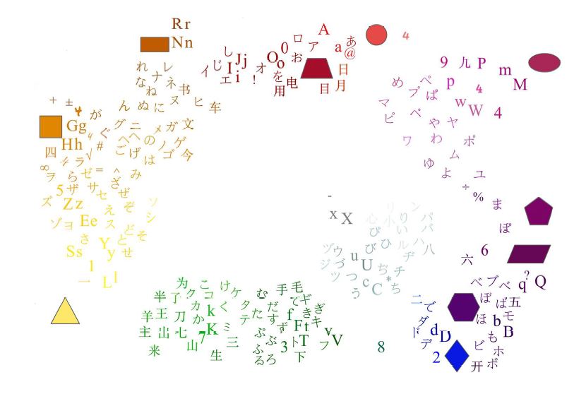
Here’s kind of an overall map of her colors for a variety of shapes and characters where it’s easier to see the similarities in each group…
All the Colors
But I digress.
It evidently takes much longer (years) to change colors than to establish them in the first place. Jacqueline didn’t notice how long it took for the piano keys to gain color, but she did see notice how fast Chinese characters gained color, because she participated in a synesthesia study when she was in 8th grade that tested her on her color response to Chinese characters before she had taken any Chinese. While taking Chinese in 9th grade, the characters dramatically changed in a matter of weeks…
Jacqueline’s Chinese Colors
With this in mind, Jacqueline inadvertently played a prank on her synesthetic mind by learning the Tibetan alphabet for a school project. She had teammates attempting to predict the future colors based on the information above, and they got most of the predictions correct based only on the shapes and sounds of the Tibetan characters. She was careful not to look at their predictions before studying the characters and establishing their colors…
Jacqueline’s Tibetan Colors
It’s sometimes easy to find similar-looking characters from her past languages that determined the color for the new Tibetan characters…
So what’s the prank? Look at the numbers in the “Tibetan Colors” image above. Notice that the Tibetan character for five looks like a 4 and the character for eight somewhat resembles a 7. Based on her “All the Colors” map, Jacqueline’s synesthetic mind instantly assigned those numbers the wrong colors! The other numbers had no color until she learned them well enough to instantly recognize them and they got the appropriate color based on their meaning. The problem is that when she learned the character that means seven, it should get the color of 7. But her mind had already assigned that color to the character for eight, which just happens to look like a 7! So how does her mind resolve that difficulty and still maintain distinct colors for each number (we know that’s important from the piano keys)?
That’s right, the character for seven gets no color! Who knew you could play jokes on your subconscious mind by learning Tibetan? (There’s a sentence that’s never been written in the history of the world)
Weren’t we going to talk about Radiohead?
Oh yeah, so in addition to all of this weird character to color stuff, Jacqueline discovered in high school that she also has musical chromesthesia, which assigns colors to particular sections of songs. She first noticed it when playing Rachmaninoff on the piano because of the dramatic shift in color that takes place during the piece.
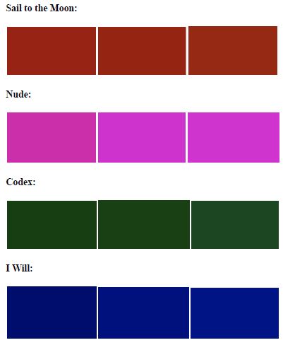
Then, one day, a song I snuck into a playlist on her phone stopped her in her tracks at school: “I Will” by Radiohead. It was a vivid blue through the whole thing! I had hoped she would appreciate the incredibly talented band, but had no idea that her fandom would quickly surpass my own as she discovered that they had many songs that had vivid and consistent colors throughout!
Jacqueline’s Colors of the Radiohead Songs
Consistent colors on a color-picker between repeated trials
Consistent colors are rare from other popular artists and in fact, even about half of the covers on YouTube of these exact songs lose the color for a variety of reasons. Jacqueline also experimented with different tempos and found that practically all of Radiohead’s pieces lose color at precisely 1/2 speed or double speed. Only one piece seemed to be “too fast” in the sense that it’s range of colors was 50-100% speed instead of the usual 75-150%. It’s as if the music were fine-tuned by a synesthete with color, literally, in mind.
Spookily, it looks like this may in fact be true: Thom Yorke, the primary songwriter for Radiohead wrote the following in the foreword to a book on his lighting and stage designer Andi Watson:
I watch a video sometimes, and I just say to him how did you know this tune was that colour?? I guess we are firm believers in synaesthesia…we won’t have even discussed it, but he just seems to know the right colour.
Anecdotally, when Jacqueline runs into other Radiohead superfans, they seem surprisingly likely to have musical chromesthesia. We joke that Radiohead is like the Cerebro machine in the X-Men that Professor X uses to find other mutants.
Then it occurred to us that Jacqueline herself is a composer and it would be interesting if other synesthetes respond to her music. I posted a link to one of her piano pieces Labyrinth on a Facebook page for synesthetes and they definitely seemed to think it was more vivid than typical music…
Spooky Stuff
As long as we’re getting spooky, we may as well go all the way down the rabbit hole. It turns out that Jacqueline has another type of synesthesia that doesn’t even have a name yet and we’ve only found a couple other cases online. Except for a handful of pieces, the music of Bach doesn’t have color for her. However, when she’s memorizing it, it has something else: images. It could be a sailboat, an old man, or even a specific memory of a scene from her grade school. They seem to be completely random and not related to the music.
The images are strangely specific and only pop into mind while she’s trying to play a piece by memory. Then, once she knows the piece well enough to play it by muscle memory, the images go away (but she can recall what they looked like). Not only that, if she then forgets the piece and relearns it, the exact images come back in the same exact sections of music!
Another interesting fact is that while some pieces have color and images, they never occur at the same time. It’s almost as if the mind is using color to remember things, but without that possibility, searches for and retrieves random images to help with the task (“this is the pumpkin chord”).
Anyway, back to spooky stuff. It’s about to get all supernatural up in here, so buckle up. I’m a rational scientist guy, so for the record, I think the following is just a coincidence. Even though it’s not the only time this has happened, I’m sure I’m forgetting about all of the times it didn’t happen, so I think it’s just the availability heuristic that makes it seem like this is a thing. Anyway, this happened…
Anyway, this blog post has probably jumped the shark at this point, but I just wanted to share some of our interesting observations about the mutant who grew up in my house.
In her words, below are all of her types of synesthesia. Anyone experience any of these?
Projective grapheme-color
Projective day-color
Projective colors for school subjects (plus associative colors for teachers of core subjects–they gain the color of their subject) or any well-known group of items in a list, for example world languages, countries
Projective colors for keys on the piano
Projective colors for basic shapes
Auditory-tactile
Associative musical chromesthesia (for musical sections instead of chords or notes)
Associative images for some sections of pieces that I have memorized as I’m playing them
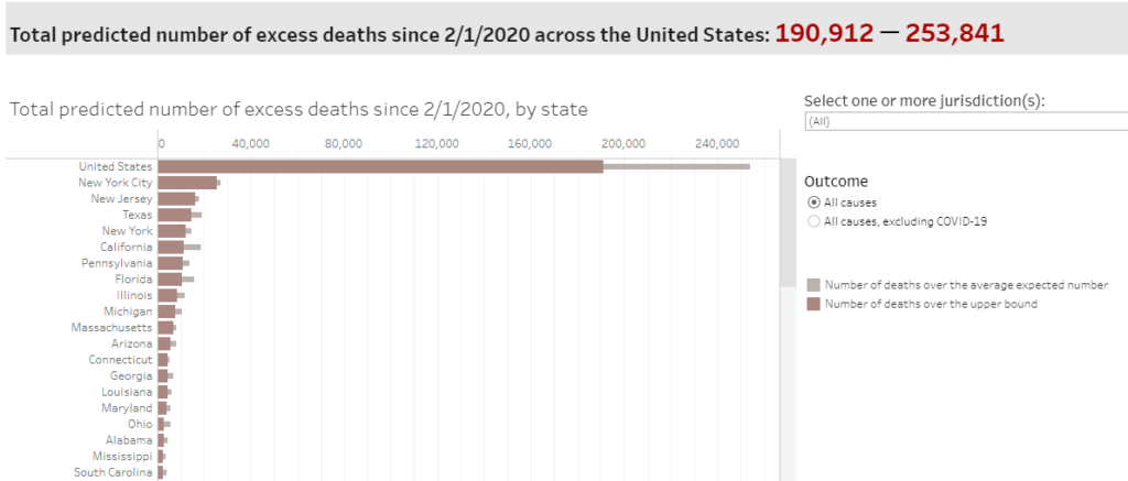
Fortunately, there are very few decisions in life that can have truly catastrophic consequences if we get them wrong. The vast majority of choices we make are mundane and will not make any major difference either way. Whether or not the outcomes are predictable, let’s call these potentially catastrophic decisions “high variance” because they can have a major impact on your life. The high variance decisions are the ones you really need to get right.
In addition to categorizing decisions as high or low variance, you can also classify a decision by how simple or difficult it is. If you were to create pros and cons lists for a simple decision, it would have a clear imbalance in favor of one or the other, while difficult decisions have pros and cons lists that are balanced. The good news is that for the most difficult decisions, you can’t go very far wrong, no matter what you decide. Since the pros and cons are almost balanced, your expected happiness with future outcomes should be about the same either way. The simple decisions are the ones you really need to get right.
The outcome of a decision doesn’t make it good or bad – it is only a bad decision if the foreseeable consequences should have led you to make a different choice. If the consequences are not foreseeable, it wouldn’t count so much as a “bad” decision if things go badly, but rather as an “unfortunate” one. For example, you can’t really be blamed for riding the daily train to work, even if it ends up crashing. However, you CAN be blamed for driving drunk, even if you don’t crash, because it doesn’t take a crystal ball to see that the potential downside is much worse than the inconvenience of taking a taxi. You make good decisions if you reasonably consider the possible paths and follow the one with the best expected value, whether or not things pan out the way you’d hoped.
Passing up the COVID vaccine would be a very bad decision, because it is high variance, it is simple, and the potential devastating outcome is easy to foresee.
So how do we know it’s a simple decision? Let’s look at the cons list first: vaccination may have contributed to three deaths from a rare blood clot disorder. Oh yeah, and it might pinch a bit and lead to a few days of feeling under the weather. That’s it, that’s the list.
What about the vaccine causing COVID? Can’t happen. What about the unknown long-term effects? There’s no reason to believe this will be the first vaccine to ever have those. What about effects on fertility? That’s also nonsense. Where do you read this stuff? If you’ve come across these warnings, you may want to look into the reliability of your sources of information.
In order to fully appreciate the pros of vaccination, let’s get an intuitive feel for the risks involved by using the analogy of drawing specific cards from a deck of playing cards. Since there are 52 cards in a standard deck, the chances of drawing a particular card is about 2%. If you’ve ever tried to predict a specific card, you know that it’s very unlikely, but possible. I guarantee that you’ll fool Penn and Teller with your magic trick if you go up on stage, tell them to think of a specific card, and then just blurt it out. So, armed with a feel for how likely it is to draw cards from decks, let’s consider the risks you’ll face depending on whether or not you get vaccinated.
Option 1: Try Your Luck.
Let’s say you don’t believe that the universe is trying to kill you and you want to take your chances and see if you draw the hospital/death card from the deck. If you choose this path, it looks like a decent estimate for you catching COVID-19 at some point in the next year is about 1 in 10. Then, if you get infected, depending on your age and pre-existing conditions, the chances the disease lands you in the hospital, leaves you with long-term damage, or a slow agonizing death, is about 1 in 4. Since you multiply probabilities to find out the chances that two independent events both occur, your probability of drawing the hospital card should be approximately 0.10 * 0.25 = 2.5%, or a bit more than drawing one specific card from the deck. So, option 1 is to shuffle up that deck and try not to pull the hospital/death card, the Ace of Spades. You’ll probably be fine.
Figure 1: Good luck – Don’t draw the Ace of Spades!
Option 2: Trust Science.
The other option is to just do what the health experts say and get the shot. So what are the chances you go to the hospital for COVID-19 if you’re vaccinated? Well, if you’re under 65 and haven’t had an organ transplant or something that compromises your immune system, it’s effectively 0%. But that’s hard to visualize, so let’s just say you’re a truly random and possibly high-risk individual. As of July 12, there have been 5,492 vaccinated individuals hospitalized for COVID-19 symptoms out of the 159 million who have been vaccinated. So, about 0.003%. Let’s bump that up to 0.007% because we want to estimate the chances of landing in the hospital at some point in the next year. That’s 7 out of 100,000.
Figure 2: Okay, NOW try not to pick the bad card hidden in one of those decks!
You can do this same exercise if you’re under 65 and have a good immune system by just imagining that there’s no bad card.
Get this one right; you may never see a simpler, higher variance decision in your life.
By now you’ve probably seen the viral video of Steph Curry draining 105 3-pointers in a row during practice. You’re probably thinking “that guy can shoot well!”, but it’s a lot more than that. Historically, he’s shot an amazing 65% during the NBA 3-point shootout competition, but let’s be generous and say that his 3-point shooting percentage during practice is 80%. To put that in perspective, there are only a few hundred NBA players in history who have a career free throw percentage that high. So, what are the chances, you ask, that someone who shoots with an accuracy of 80% would make 105 in a row? About 1 in 15 billion. Yeah, it was a lucky streak.
Now, there is another explanation which traditionally hasn’t been taken seriously by people in the data wonk profession: the Hot Hand. It’s even been called the Hot Hand Fallacy. There have been several studies concluding that there is no evidence that those of us who feel like we’re on a “hot streak” aren’t deluding ourselves and being fooled by randomness. They have a point that randomness is much streakier than we expect, but I’ve always thought that if we had a controlled environment, the evidence for the Hot Hand would become clear (and not just because I somehow made 32 free throws in a row once). After examining the NBA Three-Point Shootout data, Gary Smith and I showed in our latest book that, given the relatively few contests in history, the mere existence of Craig Hodges 1991 streak of 19 consecutive baskets provides strong evidence in favor of the hot hand hypothesis.
Now, cherry-picking extreme examples is normally not a good way to gather statistical evidence. However, it can be considered compelling if you appropriately take into account how large the number of events there were from which you were cherry-picking. In the Hodges case, this means looking at how many participants there have been in the history of the NBA Three-Point Shootout. There simply haven’t been enough shooters in the contest’s history to expect a shooting streak like that if there’s no such thing as a Hot Hand!
Some other NBA news today indirectly provided another reason to believe in the Hot Hand. Curry just broke the Warriors franchise record for most consecutive free throws made in a row: 61. The NBA all-time record is 97 straight. That’s an amazing number, but how can the all-time streak of consecutive makes from 15 feet be smaller than the number of consecutive makes on Curry’s highlight reel of 3-pointers, more than seven feet further away from the basket?
Once again, I argue that the Hot Hand is the answer. In the NBA, free throws are usually shot in pairs, so players don’t have a chance to settle in and establish a hot streak. Shooting free throws is more in line with the statisticians assumption that each shot is an independent event; whether or not you made your last free throw 10 minutes ago doesn’t affect the likelihood that you’ll make the free throw you’re shooting now.
In order to decide whether or not Curry’s videotaped shooting streak is evidence that the Hot Hand is real, we need to account for the universe of attempts from which his 3-point shooting streak was cherry-picked. Let’s say there are 500 trillion basketball players in the world and that they all shoot 50% from behind the 3-point line (the NBA average is 35%). Now, let’s assume that they’ve each made a videotaped attempt at Curry’s feat once per day for the 13.8 billion year history of the universe (never mind that 3-pointers were invented only 40 years ago). How many times would you expect to see Curry’s feat replicated? About 0.00006 times. Of course, that’s if you assume the Hot Hand is a fallacy.
Okay, so now that the president has shown us that COVID-19 is a piece of cake as long as you have a tiger blood transfusion at the ready, we can focus on more important things: I’m honored to say that poker legend Daniel Negreanu glanced at my last blog entry and … said that it didn’t add up.
Figure 1: That is correct, sir. They don’t add up, and it’s my bad for making it look like they should.
I displayed the total stats by position, summarizing the data to just show the aggregates without any filtering or funny stuff. Nothing to explain, right? It’s the total profitability for each of the positions at the 6-max tables.
The problem is, as my friend pointed out, “shouldn’t you use only the data for full tables? Apples and oranges, otherwise.” What do you think? Here’s my original table, which is the total profit for each position divided by the total hands played from each position…
Position
Success(profit per hand)
Button
$11.09
Cutoff
$6.85
Under the Gun (UTG)
$6.68
Middle Position
$6.19
Small Blind (SB)
$(9.48)
Big Blind (BB)
$(15.50)
Table 1: The original table of profit by position. Do you see what Daniel saw?
If you’re assuming that each position was played the same number of times, there’s a big problem: the numbers add up to an average profit greater than zero! Poker sites don’t run for free, and they certainly don’t give away more money than they take in. The numbers aren’t wrong, but an assumption is; every hand dealt has a big blind, but not every hand played has an Under the Gun player (there are often seats empty at the table). Allow me to present a new version of the table with profit by position only when the table is full:
Position
Success(profit per hand)
Button
$10.92
Cutoff
$7.53
Under the Gun (UTG)
$6.54
Middle Position
$5.17
Small Blind (SB)
$(11.03)
Big Blind (BB)
$(20.21)
Table 2: Better table. Profit by position WHEN ALL 6 SEATS ARE TAKEN
Even though this table is based on less data, it lines up better with expectations. If you add up the numbers now, you get -$1.07, which is the average rake (it ranges from $0 to $3). The ranking of the seats by profitability is still the same, even with that odd quirk of UTG being more profitable than the middle position, despite being a worse position. However, you’ll notice that the increase in profitability is smoother. The dealer position is no longer so unusually profitable (the dealer’s relative advantage evidently grows as the number of opponents decreases) while all of the other non-blind positions are about the same. The takeaway lesson is this: make sure you’re showing people what they’re expecting; don’t just show aggregate numbers for the entire dataset as a matter of principle.
Anyway, recall that last time, we found that, overall, the top 10 players (by total profit) were tighter and more aggressive than the bottom 10 players. Let’s look more closely at how the top 10 vs. the bottom 10 played when the tables were full. The top players pocketed a total of $508,000 ($8.35 per hand), while the bottom players lost $338,000 (-$10.84 per hand).
Another thing you’d expect to see from good players is a better ability to manage “tilt”, which is when people’s emotions get out of control and they’re unable to continue playing their “A game” after a big loss. Since we’re looking at data for $50 big blind tables, let’s call a big loss one that exceeds $1000. This happened less than 1% of the time for the biggest winners, so it’s pretty rare.
According to a paper co-authored by my professor buddy Gary Smith, “…experienced poker players typically change their style of play after winning or losing a big pot—most notably, playing less cautiously after a big loss, evidently hoping for lucky cards that will erase their loss.”
As a group, the biggest winners played 20.7% of their hands in the following round (6 hands dealt) after a big loss, while the biggest losers played 35.3%! That’s a dramatic difference, especially when you consider that the looseness in general (not preceded by big wins or losses) for these groups was 21.1% and 28.1%, so the top players displayed no tilt at all, while the bottom players went a bit crazy. After a big loss, the loss per hand for the bottom players more than doubled ($-9.43 to $-23.20 per hand).
Normal Loose %
Normal Profit
Loose % after big loss
Profit after big loss
Loose % after big win
Profit after big win
Top 10
21.1%
$8.59
20.7%
$6.93
19.8%
$5.79
Bottom 10
28.1%
($9.43)
35.3%
($23.20)
32.7%
($11.59)
Table 3: Top players stay closer to their “A game” after big wins or losses.
So, what about hand ranges? We know that top players are more selective, but what specifically does that mean? As I started looking through sample hands for the top players, I noticed that an unusual number of them were making aggressive plays because they were short-stacked (had less than $1000 when the blinds are $25/$50). There were a lot of hands where someone would raise before the action got to them and they would just respond with an all-in, especially if the raise came from the button…
(Note: the all-in raise was to $1000, but $25 was already in the pot from the SB)
Then I realized there were a LOT of hands like this and that they were primarily from two of the ten players. Sure, enough, when I looked more closely, it turned out that they were buying in as short-stacks, doubling up, and then switching tables, only to buy-in as short-stacks again – a strategy described as “hit and run” or “rat-holing”, which can be a surprisingly profitable and annoying strategy in cash-games.
Because people think of short-stacks as being in a position of weakness in tournaments, many don’t realize that it’s actually a strategic advantage in cash games (well, the pros do, which is why they’re generally not fans of rat-holers). Not only is it relatively simple to play (often, it’s just one all-in re-raise before the flop), it puts the bigger stacks in very awkward positions. Sometimes, they’re basically forced mathematically to call a bet, even if they suspect they have the worst of it.
Consider the hand above, but suppose the short-stack player (QJs) showed his hand as he went all-in, so the original raiser (44) could make a perfectly informed decision. The decision that 44 faced was whether or not to call another $825 for a chance at $2050. Since $825 / $2050 is 40.24%, a Hold’em Calculator tells us that it’s a clear call (44 vs. QJs has a 48% chance of winning). By making the correct call here, the original raiser can expect to win 48% * $2050 = $984 (hence, “pos EV” or positive expected value for the call). That’s a good amount better than the $825 it cost to call the bet, but it’s worse than if the player had just sat out the hand and never had to shell out $1000 for the experience. And this was in the case where the short-stack player had a mediocre hand! Often, an all-in from the blinds here means a medium or high pair, in which case the raiser would win less than 20% of the time. So, the call is not automatic by any means! In summary, when an initial raiser gets shoved on by a short-stack, they’re put in a very tough spot in which they’re just trying to lose as little of their money as possible.
From an earlier life, I know a bit about this short-stack style of play (shhh!) so I wasn’t completely surprised to see two short-stackers in the list of the top 10 most profitable players. They weren’t as profitable per hand as the others top players, but they made up for it with volume (often being a short-stack is so easy to play, you can play many tables simultaneously). Most notably, the short-stackers were MUCH more aggressive than the other players, due to the large number of all-ins and relatively few check/call type hands…
Sing it: Which of these players are not like the others?
Since these players truly had a distinctive style, I lumped them together; let’s call them a prototypical successful short-stacker. Here’s what I found:
Under the Gun: When seated in the worst position, they showed down the following hands (recall that “AKs” means Ace-King suited, while “KJo” means King-Jack offsuit):
[A A][Q Q][T T][9 9][5 5][AKs][AQs][ATo][KJo]
Assuming that they chose their playable hand range according to how well they rank against a random hand in a showdown, this looks like about the top 14% of possible hands (55 is the worst hand in the group by this metric, winning only 60.32% vs. a random hand, so their range would include each hand type down to “55” at the link above). This is significantly tighter than the typical player UTG (20%), so if you see an experienced short-stack player raising from UTG, you’ve been warned about what you’re up against!
[Note: if you want to figure out the top x% range yourself, just put your list of ranked hand types in Excel with a column next to them showing the number of ways to get dealt each type of hand. Card combinatorics tell us that pairs can happen 6 ways, suited cards 4 ways, and unsuited non-pairs can be dealt 12 ways. If you include all possible hand types in your list, the “ways” column should add up to 1326, the total number of different two-card poker hands. Now, you can calculate the total “ways” for the set of hands you’re interested in, divide it by 1326, and you’ve got your percentage!]
Middle Position: In this position, they showed down a wider range:
This looks like the top 20% hands (every hand above QJo here). Hmm, 5 players left in the hand, 1 in 5 = 20%? It’s possible these players didn’t base their playable hand ranges on historical data, but rather just on the number of opponents left to act (in which case they may actually play 1/6 = 16.7% of their hands from UTG).
You can see why the aggression rating for these guys is off the charts. When dealt a pair and playing with a short-stack, it doesn’t make sense to call a raise and hope to hit a set, because the pot size won’t be big enough to justify the gamble. In this case, the short-stacker correctly predicted that the hand would be a coin flip, so he bet $800 for an even chance at $2800.
Cutoff Position: They showed a similar range here, so it looks like top 20% again…
The loosest hands here are 98 offsuit (48.1% vs. random hand!) and J7 suited (52.32% vs. random hand).
Blinds: The sample hand at the beginning of this article shows that they will re-raise all-in out of the blinds even with a hand like QJ suited, which barely makes the top 20%, so it appears that they’re expecting other players to be just as loose as they are with their button raises. Here’s the whole set of hands they re-raised out of the blinds with…
In summary, they’re playing tighter than normal in the early position, looser than normal from the button, and much more aggressive than other profitable players. If they’re not in the blinds and someone raises before them, they typically push all-in with the top 10% of dealt hands. This is consistent with their overall strategy: find spots where (based on very limited information) they think they have an above average hand against their opponent’s range and then shove all of their chips in and hope for the best. It’s a pretty simple approach, and worked well ($80k profit in a few months for the two of them at the $25/$50 tables isn’t bad!)
If you’re new to poker, I’d recommend buying in with a short-stack and playing selectively and aggressively like these guys. The deeper the stacks, the more complicated the game gets and the more vulnerable you are against the more experienced opponents. If you don’t have many chips and Daniel Negreanu raises pre-flop and you push all-in on him, it doesn’t matter that he’s ten times better than you. He has to decide whether to call or fold and can’t bluff you out. Be warned however: he might have read this article and you may not be happy when he flips over his cards!
So, are you tired of arguing about things like whether or not the CDC stated that only 6% of the official deaths were due to COVID-19? Me too. (By the way, the easiest way to show that, if anything, the death count is an underestimate is to point out that the excess deaths in the U.S. this year are at about 250,000. Why would that be, if not for COVID-19?)
Figure 1: Where did all the extra deaths come from if COVID-19 is overcounted?
Well, you’re in luck, because this article is not going to talk about the pandemic (anymore). Let’s all take a break from the daily death toll and the decline of democracy and talk about POKER.
Well, not just about poker, but also about how to approach historical data and carefully draw conclusions from it. There’s no surefire way to answer questions without controlled and randomized experiments, but that doesn’t mean that observational data is worthless. The goal when digging into historical data is to not fool yourself. You need to determine which patterns are meaningful and which are spurious. If there’s a confounding variable that you didn’t think of, you could end up with pie in your face when you present your conclusions to someone who did think of it. Since nobody can think of everything, it’s good practice to consider what answers would make sense, given your understanding of the subject at hand, before you look at the data for answers. Let’s see if I can dodge the pitfalls of data-mining as I look for insights into what makes a successful poker player.
Before we shuffle up and deal, I suggest you brush up on how to play No Limit Texas Hold ‘Em. It’s a fantastic game and it will basically train you how to make good decisions by literally making you pay for superstition and irrationality. You learn that good decision-making doesn’t always result in good outcomes in the short-term, but it will eventually pave the way to success. If you play long enough, you will see that players around you whose strategy depends on their emotional state end up sliding their chips your way, sooner or later. Poker initially appears to be a game of chance, but if you take it seriously, you’ll be rewarded with the realization that you’re no longer a slot-machine player, relying on luck for your success; you’ve become the casino. What may have started out as gambling has become an investment opportunity with a positive expected return.
Anyways, let’s get to the data. A little bird provided me with hand history for over 930,000 online poker hands (at tables limited to 6 players) from about a decade ago. The blinds were $25/$50, which is high enough to be considered “serious” poker. It’s not unusual for a player to have over $10,000 at the table and, in the 3 months of data, three players made a profit of over $100,000 (one player lost over $100,000, so over this time period, poker was a more expensive hobby than golf!).
The first (and most time-consuming) step in a data scientist’s workflow is to get the data into a useable format. In this case, the data came as a semi-structured text file such as the following (names anonymized to match their position at the table)…
Game #5811672164: Table Rock Port (6 max) – $25/$50 – No Limit Hold’em – Seat 1: MiddlePositionPlayer ($575) Seat 2: CutoffPlayer ($6,244.75) Seat 3: ButtonPlayer ($7,694) Seat 4: SmallBlindPlayer ($6,297) Seat 5: BigBlindPlayer ($9,522) Seat 6: UnderTheGunPlayer ($6,100) SmallBlindPlayer posts the small blind of $25 BigBlindPlayer posts the big blind of $50 The button is in seat #3 *** HOLE CARDS *** UnderTheGunPlayer folds MiddlePositionPlayer has 15 seconds left to act MiddlePositionPlayer folds CutoffPlayer calls $50 ButtonPlayer folds SmallBlindPlayer raises to $250 BigBlindPlayer folds CutoffPlayer calls $200 *** FLOP *** [4h 7s 7c] SmallBlindPlayer bets $400 CutoffPlayer calls $400 *** TURN *** [4h 7s 7c] [3s] SmallBlindPlayer checks CutoffPlayer checks *** RIVER *** [4h 7s 7c 3s] [Ts] SmallBlindPlayer checks CutoffPlayer checks *** SHOW DOWN *** SmallBlindPlayer shows [6d 8d] a pair of Sevens CutoffPlayer shows [Jh Jd] two pair, Jacks and Sevens CutoffPlayer wins the pot ($1,347) with two pair, Jacks and Sevens *** SUMMARY *** Total pot $1,350 | Rake $3 Board: [4h 7s 7c 3s Ts] Seat 1: MiddlePositionPlayer didn’t bet (folded) Seat 2: CutoffPlayer showed [Jh Jd] and won ($1,347) with two pair, Jacks and Sevens Seat 3: ButtonPlayer (button) didn’t bet (folded) Seat 4: SmallBlindPlayer (small blind) showed [6d 8d] and lost with a pair of Sevens Seat 5: BigBlindPlayer (big blind) folded before the Flop Seat 6: UnderTheGunPlayer didn’t bet (folded)
Since I wanted data summarized by player, I created a custom computer program with class objects in code that represented players and tracked of all of their stats, such as “looseness” (VPIP, or Voluntarily Put In Pot, which is the percentage of hands a player plays) and “aggression” (the ratio of bets/raises to checks/calls). Each player “object” also had properties tracking their profit, number of hands played, etc. Note that the profit for each player is not simply the total size of the pots they won. For the example above, the CutoffPlayer won a $1347 pot, but $650 was his own money, so the profit for the hand was $697. The need to extract implicit information of interest is why custom code is necessary for the import and that there is no simple “just load it into a database” approach.
After the file was imported, the summary statistics for each player were exported to a text file for easy analysis in Excel. I also tracked stats for 6 additional virtual “players” representing each of the 6 seats at the table: Small Blind, Big Blind, Under the Gun, Middle Position, Cutoff, and Dealer Button. These stats duplicated the actual player stats, but allowed me to look at how the average player acted depending on their position for the hand.
If you’re not familiar with them, these are the positions at a 6-max table…
Figure 2: Table Positions. Betting order is clockwise and the dealer gets the last word.
Another good reason to track stats by position is so that we could do a “reality check” and ensure that the imported data makes sense. For example, players generally play fewer hands when in early position, because the more players that follow you in the betting order, the bigger your disadvantage. We would expect to find that players in unfavorable positions at the table would not only be tighter (more selective about the hands they play) but also more passive (playing more defensively by betting and raising less, in order to limit the size of their losses).
Let’s see what the data says.
Position
Looseness(VPIP)
Button
36%
Cutoff
22%
Middle Position
22%
Under the Gun (UTG)
20%
Big Blind (BB)
22%
Small Blind (SB)
28%
Table 1: Position ranked by Looseness
So, players who were first to act (UTG) only played 20% of their hands. For a sense of what this means in terms of poker hands, if you were to rank the two-card hand types according to how well they match up against random cards, the top 20% would include every hand at least as good as the following: Ace-Three suited (>=A3s), Ace-Seven offsuit (>=A7), King-eight suited (K8s, K9s, KTs, KJs, KQs), King-Ten offsuit (KT, KJ, KQ), Queen-Ten suited (QTs, QJs), Queen-Jack, or pairs of fives or higher (>=55). (Note: “suited” just means that the two hole cards have the same suit.)
As expected, the Looseness increases as the player sits closer and closer to the Button (the Dealer position). Sitting in the best position allowed players to play over a third of the time. It’s trickier to know what to expect in terms of looseness of the blinds, since the Small Blind is in a horrible position, but has already paid some of the price of playing. Similarly, the Big Blind only needs to add money to the pot if somebody raises before the flop. Nevertheless, these stats look reasonable, so I’m feeling pretty good about the imported and organized data.
How about Aggression (ratio of bets/raises to checks/calls)? Again, you would expect players in good positions to be betting and raising more (playing offense), while players in bad positions are checking and calling more (playing defense) to keep the pot size under control. Let’s see if the data matches this expectation.
Position
Aggression
Button
2.1
Cutoff
1.9
Middle Position
1.9
Under the Gun (UTG)
1.8
Small Blind (SB)
0.9
Big Blind (BB)
0.4
Table 2: Position ranked by Aggression
Aggression almost perfectly sorts the positions from best to worst! The only exception is that the small blind is the worst seat after the flop (first to act), but these players were more aggressive than the big blind. This can be explained by the fact that the small blind at least chose to enter the hand (at a discount), whereas the big blind sometimes saw the flop with two random cards (if nobody raised before the flop, they can “check” and continue in the hand for free). So again, the data looks reasonable given what we know about poker strategy.
While there aren’t any notable surprises in the data yet, if you believe in the wisdom of the masses, it does confirm that you should play looser (more hands) when you have a good position at the table, playing about a third of all hands dealt when you have the dealer button. It also backs up the idea that players in the blinds should be primarily checking and calling, while players in good position should be betting and raising. The better your position, the more aggressive you can be; with the dealer button you can bet/raise more than twice as often as you check/call.
Now comes the part that really matters: profit. Which positions are the most profitable and which ones cost you chips?
Position
Success(profit per hand)
Button
$11.09
Cutoff
$6.85
Under the Gun (UTG)
$6.68
Middle Position
$6.19
Small Blind (SB)
$(9.48)
Big Blind (BB)
$(15.50)
Table 3: Position ranked by Profitability
This clearly shows the importance of position. All things being equal, the player sitting with the dealer button is expected to make almost twice as much money as anyone else! It’s hard to see image how one seat can be so much more profitable than the seat next to it, but there is one thing that’s unique when you have the button: if everyone folds to you pre-flop, it’s just you against the blinds (and they have to act first in every future round of betting). It’s a great spot to raise and win immediately or build a pot where you have the advantage of acting last. Even the cutoff seat right before the dealer runs the risk of the dealer calling or raising their bet and having to play the rest of the hand out of position. In short, the dealer is the only one who’s guaranteed to have a positional advantage.
It’s not a surprise that the blinds are the most expensive seats at the table, since you are literally forced to bet, regardless of your cards. The profitability of the other positions sorts them as expected, except for one: players under the gun (first to act after the blinds) made more money per hand than players in the middle position. Since there’s no good reason why this should be generally true, I wouldn’t read too much into it. The difference is only $0.50 per hand at the $50 big blind table stakes so it may be that there were just a few monster hands that swayed the results.
Note that we don’t just look at total dollars won, since sometimes there are fewer than 6 players at the table and the seats in the worst positions are empty. Technically, the players at the middle position made more profit than the players under the gun ($793k vs. $544k), but since there were 128k hands dealt with a player in the middle position and only 81k hands dealt with a full table (and therefore included a player sitting under the gun), the UTG position made more profit per hand.
It’s good to see that the small blinds and big blinds are losing less than $25 and $50 per hand respectively, or they would have been able to improve their results by simply folding their hands every time they were in the blinds! I was a bit surprised to see that every position other than the blinds was actually profitable on average. Since we know that the poker site is making money from the rake, the total losses must exceed the total wins (in this case $153,500 went from the players to the online cardroom during the months observed). Surprisingly, the losses for the two blinds ($4.75M) more than offset the total winnings from the other four positions at the table ($4.60M).
Let’s move on from stats by position and look at the stats by player. The big question is whether or not playing tight and aggressive (TAG) is generally the winning formula for poker. Excel has a nice Data Analysis add-in that allows you to easily run multiple linear regressions. Basically, you just highlight the profit per hand column as the target variable and select the looseness and aggression columns as your predictive variables and see what it comes up with…
Table 4a: Tight is right. Aggression is not so clear.
While the general conclusions seem reasonable, there’s something a bit strange about the p-value; it’s off the charts! Are there any gotchas we should be looking for? Remember what we’re predicting here: the profit per hand. Well, what if someone just played one hand and won or lost a lot?
Sure enough, there was one player, who sat down with $5,000, ended up going all-in on his first hand and losing, never to play again. His profit per hand is -$5000 and he played 100% of his hands. Similarly, there are 15 others who all played exactly one hand and lost more than $1000, never to return. These outliers need to be removed from consideration, because the extreme looseness and results dwarf any of the values you’d see with regular players and will warp our conclusions. Let’s limit the data to players with at least 10 hands played and see how that changes things…
Table 4b: Tight and Aggressive are the way to go!
Well, the p-value is still pretty outrageous, but we peeked at the raw data and nothing jumped out as an obvious problem, so we’ll run with it. Looking at these results, I’d state with confidence that the tighter players generally make more money. Obviously, you can’t take this to the extreme and say that the best player would play 0% of the hands, but you can say that when comparing any two players in this data set of 1290 players, the tighter player is probably the more profitable one. And the tighter the player, the more profitable you’d expect him or her to be.
What about aggression? Now that we’ve removed the outliers, it appears that more aggressive players are also significantly more profitable on average.
The R-squared value of 0.04 is very low, which tells you that knowing only aggression and looseness can only “explain” 4% of the variation in the profitability between the players. More specifically, if you used the equation suggested by the coefficients above [profit per hand = $7.66 – 0.77 * Looseness + 5.90 * Aggression], your predicted profit would only have a 0.2 correlation with the actual player profitability in the data (R-squared is the correlation squared – a 1.0 correlation would be a perfect prediction, and a 0.0 correlation would mean your prediction may as well have been completely random).
Recall that while we have extremely high confidence that profitability is associated with aggression and negatively associated with looseness, we still have to take this with a grain of salt since we’re just analyzing historical data and not the results of a controlled experiment. There could be a hidden confounding variable that we should be considering. For example, what if we break down the data by how many players are at the table? Conventional wisdom states that as the number of players at the table decreases, you should loosen up the range of hands you play and also play more aggressively. Let’s see what we get if we re-run our regression analysis on 6-player, 5-player, 4-player, 3-player, and heads-up situations.
Number of Players
Looseness Coefficient
p-value
Aggression Coefficient
p-value
6
$(1.28)
0.000
$1.76
0.281
5
$(0.47)
0.007
$3.16
0.110
4
$0.02
0.934
$1.34
0.499
3
$0.15
0.607
$0.58
0.822
2
$(0.12)
0.680
$9.61
0.004
Table 5: Importance of Looseness and Aggression by Number of Players
There are a couple interesting things here! The first is that the cost of playing loosely is only significant when there are 5 or 6 players at the table. Another finding: playing aggressively isn’t particularly predictive of success (although generally good) unless it’s one-on-one. These results are a bit surprising, but not necessarily out of left field (which is a good thing when you’re worried about data-mining). In summary, you want to be the tightest player at the table when it’s 5 or 6 handed. But if it’s heads-up, you want to be the aggressive player.
Let’s look at how the average players actually played, depending on their number of opponents. And, more interestingly, let’s see how the 10 biggest winners (by total profit) and the 10 biggest losers played…
#
Avg Looseness
Avg Aggression
Top 10 Loose.
Top 10 Aggress.
Bot 10 Loose.
Bot 10 Aggress.
6
28.7%
1.12
22.7%
1.97
29.3%
1.20
5
29.8%
1.02
24.3%
1.92
28.3%
1.37
4
34.2%
1.05
29.8%
1.89
28.9%
1.14
3
40.8%
1.09
33.8%
1.59
37.5%
1.49
2
50.3%
0.97
47.5%
1.57
45.9%
1.35
Table 6: Looseness and Aggression by Number of Players
As expected, everyone loosens up as the number of opponents decreases. However, notice that the 10 biggest winners are consistently playing 4-7% fewer hands than the average player (with the exception of heads-up situations). Interestingly, both the best and the worst players are more aggressive than average, but the best players do consistently bet and raise more than they check and call. Again, there may be other variables at play, such as that the best players are more likely to seek positional advantage (which in turn leads to more aggressive play). However, describing them as Tight and Aggressive does appear appropriate.
Next time, we’ll discuss more specifically how the most profitable players play. The great thing about poker hand history files is that you can often see cards at showdown and then match them up with the betting patterns from the player earlier in the hand for analysis. With enough data, you’ll have a pretty complete sense of the types of hands people play and how they play them. To me, this is what makes poker so interesting. It needs to be studied in the context of what people actually do, rather than what is best in some theoretical sense. It’s not the optimal strategy you seek; it’s the exploitive one.
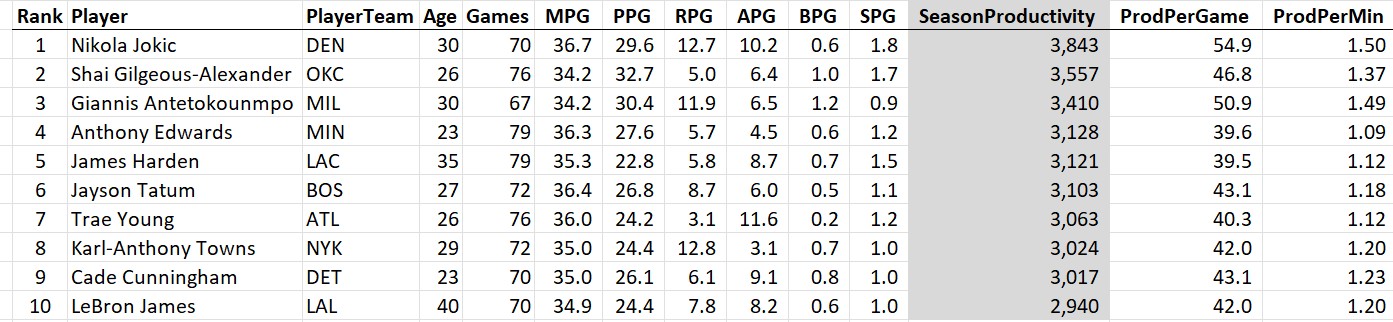
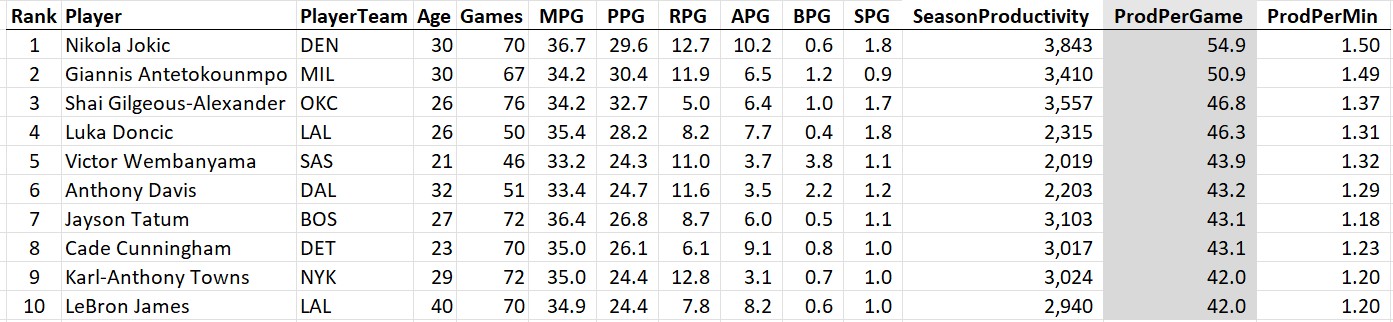
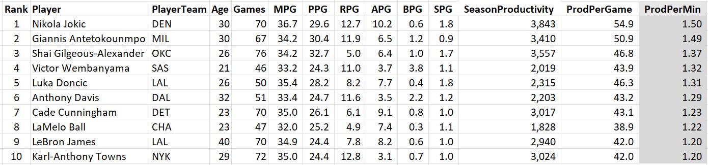
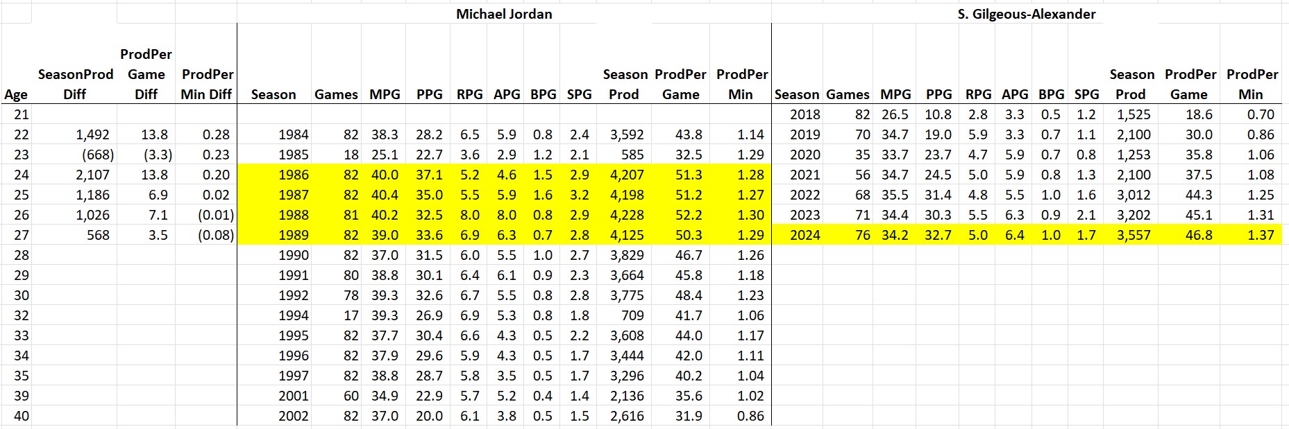
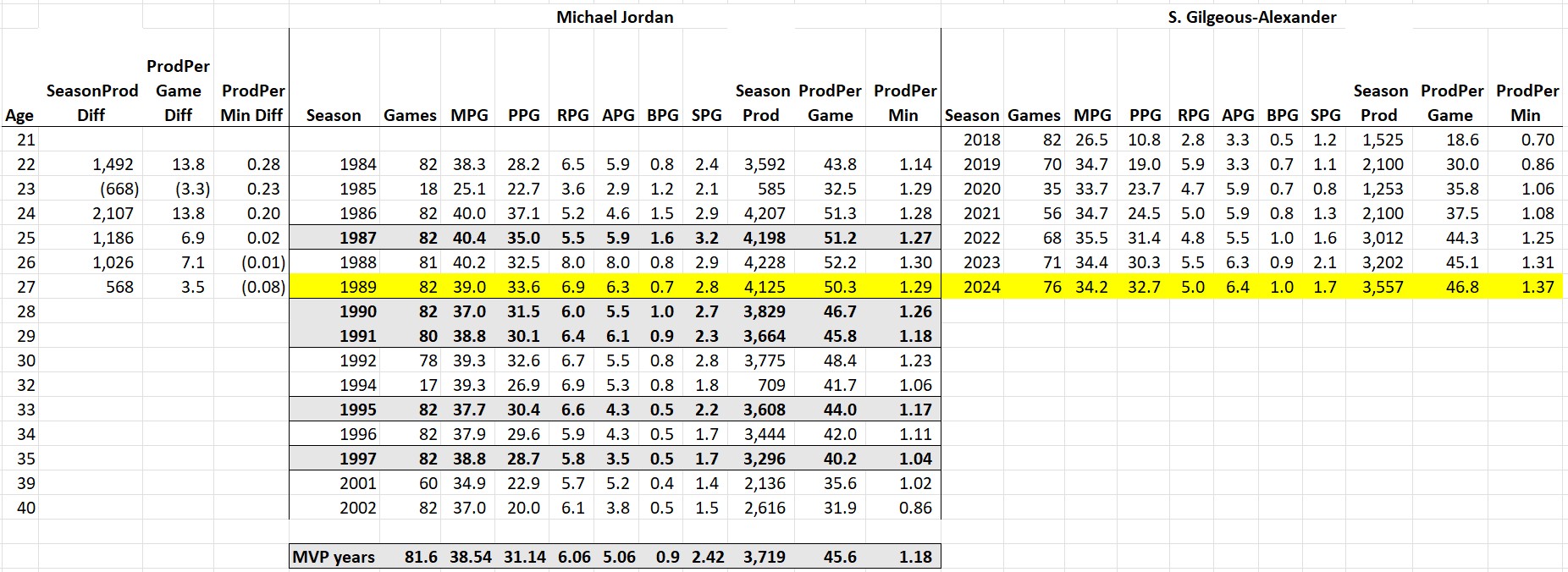
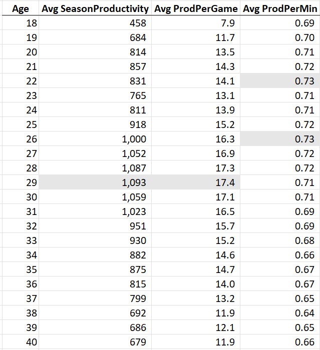
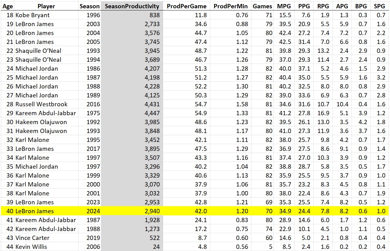
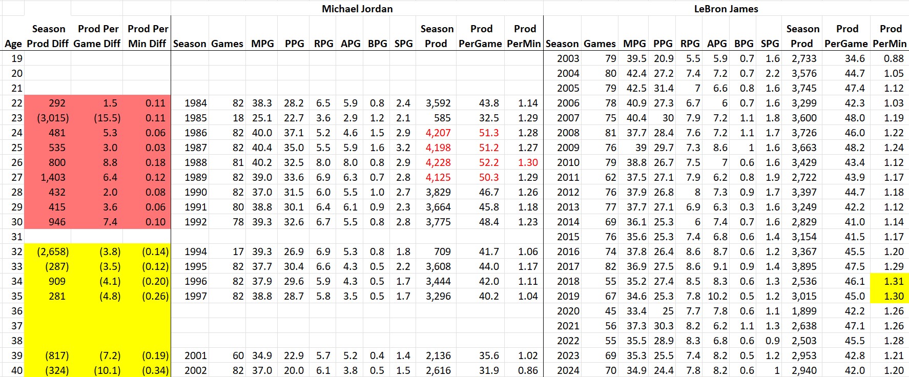
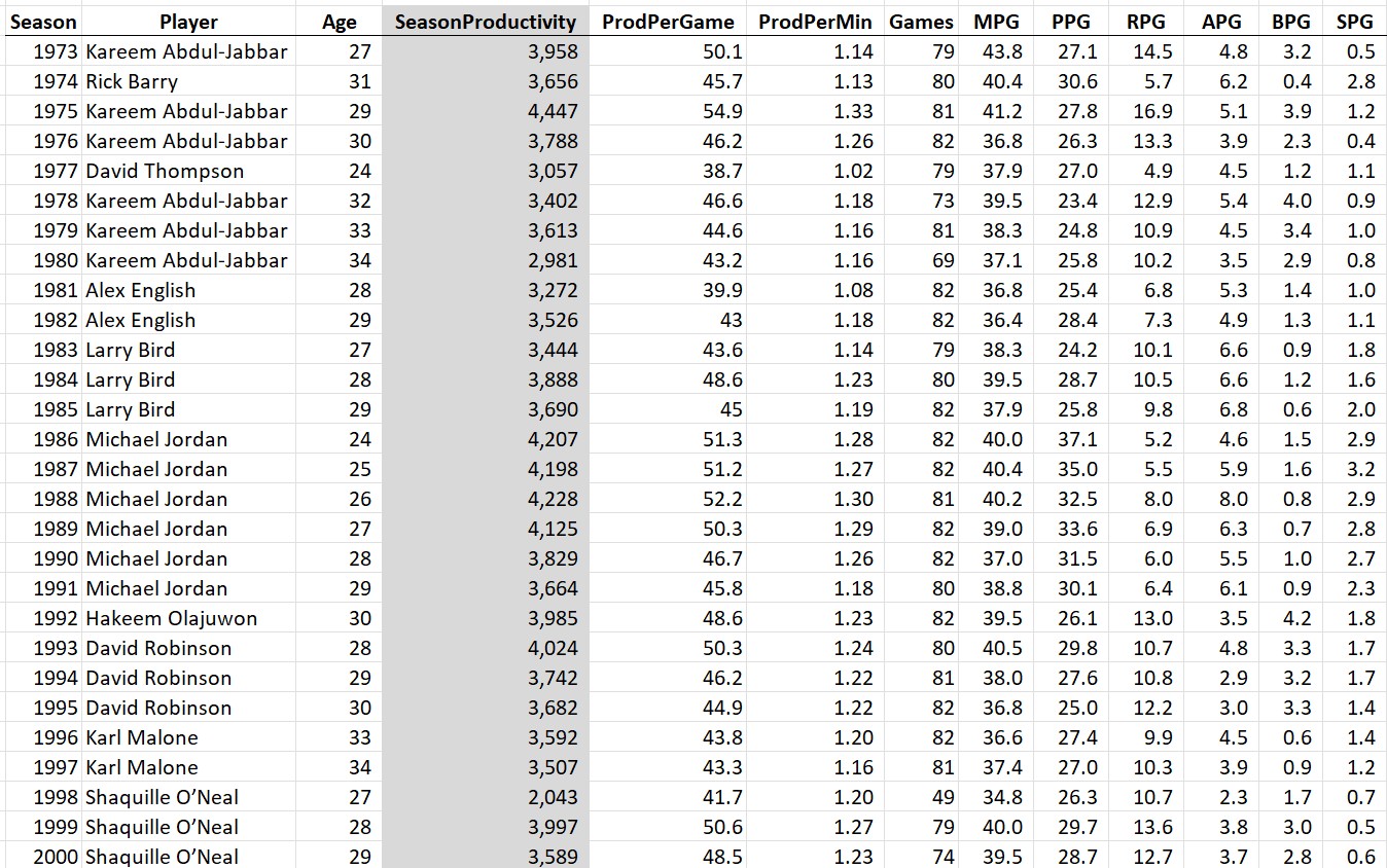
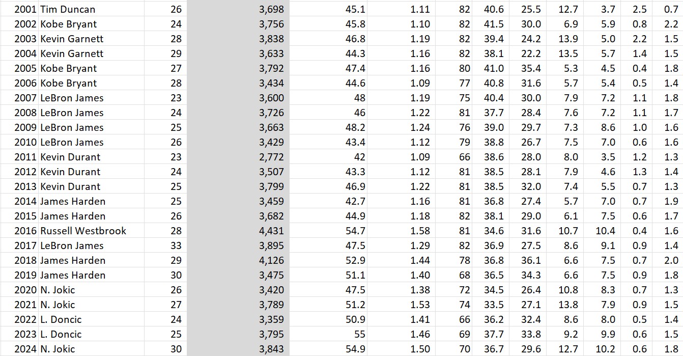
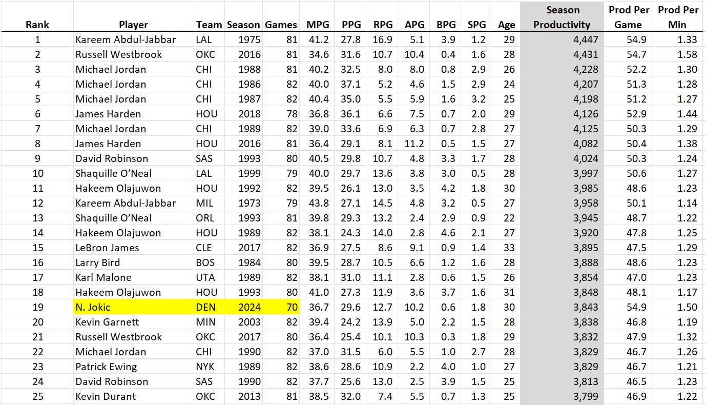
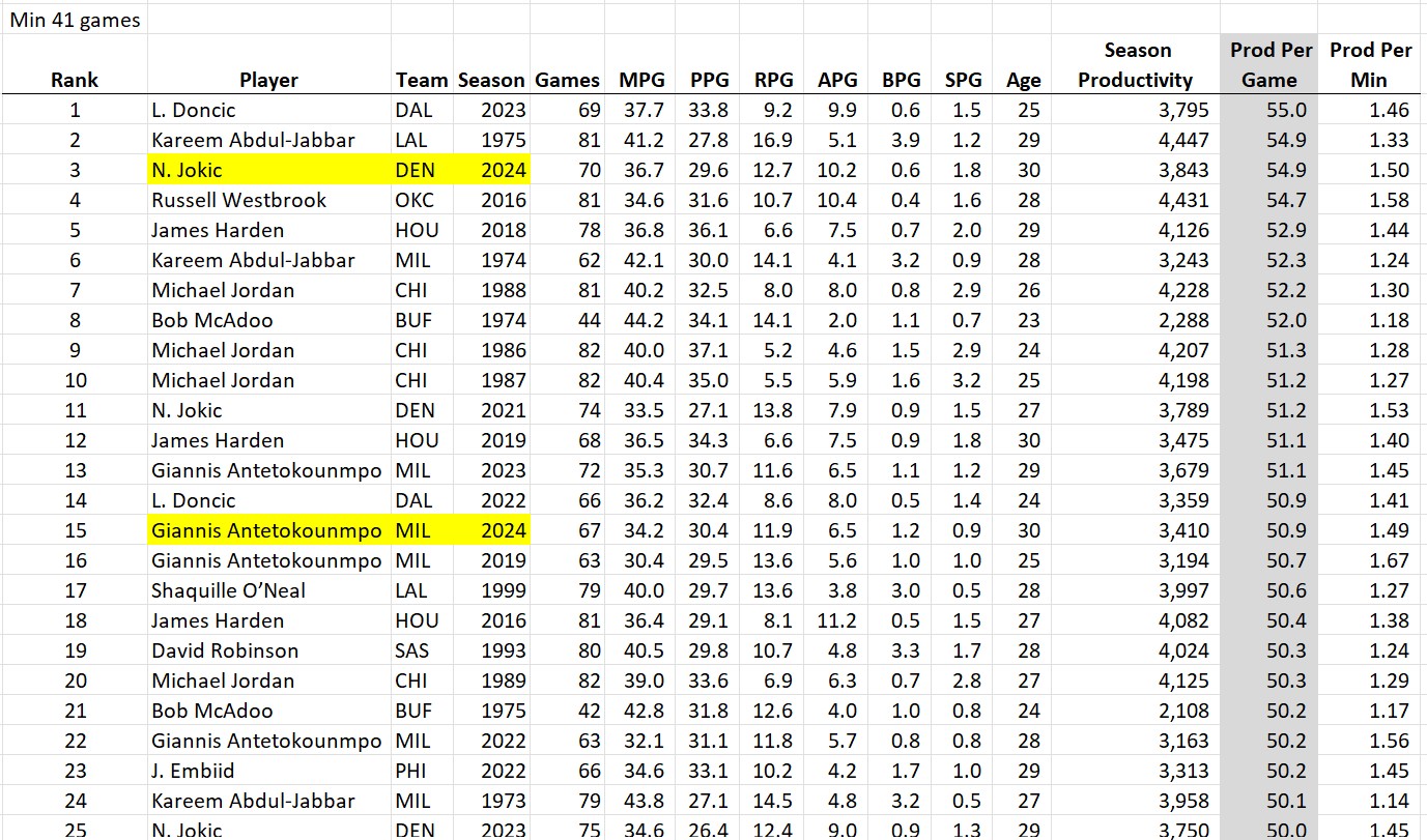
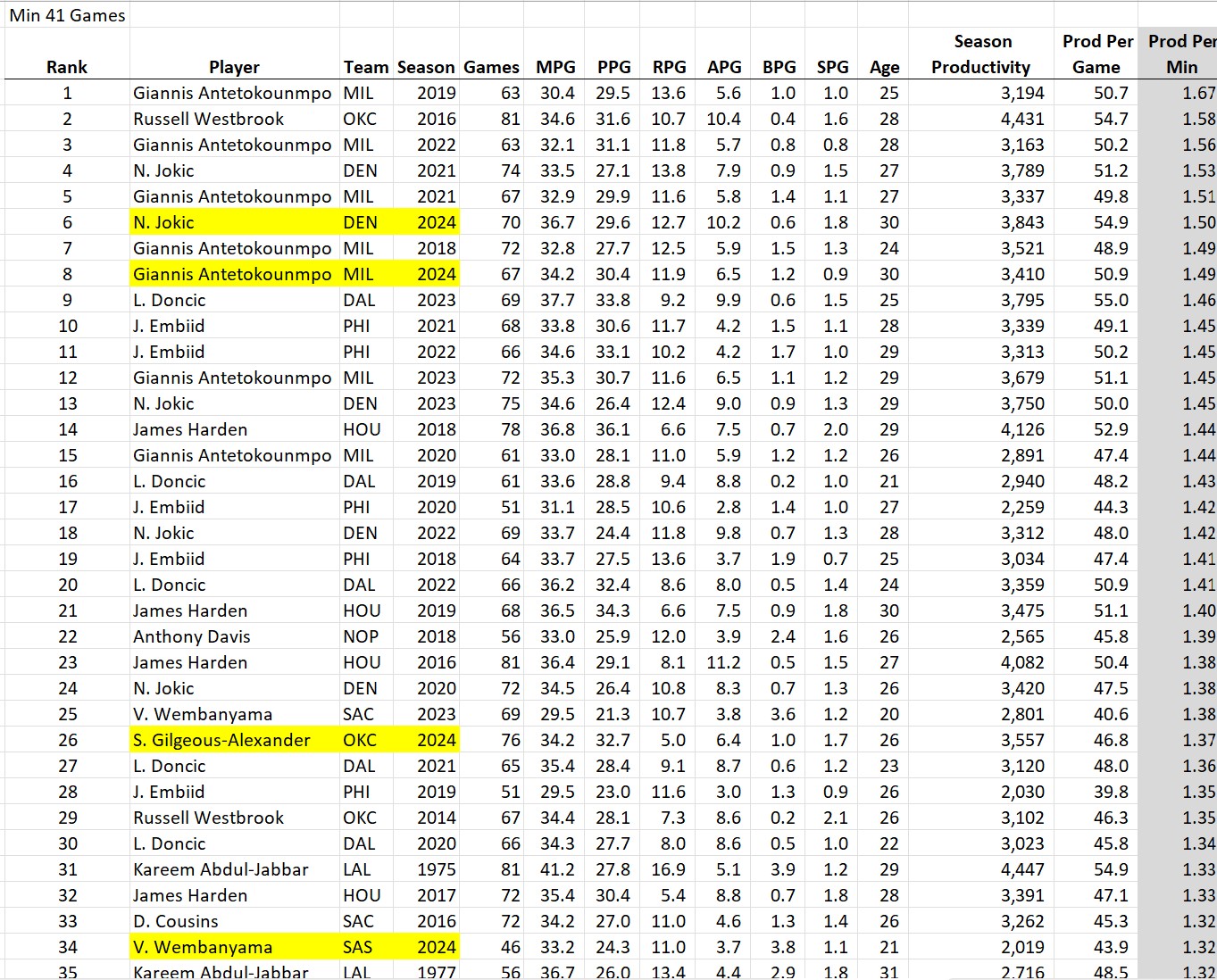
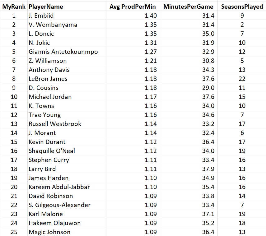

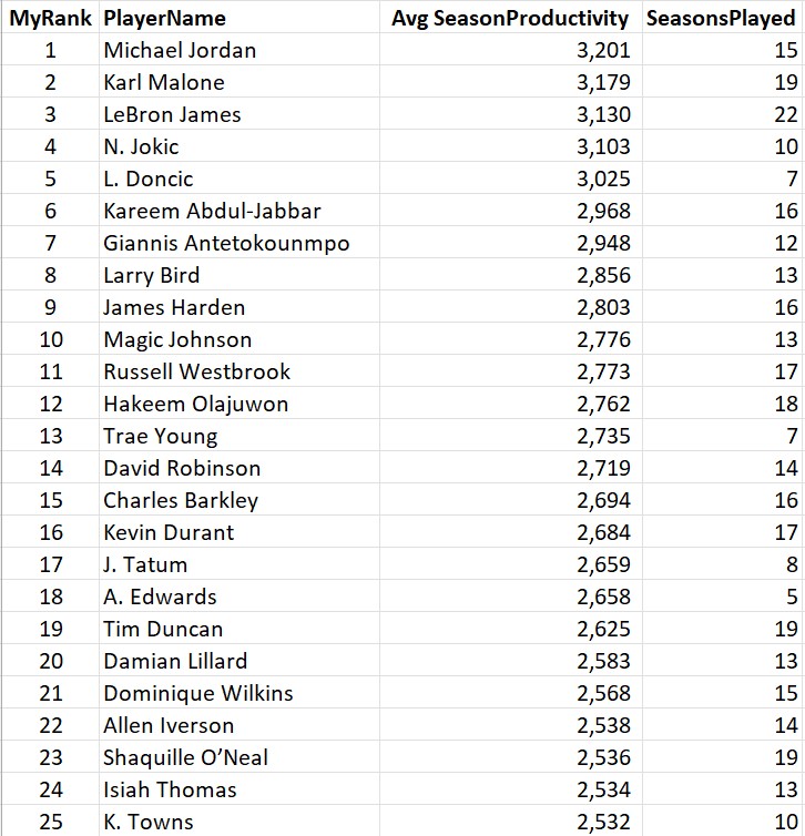
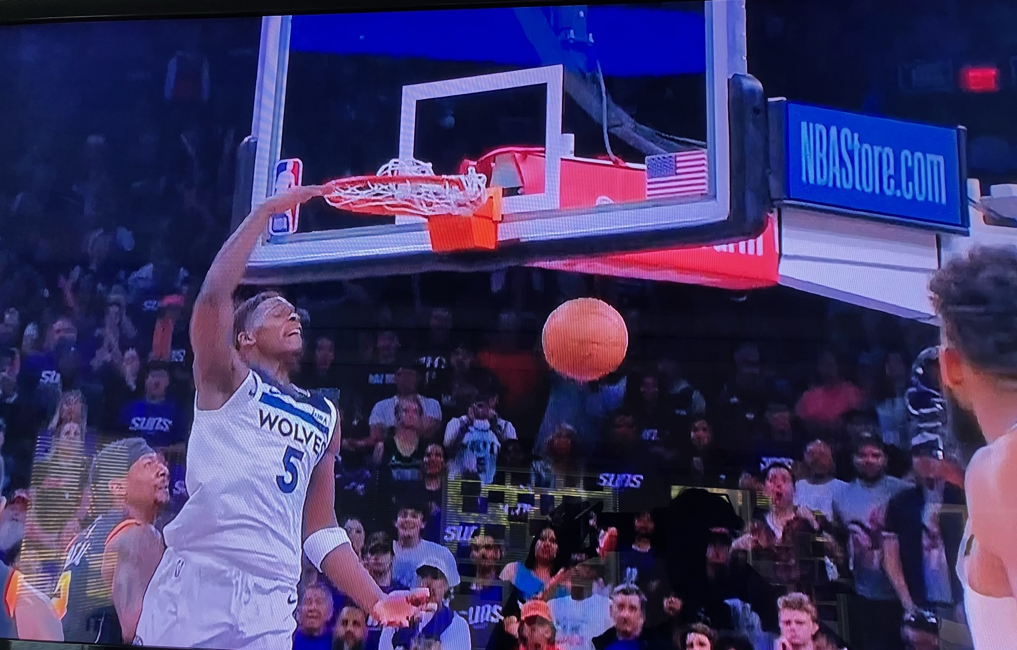
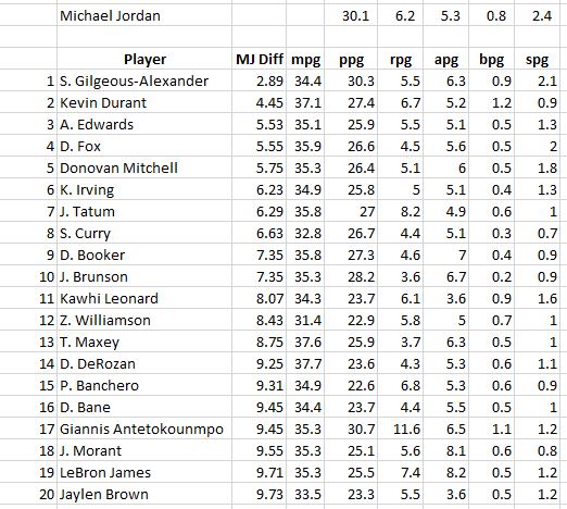
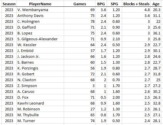
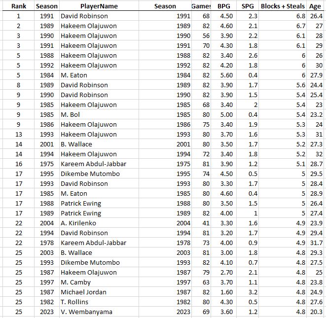
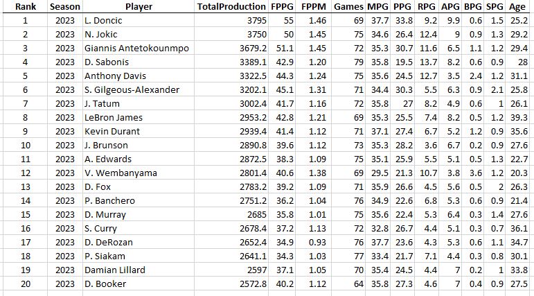
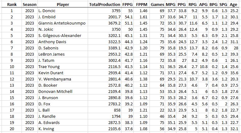
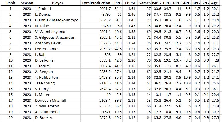
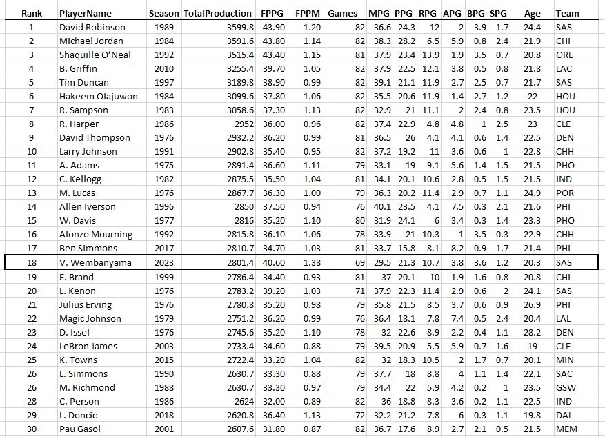
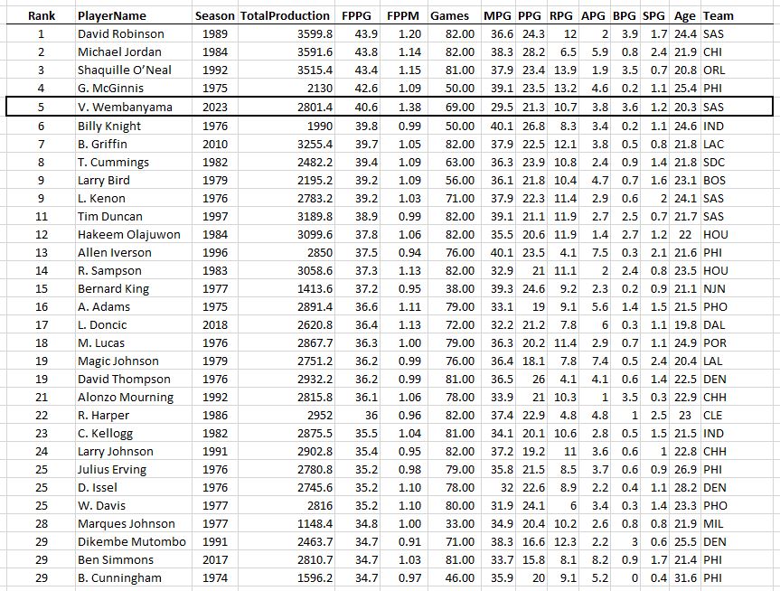
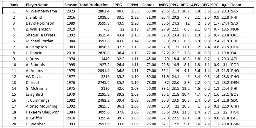
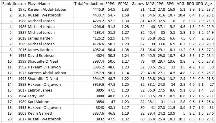
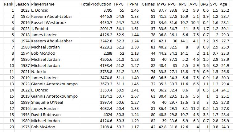
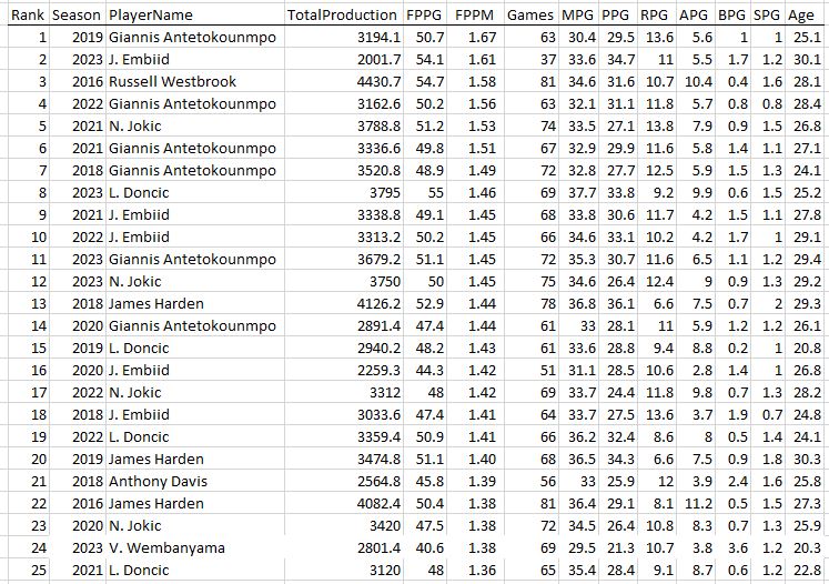
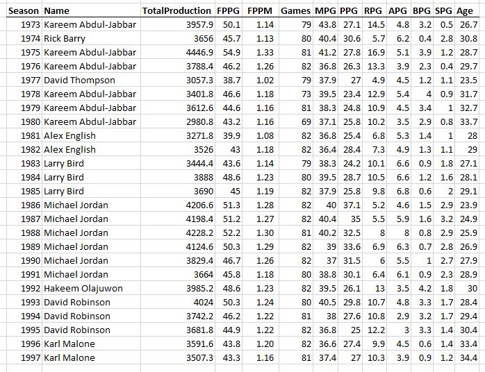
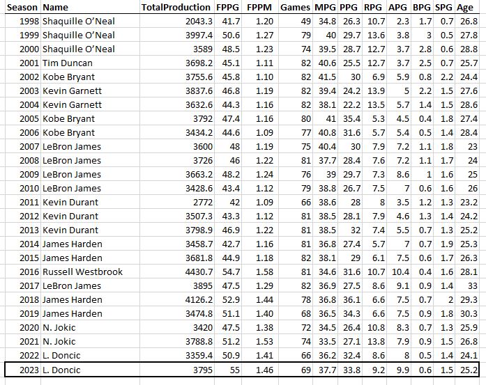
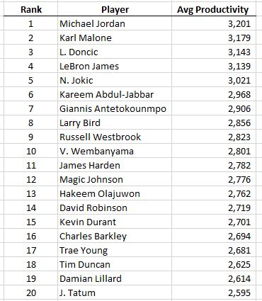
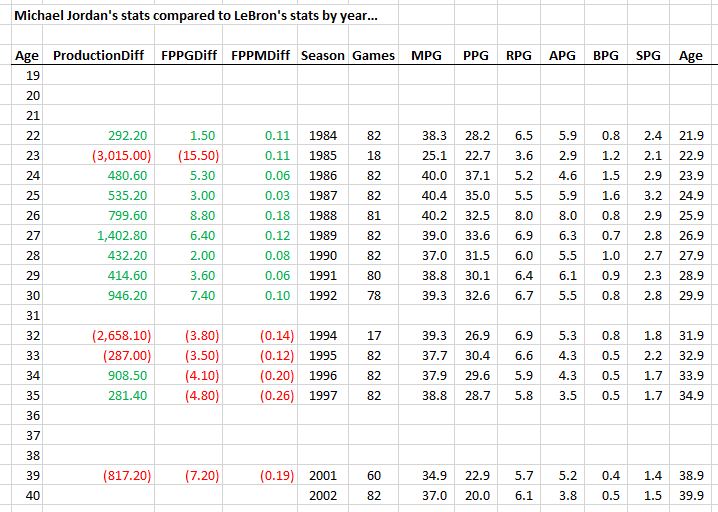

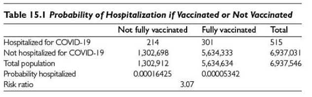
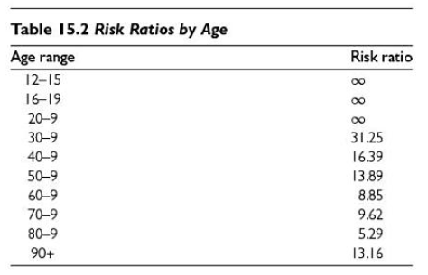
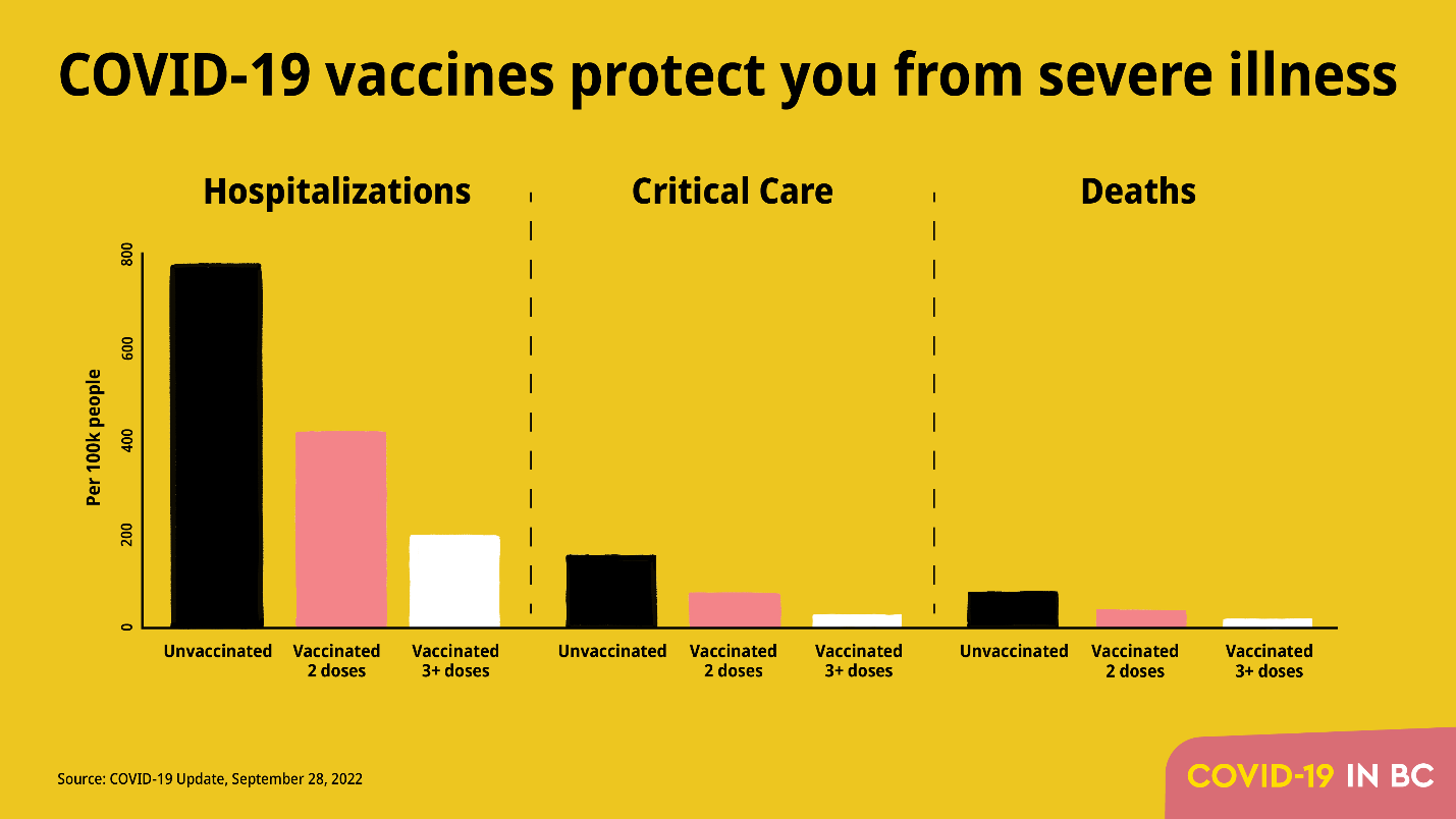
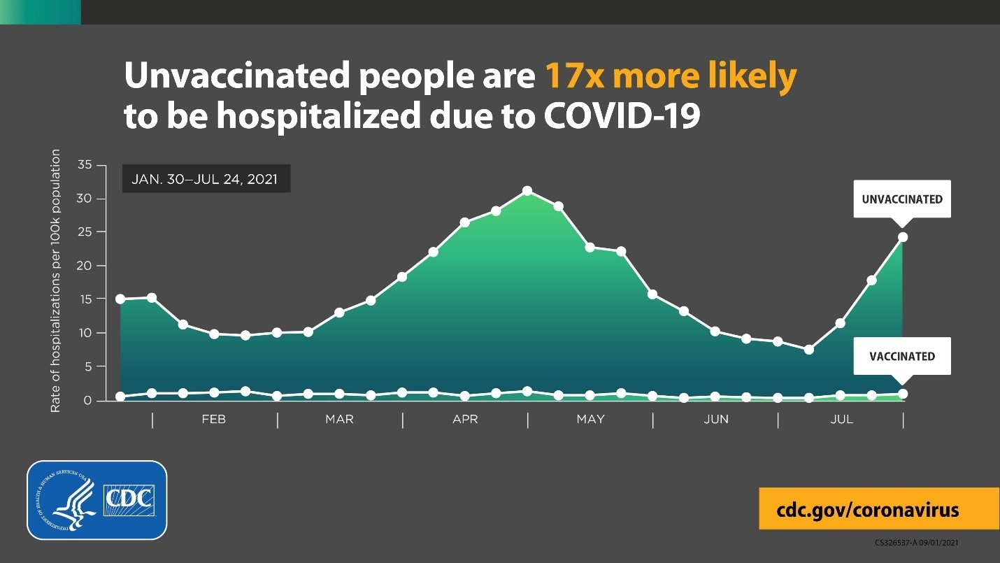
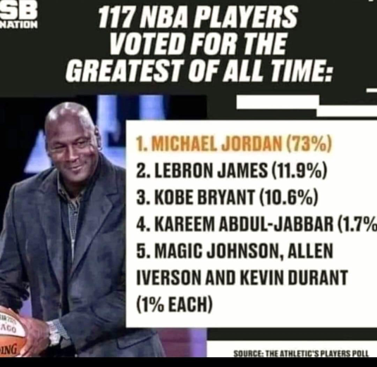
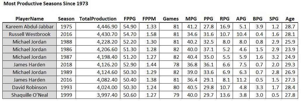 Some guy named Michael Jordan had 4 of the top 10 seasons of all time.
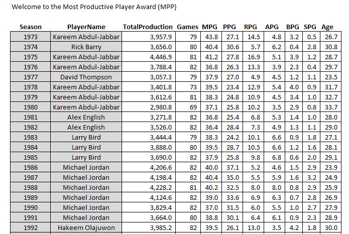 The first 20 seasons in my dataset
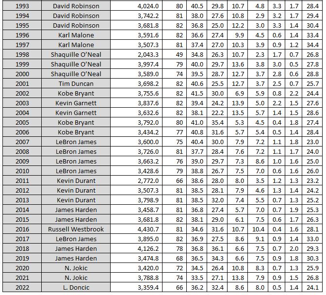 And the last 30. Congrats Luka on your first MPP this year!
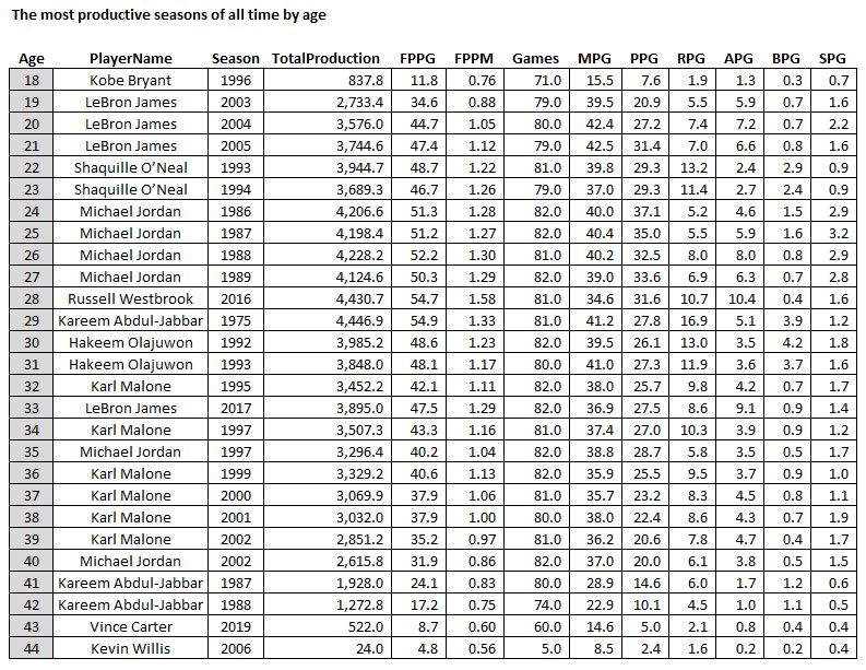
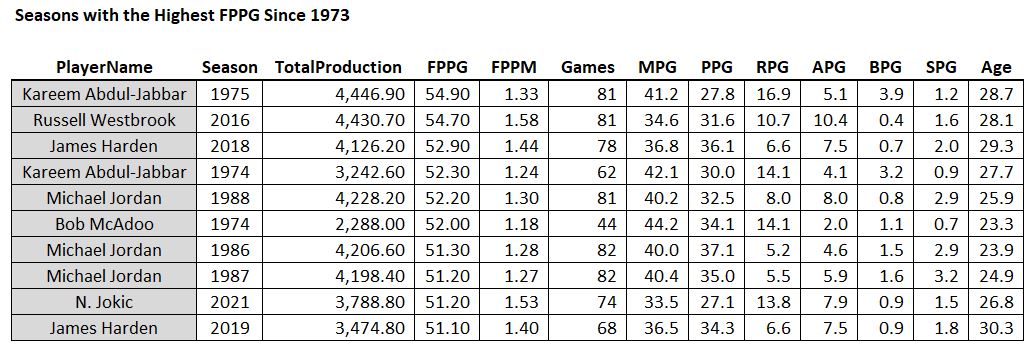 A couple recent seasons sneak into the list
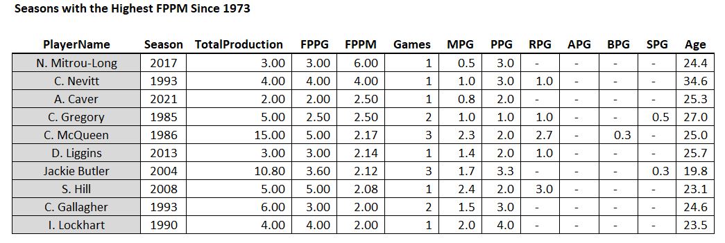 Just kidding! The statistical pitfall of small sample size in all of its glory – Mr. Mitrou-Long played 30 seconds and got three points. Best season ever!
 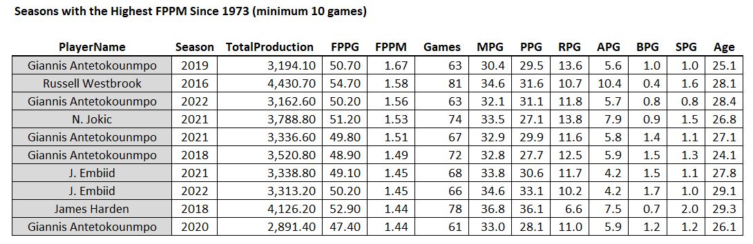 Greek Freak! And all recent seasons (half of the list is in the last two seasons)!
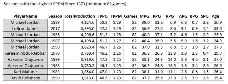 Pretty much.
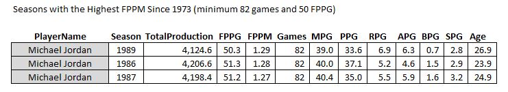 But this is data-mining (don’t tell Gary Smith on me)
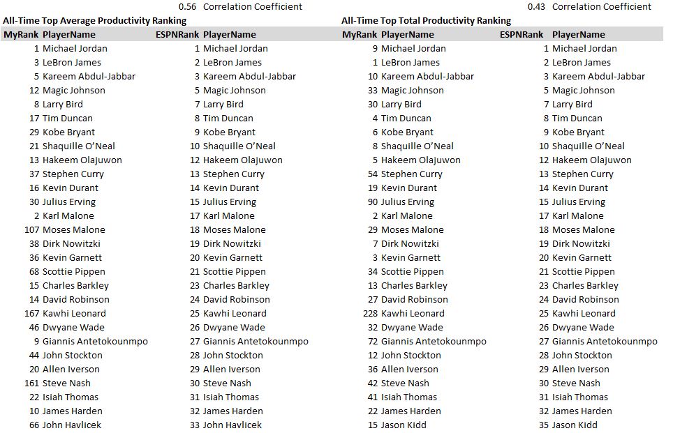 Side-by-Side Comparison with ESPN’s list (in ESPN order)
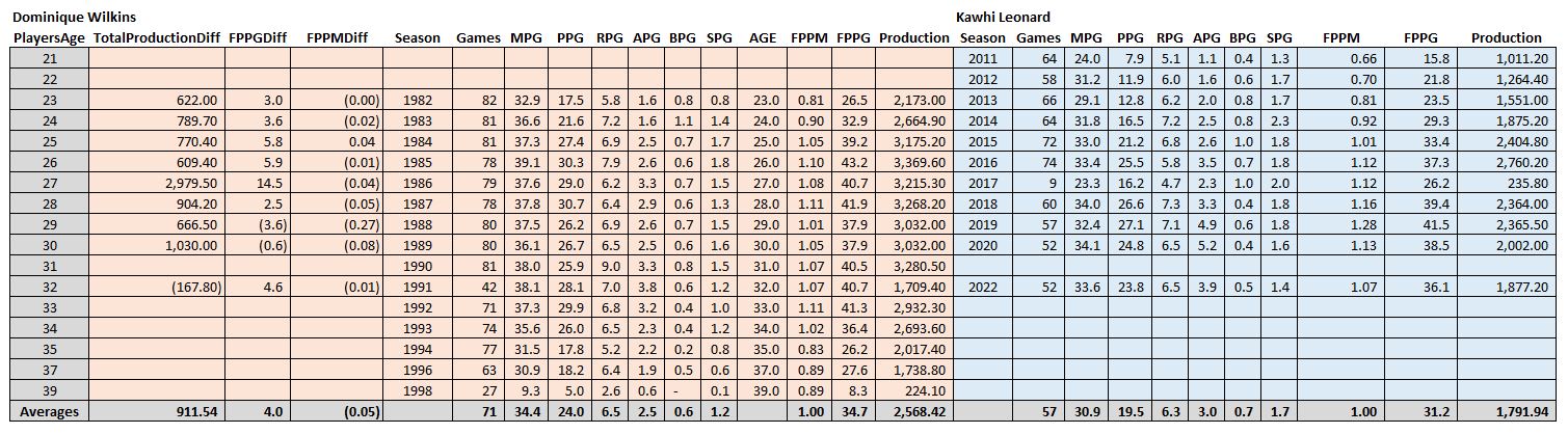 Too small to read, click here!
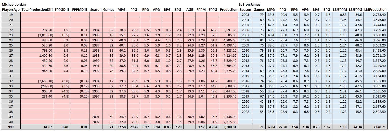 Who’s more productive, MJ or LeBron?
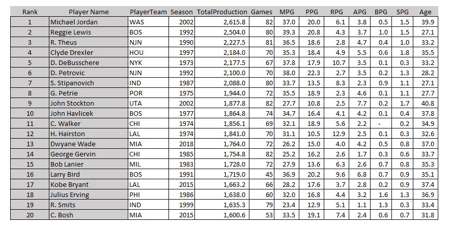 This could be called the “why did they retire again?” list
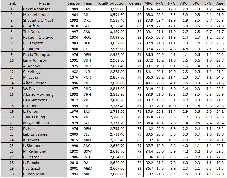 A lot of familiar names here