Jay Cordes is a data scientist and co-author of "The Phantom Pattern Problem" and the award-winning book "The 9 Pitfalls of Data Science" with Gary Smith. He earned a degree in Mathematics from Pomona College and more recently received a Master of Information and Data Science (MIDS) degree from UC Berkeley. Jay hopes to improve the public's ability to distinguish truth from nonsense and to guide future data scientists away from the common pitfalls he saw in the corporate world.
Check out his website at jaycordes.com or email him at jjcordes (at) ca.rr.com.
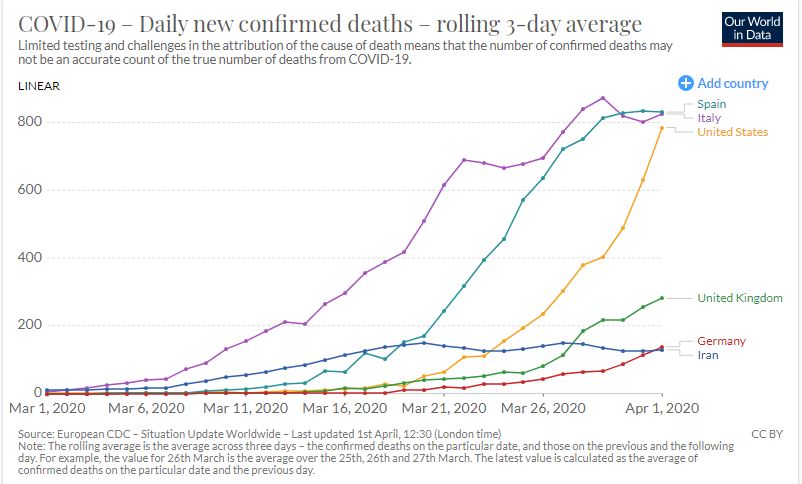
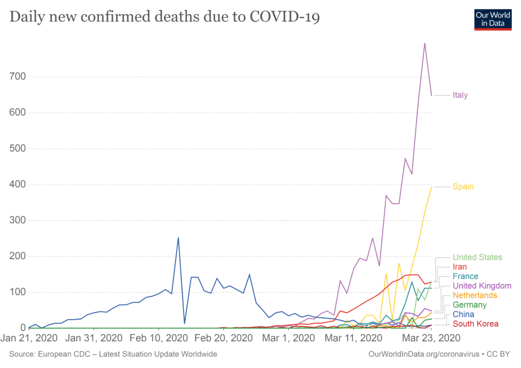
So first of all, some good news: it looks like the daily death rates in Italy and Spain have finally reached a peak.
I’m not an epidemiologist, but just eye-balling the chart above, it looks like Italy took about a month to get there. So the estimate that the United States will hit its peak around April 15, a month after deaths started taking off here, looks very reasonable.
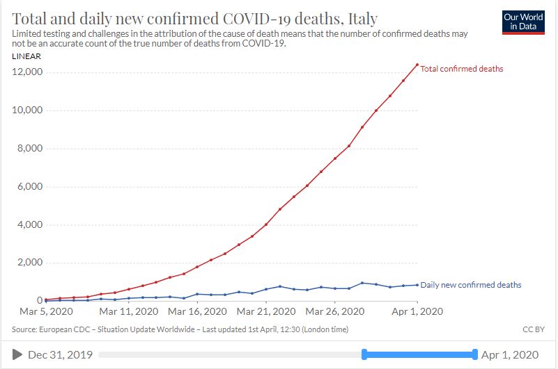
Here’s Italy by itself, reaching 100 total deaths on March 5 and seemingly hitting its peak now.
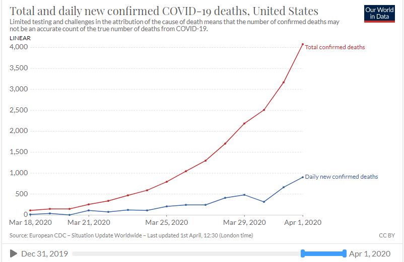
Here’s the United States, hitting 100 deaths 13 days later on March 18…
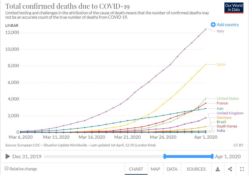
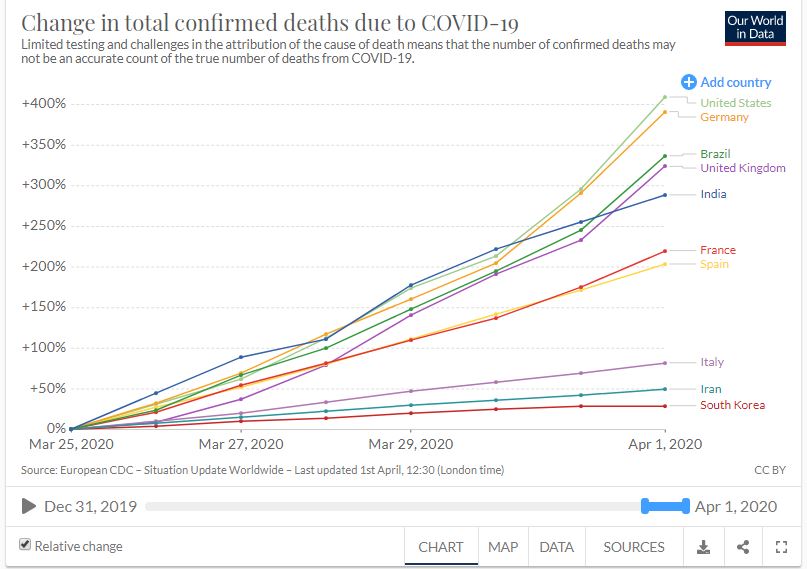
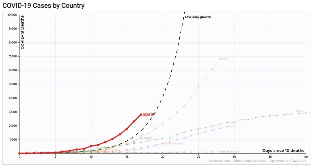
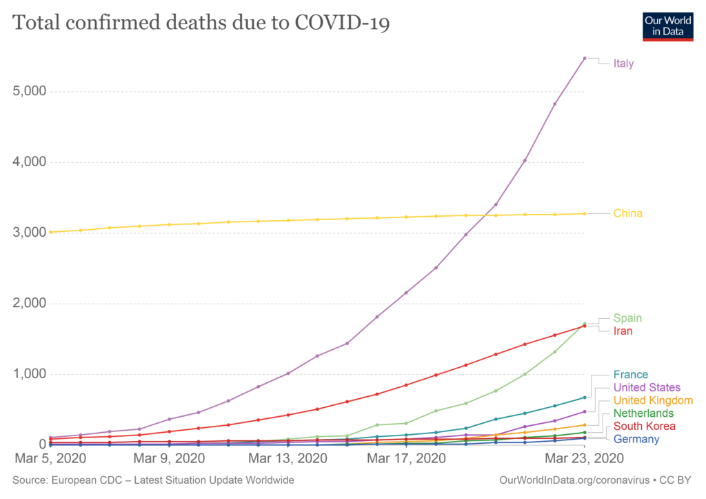
Below are the total confirmed COVID-19 deaths by country, with the United States skyrocketing and on its way to catch up to and surpass Spain and Italy (more on that below)…
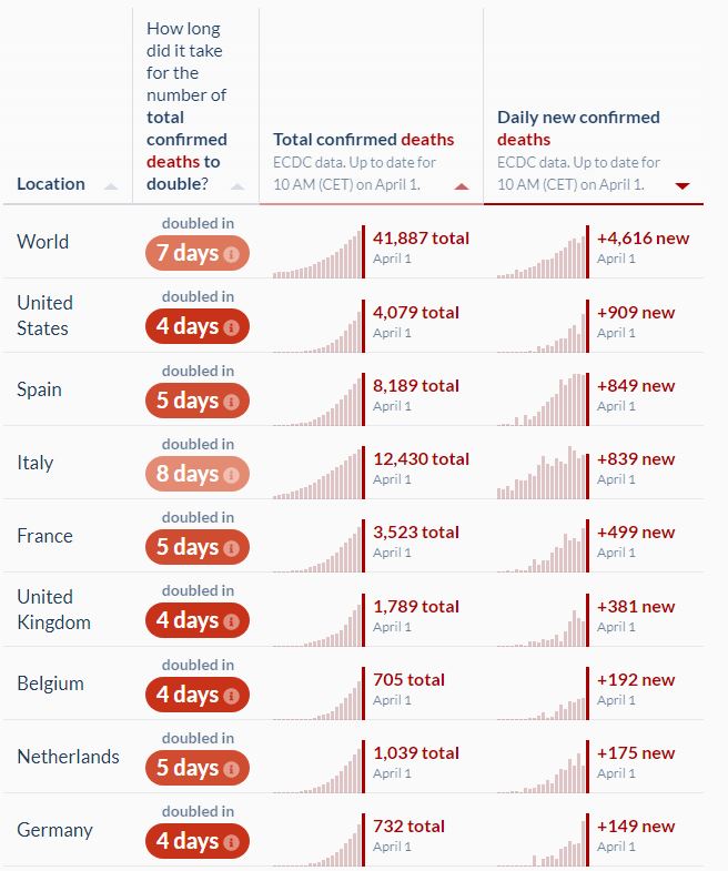
The bad news is that, in terms of the things getting worse in the last week, the United States is on top of the world. Below is a chart showing the increase in total deaths relative to one week ago (100% means the number of deaths has doubled since then). The United States had only 801 total deaths by March 25 and reached 4,079 today, so the relative increase is (4,079 – 810) / 810 = 409%.
The appearance of Brazil and India on this list is also very concerning, given their huge populations. While India’s share of population over 70 is only 3.41% compared to the United States’s 9.73%, there are four times as many people living there. So, while it looks like the United States is on track to easily set the record in terms of the total number of deaths in the world, India could certainly surpass it if things get out of control.
The reason I expect the United States to set the bar for total death count is because not only is its daily death count increasing the most, it also posted the largest absolute number of deaths in the world yesterday, surpassing even Spain and Italy at their peaks.
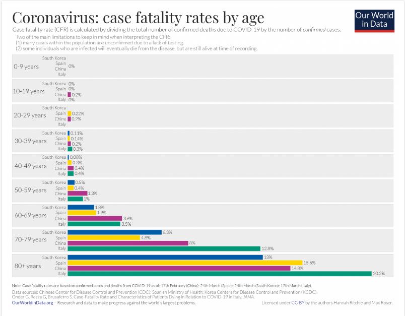
So if we’re already losing 900 per day, how many people will be dying in the United States when we reach our peak around mid-April? At first, the estimated number of daily deaths in the United States of around 2,000 seemed low to me, since we have five times the population of Italy and it has 800 deaths per day right now. However, the experts are probably taking into account the fact that 16.24% of Italy’s population is over 70 compared to the United States 9.73%. You’ve probably seen why that fact is so important…
Also, the chart above shows that Italy’s elderly death rates are higher than anywhere else, presumably due to the over-crowded hospitals. It’s hard to believe that losing 2,000 people to COVID-19 on Easter could be a good thing for the United States, but it would probably be a sign that we’ve successfully stocked our hospitals with ventilators and will soon be on our way to recovery. It may be a long tunnel, but there does appear to be a light at the end of it.
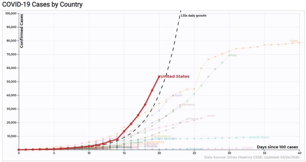
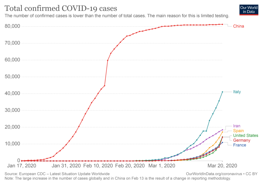
First things first. If you start counting days after the 100th confirmed cased of COVID-19, the United States is indeed skyrocketing past every country in terms of confirmed cases.
However, the number of confirmed cases is simply a function of the number of tests administered and the existing prevalence of the disease. We know that we got a late start and are catching up fast, so this probably isn’t the best measuring stick.
The more important number to watch is the number of deaths.
By this metric, Spain is far and away the country breaking the records, going from 10 deaths to 2,808 in only 17 days. It’s already about to pass up China in terms of total deaths. If Spain is the next Italy, the United Kingdom may be the next Spain…
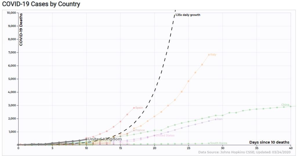
The UK is actually not far behind where Spain was at 10 days after 10 deaths. Meanwhile, the United States seems pretty quiet, relatively speaking…
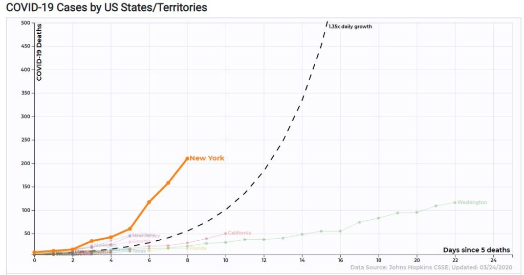
However, at the state level, you see a different picture…
If you count days since 10 deaths (the first data point for NY above is at 10, even though the chart says it’s counting days since 5), New York is at a whopping 210 deaths after only 8 days. Compare that to Spain’s 289 and Italy’s 107 at that point and you realize that this is very alarming. NY has less than half the population of Spain and a third of the population of Italy.
Given that Italy’s death toll has been rising 20 days longer than New York’s with no end in sight, I don’t think that this thing is going to clear up by Easter.
First, the bad news. Starting the day that 100 cases of COVID-19 were confirmed, the United States has reached 35,000 confirmed cases faster than any other country, even China.
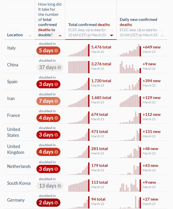
However, much of that is due to finally getting some testing done, which is a good thing. Probably a more important metric to watch is the number of deaths. Here are the top 10 countries sorted by total deaths.
Among these countries, the speed at which the U.S. has ramped up deaths since the first one is only average (it took 18 days to go from 1 to 100 deaths, 23 days to go from 1 to 400) . South Korea is given a lot of credit for their extreme testing and rightly so, it took them 29 days to get up to 100 deaths. Surprisingly, France did even better, staying under 100 deaths for 31 days after their first.
I expected to see Italy as the country that hit 100 and 400 deaths the fastest at 12 and 17 days, respectively. However, Spain is in even bigger trouble than Italy was, taking only 10 days and 14 days to get there.
Italy is still the country with the highest daily number of deaths per day, however Spain is catching up fast.
Below are the cumulative totals. Italy has passed China long ago and Spain is on track to become the second country to do so.
It’s even worse for Spain when you consider population sizes. It could be where Italy is in a matter of days.
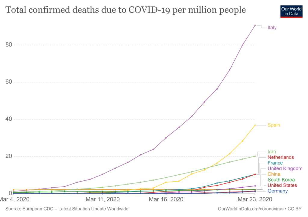
If you live in the United States, you can take comfort in the fact that, at least for the time being, the cumulative number of deaths per million population is barely on the chart. If total deaths per capita is the Scary Index, Italy and Spain are ones setting the bar.
All of these charts are available and interactive at this site.
According to a WSJ article, doctors in France, South Korea, and the U.S. are using hydroxychloroquine to treat COVID-19 “with success” and it says that we don’t have time to wait for confirmation. It refers to this study, stating “…researchers in France treated a small number of patients with both hydroxychloroquine and a Z-Pak, and 100% of them were cured by day six of treatment. Compare that with 57.1% of patients treated with hydroxychloroquine alone, and 12.5% of patients who received neither.” That sounds incredibly promising, and while the article does mention the potential downsides of the shortage of hydroxychloroquine and peddling false hope, it clearly recommends using the treatment now rather than waiting.
A shortage of the drug may not seem like a big downside until you realize that it’s actually being used by people (including my aunt) for conditions that the drug has actually been clinically proven to treat. (Update: it looks like Israel has got my aunt covered.) As for the French study, unfortunately, if you look at it closely, it is practically a poster child for the types of research that can’t be replicated. There’s no randomized control. There are a small number of treated patients (only twenty). It’s a hot field of study.
To see why these things matter, you may want to read one of the most downloaded papers in history from Dr. John Ioannidis titled “Why Most Published Research Findings Are False.” Its popularity is due to the fact that it addresses the replication crisis in science head-on and provides warning signs to watch out for before deciding to take new research seriously. In short, they are…
Small sample sizes. Have you ever noticed that if you rank cities by crime rate or cancer rate, that the ones at the top and the bottom of the list always have very small populations? This is because it’s much easier for small sets of data to show extreme results. In the same way you wouldn’t be convinced if someone says they’re the best shooter in basketball because they made 100% of their shots, your first response to the report that 100% of patients were cured of COVID-19 after 6 days with a combination of Z-Pak and hydroxychloroquine shouldn’t be “there’s a cure!”, it should be “wow, not many patients in that study.” If a study has a surprising result and a small sample size, be skeptical.
Small effect sizes.Effect sizes tend to be exaggerated, so if there’s a small effect size being reported, there’s a decent chance the real effect size is zero. In the case of the French study, the effect size is huge, perhaps suspiciously so. Only 2 of the 16 patients in the control group recovered in 6 days, while 14 of the 20 in the treatment group did. This seems overwhelmingly convincing until you see that the control group was not randomly chosen and are extremely different from the treatment group (on average, they were 14 years younger, so who knows how different they were on important features like how widespread the infection was on day one).
Also, even if we assume that the treatment and control groups were comparable, the claimed p-value of 0.001 is unlikely to be accurate. It’s calculated correctly, given the difference between control (12.5% recovering) and the treated patients (70% recovering), but ignores the fact that the treatment group had some patients removed from the analysis: “Six hydroxychloroquine-treated patients were lost in the follow-up during the survey because of early cessation of treatment. Reasons are as follows: three patients were transferred to intensive care unit…one patient stopped the treatment…because of nausea…one patient died…” Wait, what? Can we not assume that patients who went to the ICU or died would still have the virus if they were tested? Instead of just testing whether or not the drug removes the virus from patients still kicking, shouldn’t the question be whether or not the drug helps patients leave the hospital alive when all is said and done? There was also a patient counted as virus free who was found to have the virus two days later (presumably due to a false negative test). To be fair, even when I add back in the five patients I think should not have been removed from the treatment group, the p-value is still 0.01, but the filtering out of patients with clearly bad outcomes from the treatment group is not comforting.
Many tested relationships. If there are many failures that are disregarded, you can be pretty sure that the successes occurred due to chance alone. Fortunately, the French study doesn’t appear to be doing this. They mention that the combination of Hydroxychloroquine and Z-Pak had a 100% success rate, but also don’t hide the fact that it was only tried on a total of six patients. The overall focus remains on the big picture of hydroxychloroquine vs. COVID-19 as originally intended.
Flexibility in analysis.This one is very similar because it has to do with trying many different ideas before coming to a conclusion. Economist Ronald Coase summed this up nicely with the saying: “If you torture data long enough, it will confess.” There does seem to be a bit of data torture going on in the French study. These were described well and enumerated in an email from a friend, Dr. Adam Chapweske, yesterday…
Any patient whose illness becomes severe during the trial is excluded from final analysis. So it seems that a study designed to determine viral clearance explicitly excludes anyone who ends up having a really high viral load at some point in the study (assuming severe illness indicates high viral load). This ended up excluding 4 patients receiving hydroxychloroquine from the final analysis (in addition to two others lost to follow up for other reasons) and none from the control group.
Their registered secondary endpoints include clinical outcomes, but they don’t include these in their reported endpoints. As mentioned above, several patients receiving hydroxychloroquine either died or required transfer to an ICU, whereas no patients in the control group did. This makes me wonder about the other clinical data they originally planned on reporting but ad hoc decided not to mention. It’s particularly concerning since the authors themselves make very strong clinical recommendations based on their study.
Best I can tell, their decision to report on results early (i.e., prior to completing enrollment or completing their registered primary endpoint) was also ad hoc.
Their registered design does not mention azithromycin, yet they report on outcomes involving that drug and even include it in the title of their paper and in their results. Given they were not actually studying azithromycin, it would have been fine to mention the effect in the discussion section as a possible intervention for future study but they shouldn’t give the impression that it was in some meaningful sense “studied”.
The primary endpoint was virological clearance, but the baseline viral load for the control group is not given so we don’t know if the two groups are comparable with respect to this parameter. This is especially important in light of the small sample size, differences in disease (upper respiratory tract infection vs lower respiratory tract infection) and demographic and geographical differences between the two groups.
Virological measurements were reported differently for the two groups as well, which suggests to me that there were differences in the way they were tested.
Financial incentives.We all know to watch out for this one. Financial incentives are incredibly powerful and unfortunately, many people value money more than their scientific integrity. I didn’t see any reason to suspect that the researchers would benefit personally by promoting their recommended drug. They’re just reporting what they truly believe is a promising result.
And the last one: A hot field of study.If the field is hot, there is a race to publish, and with enough researchers trying different things, it’s almost certain that someone will find something somewhere that is statistically significant. This is like collective p-hacking. Rather than one researcher trying many things, you have many researchers trying one thing, and the result is the same: unreliable results. Studying the effect of drugs on COVID-19 is clearly a hot field of study. So prepare yourselves for several false positives, even from more scientifically rigorous studies than this, before we find an effective treatment. In the meantime, keep experimenting. And I’m begging you: please use a randomized control.
Update (3/23/2020): WHO announced a megatrial that will test the four most promising treatments for COVID-19. The WHO scientific panel originally wasn’t going to include the “game changer” drug, but decided to test it due to the attention its getting. According to Susanne Herold, an expert on pulmonary infections, “Researchers have tried this drug on virus after virus, and it never works out in humans. The dose needed is just too high.” Even though it doesn’t seem likely to work, I am happy to see that it was included in the megatrial. Now that the rumors are out there and people are scrambling for it, some people are inevitably going to find out the hard way that hydroxychloroquine might do more harm than good. It’s better to give it a rigorous test and provide people with solid answers rather than speculation.
Of all of the statistics and numbers out there, the chart I’m most interested in watching is this one…
This chart will make it clear when the spread of COVID-19 has ended its exponential growth in each country. When the number of new cases slows down, we can estimate what the final prevalence (spread of the disease) will be. In other words, when Italy’s curve levels out, we can see the light at the end of the tunnel.
Here’s the same chart with China included…
What I’m looking for is where it looks like Italy’s curve will flatten out like China’s did.
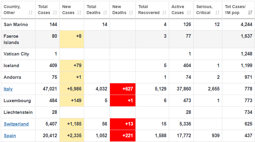
Many sources are using mathematical models estimating that 50% of the population will become infected, but I think this is much too pessimistic, given the drastic measures being taken around the world to slow down the spread (please stay home!). More specifically, there are only a couple of very small countries where the prevalence has passed 1% (see the top four below)…
Notice the final column, showing the total number of cases per million population. San Marino, a tiny country within Italy (population 33,000) has the highest percentage of infected people at 4.2% (144 cases). Because of the small population size, tiny countries like this will be the most extreme, and the numbers should be taken with a big grain of salt. Hence, the importance of watching Italy in the first chart. Because of its large population size and massive spread of the disease, it will give us a good indication of the final infection rate we can expect.
The reason prevalence is so important is because if you want to estimate your probability of dying by the disease, you need to multiply it by the fatality rate. A disease with a 100% fatality rate that only spreads to 0.01% of the population (0.01% die) is much less scary than a disease with a 1% fatality rate that spreads to half of the population (0.50% die).
John Ioannidis, the most careful thinker I’ve ever talked to, recently wrote an article suggesting that the fatality rate of COVID-19 (based on admittedly thin data) is more likely in the range of 0.05% to 1%. That would be good news compared to the current higher estimates. Also good news to me is that the estimated final spread of the disease is based on mathematical models and not what’s actually happened in other countries. Mathematical models are very useful, particularly if they motivate people to stay home and stop a pandemic in its tracks. However, if you really want to estimate your chances, watch the real world data.
Note: a reader pointed me to a very well argued opposing view to Ioannidis. I need to reiterate that that my somewhat optimistic view above is based on the assumption that the dramatic shutdowns around the world continue. I can appreciate the opposing view that “the exact numbers are irrelevant” and that we don’t want to be lulled into a “false sense of security by Ioannidis.” We should indeed continue to act in ways that avoid the worst case scenario, because in a situation like this, the cost of being too optimistic is much higher than the cost of being too pessimistic (stocks can rebound and people can eventually find jobs again). In summary, if you’re in a position of authority, please continue closing everything until this is behind us! It is this dramatic action which makes me optimistic about the future.
A couple days ago, college basketball player J. J. Culver made the news by scoring an astounding 100 points in a game. Since it was against Southwestern Adventist University and not the New York Knicks, it’s not as impressive as Wilt Chamberlain’s 100-point game in the NBA. However, players at every level have progressed a lot since 1962. Or have they?
It’s incredibly difficult to compare players across different eras, since the defense evolves along with the offense. It certainly appears in video footage that NBA players in the 1960s are light-years behind modern players. Even the championship teams of that era subjectively look like Division I college teams at best. However there are two statistics that can be compared across decades: free throw percentage and the NBA Three-Point Contest shooting percentage. If players have gotten better over the years, there’s no reason to think that they only improved in some ways and not others, so their improvement should be statistically apparent across the board, including these two.
Well, it turns out that I’ve compiled a nice dataset with all of the scores in history from the NBA 3-Point Contest from various sources (including watching videos) and historical NBA free throw stats are readily available. Unfortunately, there are various numbers of 2-point “money balls” in the shooting contest, so I don’t have the exact shooting percentage, just the percentage of possible points scored. However, it’s reasonable to use this as a very good approximation of shooting percentage, since it’s hard to imagine why a player would shoot significantly better or worse when he knows the ball is worth two points. So let’s do this!
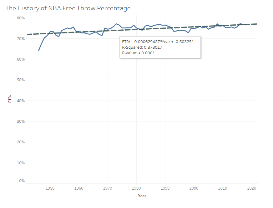
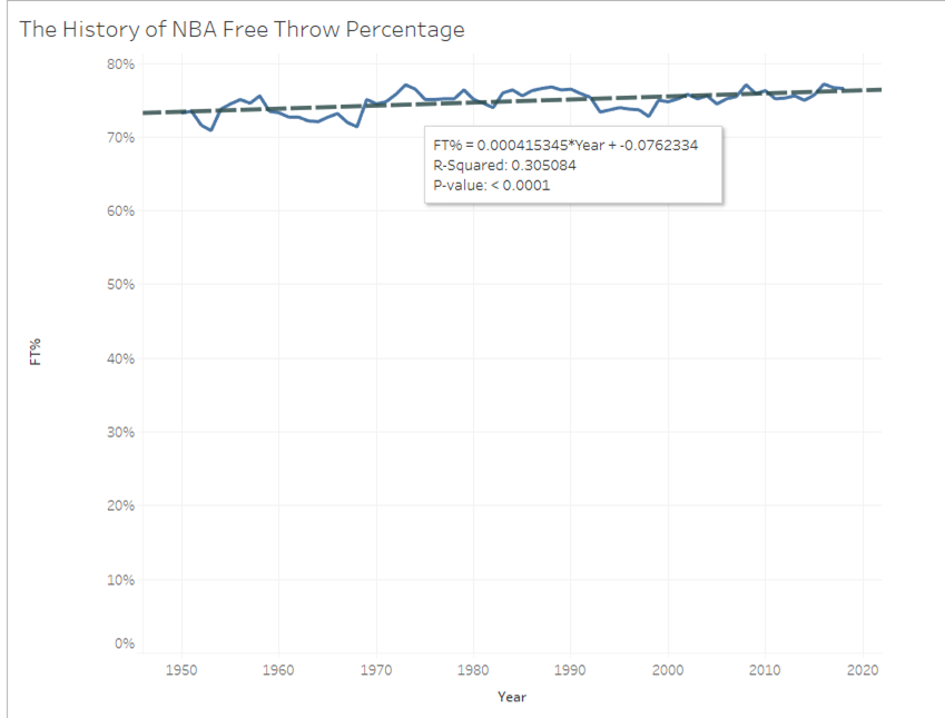
Starting with the less interesting stats, there is a significant improvement in league-wide free throw percentage over the years…
It’s not a big difference, but it’s there. The trendline shows a historical 0.06% improvement per year with a p-value of less than 0.0001, which means that it’s extremely unlikely that there would be a trend like this if the year the stats were collected were unrelated to shooting percentage. However, it looks like there were a few really bad years at the beginning that could be making all the difference. So let’s look at it since 1950.
The slope has definitely decreased (it’s now at 0.04% per year), but it’s still statistically significant at the p=0.0001 level). Of course, it would’ve been easier to simply average the shooting percentage of the last five years in the dataset and compare it to the average for the first five years and show that it’s improved by 6.9% since then. However, doing a linear regression like this provides a more accurate estimate of the actual improvement (73*0.0006 = 4.4% improvement since the beginning) since it considers all of the data. It also tells you whether or not the relationship is statistically significant. So you can see why linear regressions are a statistician’s best friend; it’s easily interpretable and fun! (BTW, the R-Squared metric is a “goodness of fit” measure that ranges from 0 to 1 (perfect fit) and this is saying that the year explains 30% of the variance in free throw scores. The other 70% probably being the presence of Wilt Chamberlain or Shaquille O’Neal dragging the percentage down. Joking!)
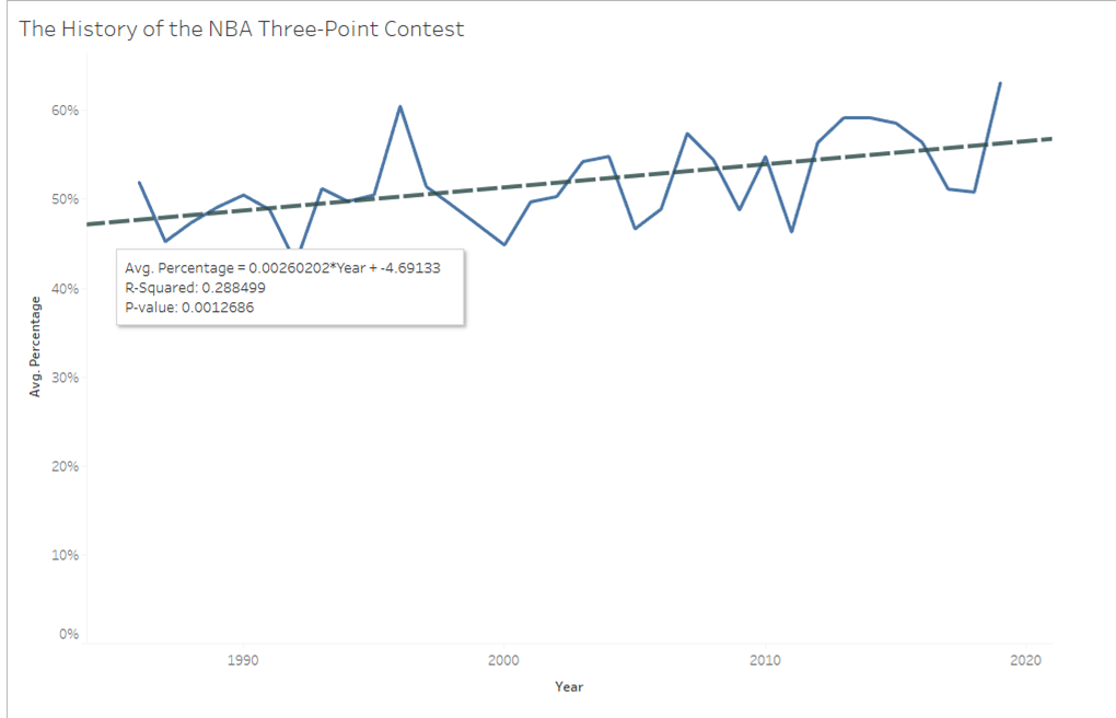
Okay, now for the fun one: Are NBA 3-point shooters getting better as well? During the first years of the NBA 3-Point Shootout first took place, there were some incredible performances from shooters like Craig Hodges (made 19 straight shots in one round) and Larry Bird (won the first three contests). Maybe the “splash brothers” from Golden State are outliers and that the long-distance shooting accuracy has generally remained stable since the 1980s.
It doesn’t look like it! Due to the small number of shots in the contest each year, the data is much noisier than the free throw percentage, but the trend is still clear: recent players are better shooters. The slope is steeper than the free throw trend, with an improvement of 0.26% per year, but because of the volatility in the data, the p-value isn’t as small (p=0.0013). Another way to think of the level of statistical significance is to say that we have provided strong evidence against the hypothesis that shooters are equally skilled across the decades. In science, you can’t really prove a hypothesis is true, you can only provide evidence that’s consistent with it or falsify it.
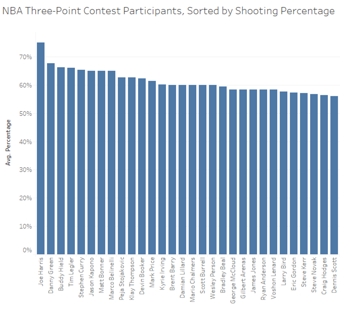
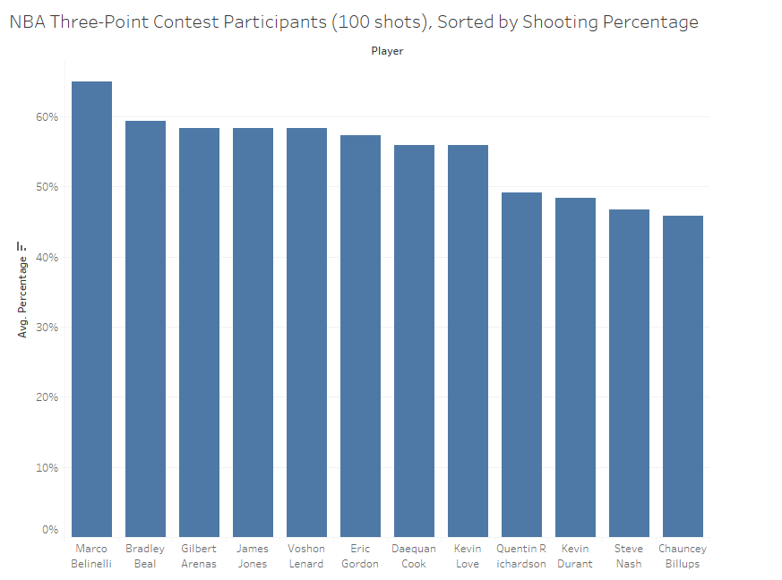
We can’t talk about the history of the NBA three-point contest without addressing the question: who is the best shooter in the contest’s history? If you simply sort by shooting percentage, this is what you get:
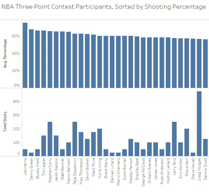
So, the highest shooting percentage in the contest history is Joe Harris, with an astonishing 75% accuracy. However, this isn’t the whole story. Here is the same list, with important piece of additional data: the total number of shots taken:
There is a statistical tendency for the tops (and bottoms) of ranked lists to be monopolized by the smallest sets of data. This is because it’s easier to achieve extreme results with only a few tries. Intuitively, this makes sense. If someone says “I’m the best shooter in basketball; I’m shooting 100% this year”, you already know that they’ve only made a couple baskets at most. In this case, the effect is not as extreme as it normally is, because if a shooter was on fire in one shooting round, they probably advanced to another round (it’s truly remarkable that Danny Green didn’t make it to the finals in 2019 after shooting 68%!). However, you do see a lot of players at the top of the list who only shot a couple rounds. So, how do we adjust for this “small sample size effect” and compare shooters with varying numbers of shots?
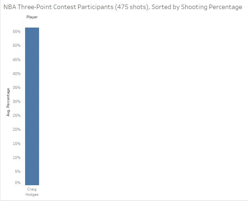
I don’t think we can. How can you say who’s a better shooter, between Joe Harris, who made 75% of his 50 shots, or Steph Curry, who made 65% of 250 shots? The only thing I think we can do is to control for the number of shots and compare players who shot the same number of rounds. Starting with the most shots and working backwards, the winner of the “475 shots” category is…
Craig Hodges! Of course, it’s hard to call him the best shooter since there’s nobody with that many shots to compare him with, and his 56% shooting isn’t particularly noteworthy (the overall average was 52%). However, he did leave us with this unforgettable performance, so he deserves recognition for that.
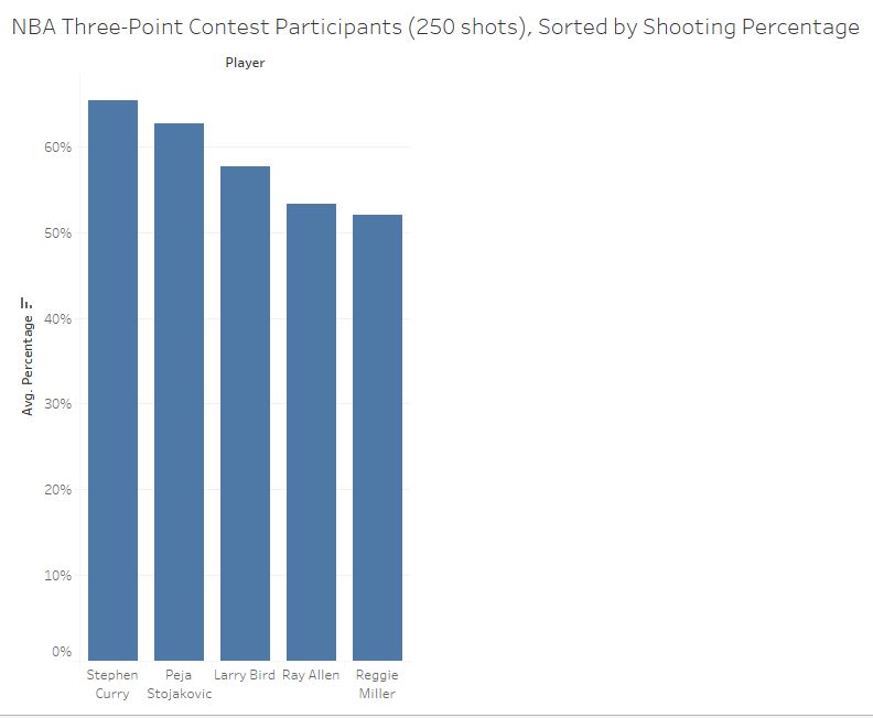
Similarly, Dale Ellis, and Dirk Nowitzki were the only shooters with their number of shots and only shot about 50%. However, when we get down to players with 250 shots, it gets interesting…
These shooters are no clowns. Who could have imagined that Reggie Miller would rank last on any 3-Point Shooting ranking? So, we have our first candidate for best shooter in the Three-Point Contest history. Steph Curry, with 65% accuracy, ranks best in the first contested category.
Next up is the 200-shot category.
With a 60% shooting accuracy, Kyrie Irving edges out Curry’s coach Steve Kerr. Now, I realized that I lied earlier. We can compare across these categories, if the shooter with more shots also has a higher percentage! We can unquestionably state that Curry’s 65% with 250 shots is more impressive than Irving’s 60% performance with 200 shots. So, Curry can still be considered the top shooter.
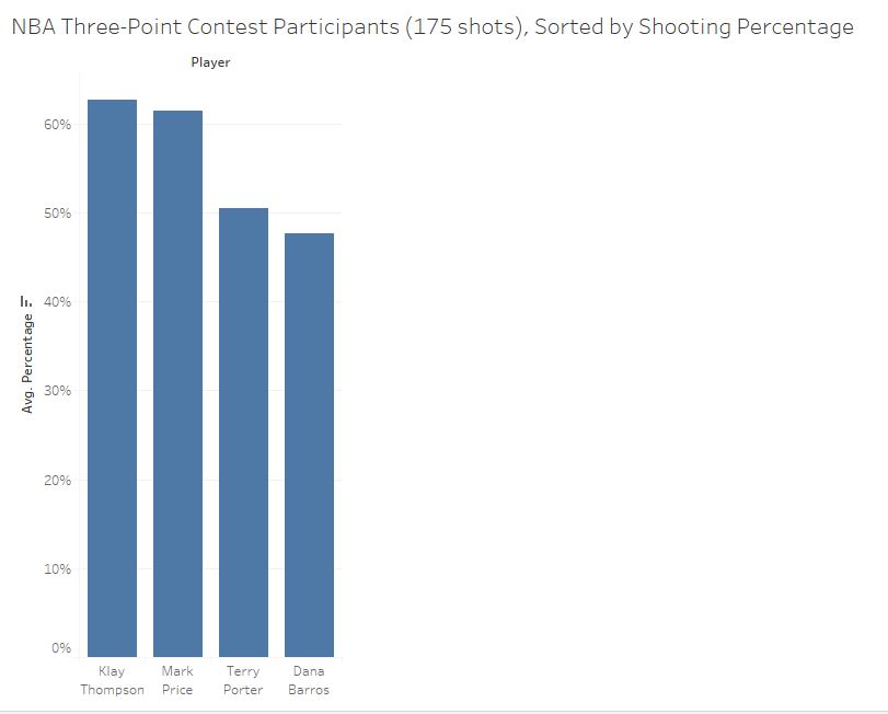
Next up: 175 Shots.
Klay Thompson takes this title with 63% shooting. Now, it’s unclear whether his higher percentage would hold up if she shot another 25 times, so we can’t clearly rank him above Kyrie Irving. However, we can say that Curry’s higher percentage is still objectively the best.
150 Shots…
We finally have a true contender for Curry. Tim Legler has technically shot a higher percentage than Curry (66% to 65%), however if he took another 100 shots, it’s fairly likely that he would regress toward the mean a bit and fail to keep up his accuracy. Since we don’t truly know what his mean is, I don’t think there’s an objective way to judge who’s more impressive unless we got Tim out there to shoot a few more rounds.
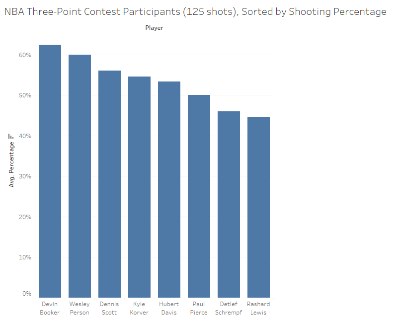
125 shots…
In the 125-shot category, Devin Booker takes it with 62% shooting. Both Curry and Legler outperformed this with more shots, so this means we can leave Booker out of the overall “most impressive shooter” contention.
100 shots…
Marco Belinelli takes this category, with a Steph-matching 65% accuracy. However, it’s more impressive to shoot 65% over 250 shots than to do it with 100 shots, so Steph and Legler’s performances are still the best.
75 shots…
Jim Les wins this one with 56% shooting, but again falls behind Steph and Legler.
Next up is the highly-contested 50-shot category. These are all the remaining players who won at least one shootout round.
Joe Harris shot a remarkable 75%, so even though the sample size is so small, we can’t rule out that his performance gives him the title for most impressive 3-Point Contest shooter in history.
So we’ve boiled it down to three contenders. Who do you consider most impressive? Your guess is as good as mine…
Steph Curry: 65% of 250 shots
Tim Legler: 66% of 150 shots
Joe Harris: 75% of 50 shots
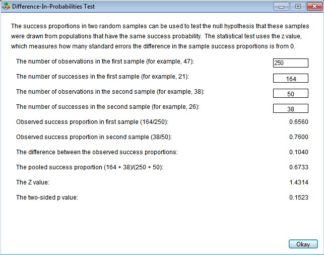
UPDATE: Since publishing this blog article, my co-author Gary Smith (he knows a lot of things) pointed out that there is a statistical way to compare Joe Harris to Steph Curry here. He said “there is a difference-in-proportions test for the null hypothesis that two probabilities are equal” which is another way of saying that you can attempt to falsify the hypothesis that Curry’s and Harris’s shooting percentages are the same. Here’s what I get when I plug in Curry’s and Harris’s shooting percentages…
So, this is saying that the shot data we have is not sufficient to argue that Harris’s shooting performance was significantly better than Curry’s. However, it is suggestive that he may be better; in fact, if he had made two more shots out of the 50, this test would have supported the idea that Harris’s performance was significantly better than Curry’s. Time will tell!
(Below is the data I used… enjoy! Oh yeah, and buy my book, thanks!)
Did you miss my rousing keynote at the Claremont Data Science conference? You’re in luck! Below are my slides, and every somewhat witty and thought-provoking thing I said…
Hi, I’m Jay. I’m super excited to be here, especially because this is the first time I’ve ever done a talk like this! My friend told me that this experience would be good for my next book, the 9 pitfalls of public speaking. Funny guy! My co-author Gary is sitting over there. You do know he’s the one with a PhD from Yale, right? You had a 50/50 shot at hearing from a genius today! Don’t worry, though, I’m not a total clown. I graduated from Pomona College with a degree in math and worked as a software developer for 11 years before following my inner data-wonk to the Analytics department of a booming Internet company. I would take the Metrolink from Claremont to downtown L.A. every day and those years of grand successes and epic failures taught me the value of scientific rigor.
I had a manager once who liked to say “up
is up”, which I took as meaning that data speaks for itself. I strongly
disagree. Data needs an interpreter. One who knows things. And machines don’t
know anything. They’ll crunch random data and find statistical significance
everywhere.
On top of that, as you can see here, it’s not even always clear what “up” is! We had all the data you could ever want at my work. Billions of rows piled into a Netezza database. So we tried to use that wealth of data to answer a simple question: what’s more profitable: 1-click pages or 2-click pages? The answer we got back is that overall, 2-click pages are better. Then we asked, okay, what about in the U.S.? One-clicks are better there. How about outside of the U.S.? One-clicks are better there too. Which “up” are we supposed to believe? This is Simpson’s Paradox in all of its glory. In this case, the weighted average looks like that because we had U.S. traffic mostly on 2-clicks and International traffic mostly on 1-clicks. It’s even worse than that! The reason most U.S. traffic was on 2-clicks was because we had run randomized A/B tests that showed 2-clicks are better here, so even that top line is backwards! We decided to stick with the experiments so we don’t get fooled by confounding variables.
Data science is often said to be about extracting knowledge from data. Well, as you can see from this example, if you’re talking about historical data as opposed to data produced by an A/B test, you need to be very careful to ensure that what you’ve extracted is knowledge and not nonsense. Data science is less about extracting knowledge than creating useful data that can provide knowledge. Up is definitely not always up.
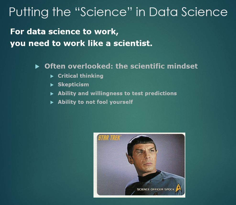
I hope to convince you today that for
data science to work, you need to work like a scientist.
When people talk about what data
scientists do, they always mention statistics and computer programming and also
might say how important it is to have domain or subject knowledge. What they
tend to forget is the “science” part. I’m here to tell you that the
scientific mindset: the critical thinking, the skepticism,
the willingness to put your predictions to the test, and make sure you’re not
fooling yourself, is essential.
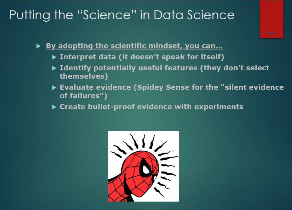
Rather than just go through all the pitfalls of data science, I’d like to talk about four ways that a scientific mindset can avoid them. (1) You can effectively interpret data (does it mean what you think it means?) (2) You can identify which features might be useful for making predictions. Machines can’t really do that for you because if you include too many nonsense variables, they crowd out the real ones. (3) You’ll be able to evaluate evidence and develop a Spidey Sense and avoid being fooled by the “silent evidence of failures”. Are you seeing the whole picture or is someone showing you the statistical hits and hiding the misses? The last one is that you run experiments whenever possible, because it’s the strongest evidence out there.
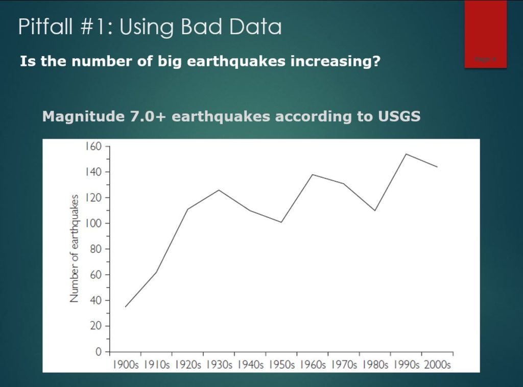
Okay, so let’s put your critical thinking to the test. What’s this data saying? This is earthquake data from the United States Geological Survey showing an alarming increase in the number of major earthquakes worldwide over the last century. Is the apocalypse approaching? Is the earth breaking apart? Or is something wrong with this data?
Don’t worry. These are the earthquakes
that were recorded each year, not the number that occurred. There is now a far
more extensive network of seismometers than in the past, so many earthquakes
that went unnoticed decades ago now get monitored and logged.
If the data tells you something crazy,
there’s a good chance you would be crazy to believe it.
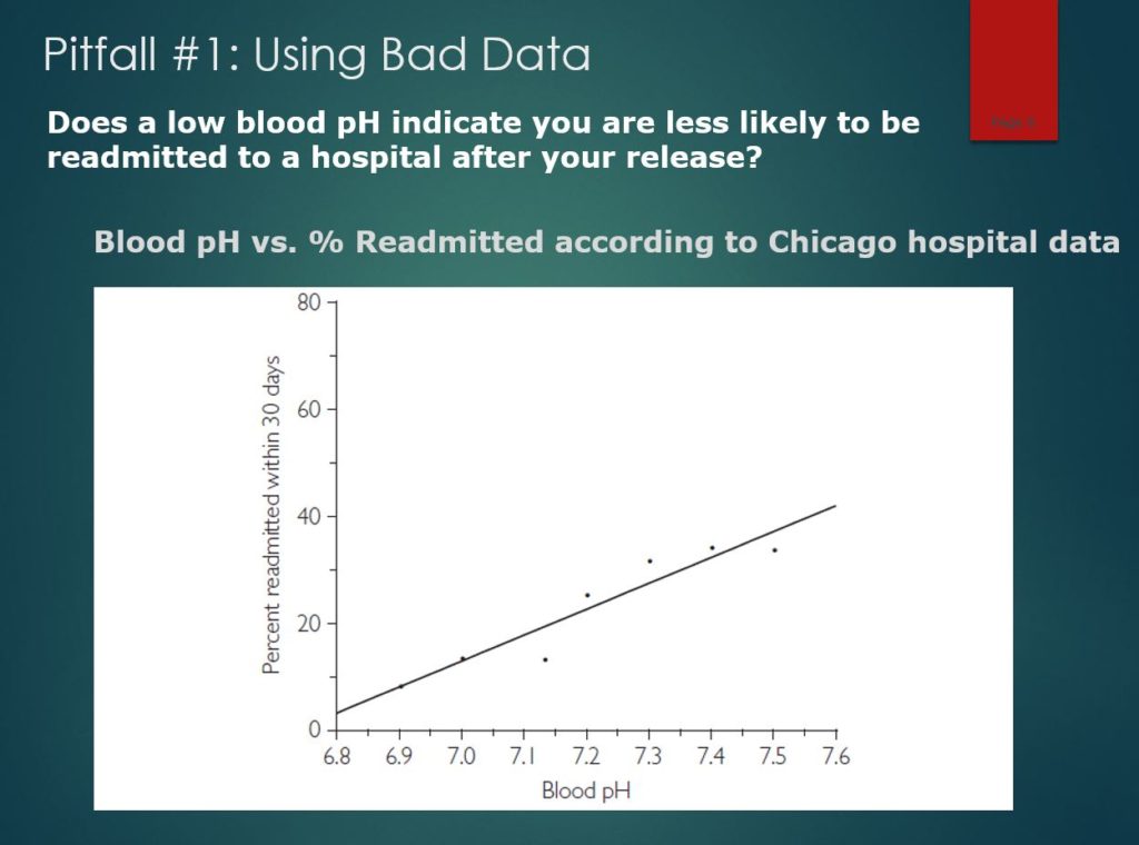
Too easy? Give this one a shot. At
Berkeley, I was on a group that analyzed data for over 7,000 patients with
sepsis at a Chicago hospital to find a way to predict the chances of being
readmitted to the hospital after being discharged. You can see here that we
found a strong relationship between the pH level of the patient’s blood
(normally between 7.35 to 7.45) to the hospital readmission rates.
There is a clear positive relationship,
indicating that patients with high pH levels are more likely to return to the
hospital soon after being discharged. A low pH signals that a discharged
patient is unlikely to be readmitted. The correlation is 0.96 and data clowns
would call it a day. “Up is up”!
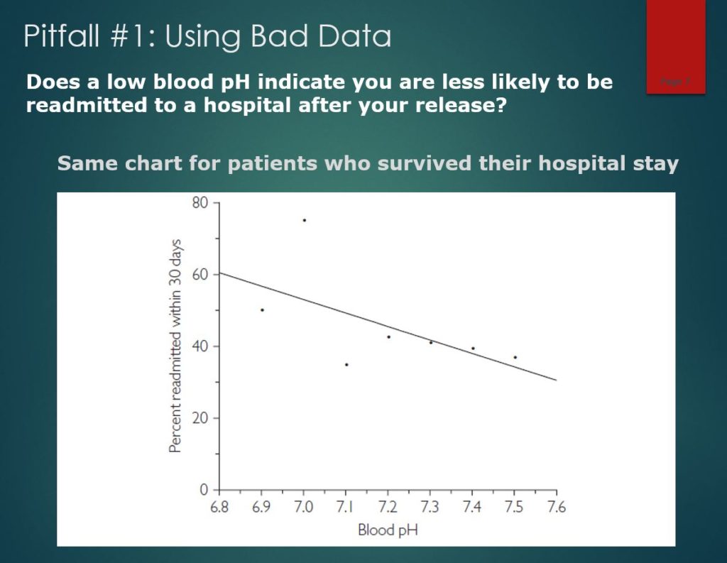
However, my teammates and I were not clowns, so we made sure to run this by a doctor to see if it made sense. When he saw this figure, a puzzled look came across his face: “That’s strange; the relationship is backwards. If you have a low pH level, you’re probably dead,” but the chart implied that having a very low pH level was a sign of health. This stumped us until we realized that the data included patients who died during their hospital stay! We had simply found that the patients least likely to be readmitted are the ones who were discharged to the mortuary.
This figure shows that, once we removed
the deceased patients, the pattern reversed. Now there is a negative
relationship, just as the doctor expected.
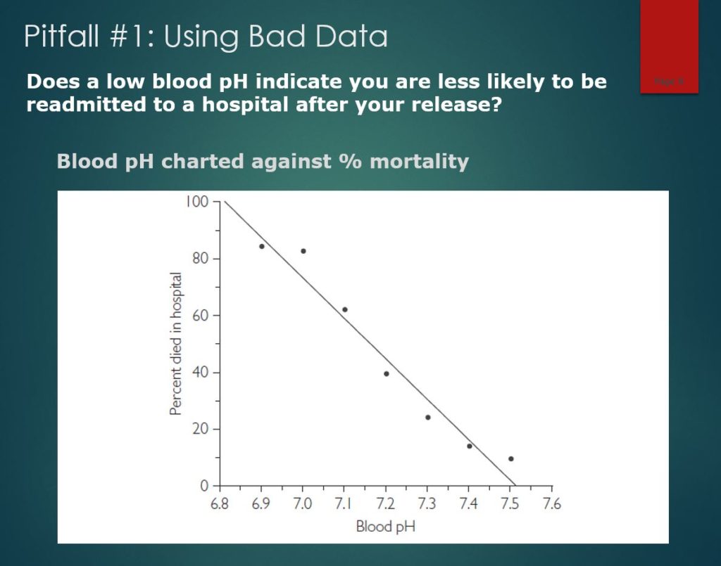
This one shows the clear danger of acidic
blood by comparing pH level with the likelihood of death. Patients with pH
values below 7.2 are not in good health, they are in serious danger. In this
case, the data spoke, but it was talking about something else.
In this case, only the scientific mindset
saved us from embarrassment.
It gets even trickier. How can you dismiss patterns that repeat consistently? After Oklahoma won 47 straight college football games, Sports Illustrated ran a 1957 cover story proclaiming, “Why Oklahoma is Unbeatable.” Oklahoma lost its next game and people started noticing that other athletes or teams who appear on the cover of Sports Illustrated tend to perform worse afterward. The Sport’s Illustrated Jinx was born. More recently, we have the Madden Curse, which says that the football player whose picture appears on the cover of Madden NFL, a football video game, will not perform as well the next season. The Sports Illustrated jinx and the Madden Curse are extreme examples of regression toward the mean. When a player or team does something exceptional enough to earn a place on the cover of Sports Illustrated or Madden NFL, there is essentially nowhere to go but down. To the extent luck plays a role in athletic success, the player or team that stands above all the rest almost certainly benefited from good luck—good health, fortunate bounces, and questionable officiating. Good luck cannot be counted on to continue indefinitely, and neither can exceptional success. There’s a Swedish proverb which states “Luck doesn’t give, it only lends.”
We ran into this at work. My company specialized in maximizing profit for domainers, or people who collect websites in order to show ads. We designed and conducted experiments to find the best design. So for example, a web visitor comes in and we generate a random number to determine which page they go to. When we then compared how the various pages performed, we knew we could trust the results because no possible confounding variable could be correlated with a random number. If we had just used a different layout each day, the results might be muddled by the nature of web traffic on the different days—for instance, people are typically more likely to click on ads on a Monday than over the weekend. So anyway, we know what the most profitable design was and used it all over the place.
Anyway, our customers have collections of domain names and, of course, some names do better than others. Some would ask us to work on their “underperformers” and see if we could get revenue up. So my friend in Analytics would change the web page design or the keywords and every single time, revenue would go up by 20% the next day. He was a hero and they were like “you should do this full time!” We made the point that, to be scientifically rigorous, we should really only be working on a random half of the names in order to have a control for comparison, but they thought we were being ridiculous. A twenty percent revenue lift the day after he made changes and we’re nitpicking the process?
Well, one day he forgot to make the changes and the next day, revenue went up for the names by 20% like they always did. It was like an anti-jinx! Instead of the best performers getting on the cover of Sports Illustrated, this was the worst performers getting emailed to Analytics. Someone came by his desk to congratulate him again and he said “I didn’t get around to it yet” and they said “well, whatever you did worked!” Now, we knew for sure that we had to hold back a control, because there was no way to know if what he was doing was helping or hurting!
It turns out that Regression toward the Mean is everywhere. Let’s quickly go through a few more examples…
Why is there a sophomore slump? It’s because you’re looking at the best freshmen. Whether you’re looking at the best batting averages or any other statistic, the top performers will almost always do worse the next time.
Why are movie sequels typically worse than the originals? Well, if you’ve been paying attention, you know how to fix this one. If you want sequels that are better than the originals, make sequels to the worst movies!
Why does punishment seem to work better than reward? Johnny does something exceptionally well and you give him a treat. Then, he does worse. Johnny does something exceptionally badly and you whack him. Then, he does better. The same thing would have happened without the treats or the whacking.
There was a study showing that kids who underperformed on the SAT did better the next time if they were on a drug called propranalol to relax them. As soon as you heard, “underperformed”, I hope your Spidey Sense tingled. They’re expected to do better if they underperformed! The kids almost certainly did worse on the drug than they would have without it, but you’d never know, because they didn’t use a randomized control.
Now, to be clear, this is not the
even-steven theory from Seinfeld. Your luck will not reverse, you will just
become less lucky.
So you can see why people believe in jinxes! By the way, if you think this talk is exceptionally interesting right now, I have bad news about the rest of the presentation (I knock on wood).
So interpreting data requires the
scientific mindset, but
what about finding good predictive features? Here’s a tough one for you. What
is this thing?
Did anyone get it? Of course! This is easy for humans. Even if the sign were bent, rusty, or has a peace sticker on it, we would still know what it is. Not so with image-recognition software. During their training sessions, Deep Neural Net algorithms learn that the words “stop sign” go with images of many, many stop signs. Because they look at individual pixels, computer programs can be led astray by trivial variations. People can exploit this and intentionally cause a misidentification with tiny changes, called an adversarial attack.
Gary did a quick-and-dirty test by
putting a peace sign on an image of a stop sign to see what a DNN would
conclude. It misidentified the image as a first-aid kit. In 2018, the
organizers of a machine-learning conference announced that they had accepted 11
papers proposing ways to thwart adversarial attacks like this. Three days
later, an MIT graduate student, a Berkeley graduate student, and a Berkeley
professor reported that they had found ways to work around 7 of these defense
systems. There is clearly an AI arms race going on.
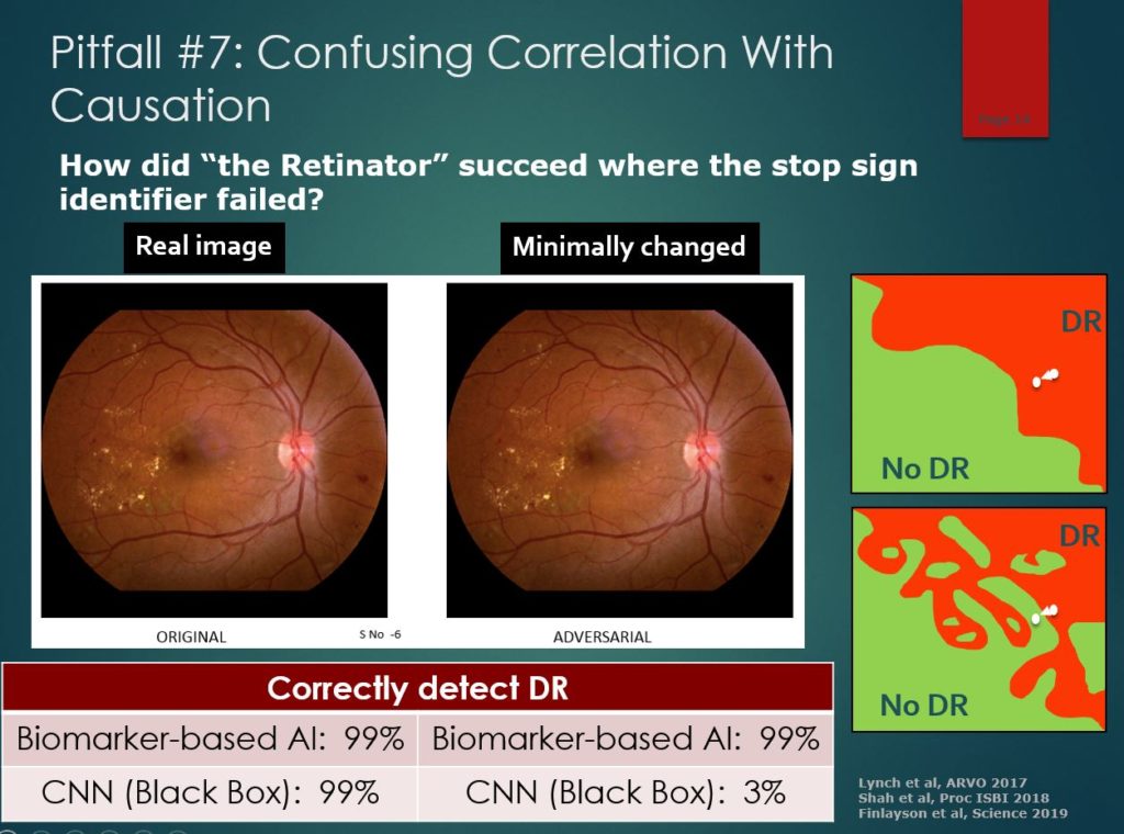
So how can thinking like a scientist possibly help a neural net work better? I talked to one to find out! “The Retinator”, Dr. Michael Abramoff, invented an autonomous AI system to diagnose diabetic retinopathy (DR), which is the leading cause of blindness in working-age adults. He said it took him decades, but he eventually succeeded in building a neural net AI system that performed as well as a doctor
So, if neural nets can be confused about
stop signs, how did the Retinator keep
his AI from being fooled?
His approach was to classify images of
the eye the same way retinal experts do, by looking for specific signs of DR.
He developed multiple detectors to look for known predictive features such as hemorrhages and
other biomarkers. He also wanted his results to be comprehensible so that
doctors and patients understand the diagnosis. If his system failed to
recognize a case of DR, he wanted to know why it failed. He said “If I give
clinicians an image with a bunch of hemorrhages,
they’ll say ‘This is likely DR.’ If I start taking those hemorrhages
away, eventually they’ll say ‘there’s no disease here.’” His biomarker AI
system works the same
He wouldn’t settle for a black box, blank slate approach, because he knew that would risk catastrophic failure. In theory, letting computers teach themselves which characteristics are useful might find important features that clinicians didn’t know about. However, much of the data is irrelevant, so many features found to be correlated statistically with a DR diagnosis will be spurious. As with the stop sign detector, errors can arise when algorithms are put on auto-pilot. In the case of DR, there might be a bias due to the color of the retina, a different kind of background, or even part of the border around the image. A black-box model can fail with new images, with no one knowing why it failed.
Here you can see an example of a
catastrophic failure of a black box algorithm. Its diagnosis is so fragile that
you don’t even need a peace sign; changes in pixels that humans can’t even
perceive can completely change the prediction. The Retinator’s
system wasn’t tricked because it only considers the small number of features
that make sense. In healthcare, the possibility of these adversarial images is
particularly concerning because of the ability to make fraudulent claims by
exploiting automated diagnoses.
In April 2018, Dr.
Abramoff’s Idx-DR
system became the first FDA approved autonomous AI diagnosis system.
Feature selection isn’t just a problem
with neural nets. In 2011, Google created a program called Google Flu that used
search queries to predict flu outbreaks. They reported that their model had a
correlation of 0.975 with the actual number of flu cases from the CDC. Their
data-mining program looked at 50 million search queries and identified the 45
queries that were most closely correlated with the incidence of flu. It was
pure-and-simple data-mining. A valid study would use medical experts to specify
a list of relevant query phrases in advance, and then see if there was an
uptick in these queries shortly before or during flu outbreaks. Instead,
Google’s data scientists had no control over the selection of the optimal
search terms. The program was on its own, with no way of telling whether the
search queries it found were sensible or nonsense. Google Flu may have been
simply a winter detector. When it went beyond fitting historical data and began
making real predictions, Google Flu was far less accurate than a simple model
that predicted that the number of flu cases tomorrow will be the same as the
number today. After issuing its report, Google Flu overestimated the number of
flu cases by an average of nearly 100 percent. Google Flu no longer makes flu
predictions.
Now I want to be clear: this type of
automated data-mining is not what helped Google take over the world. It’s the
thousands of rigorous A/B tests that they run that allowed them to do that.
Having a huge amount of data to analyze for
patterns is not enough, and Google knows that.
Compare Google Flu with how Wal-Mart
stocks its shelves when a hurricane is on the way. Customers don’t just buy
water and flashlights; they also buy strawberry Pop-Tarts and beer. Since
historical data was analysed, this appears at first glance to be more mindless
data mining. However, it is actually more like a controlled experiment! Recall
that one major downside of data mining is the possibility of confounding
variables. However, since hurricanes only affect a few stores out of many,
Wal-Mart had a natural experiment that eliminates confounding influences like
the day of the week or season of the year. This is almost as good as letting
mad scientists randomly choose cities to be blasted by hurricanes and then
comparing the shopping habits of the lucky and unlucky residents. The
scientific method is alive and well at Wal-Mart. Another problem with data
mining is that correlation can get confused with causation. It is highly
unlikely that customers stocked up on Pop-Tarts in threatened cities for some
reason other than the hurricanes. Also, unless buying Pop-Tarts causes
hurricanes, the relationship clearly goes in the other direction. We might no
know exactly why people buy these products, but we do know that hurricanes
caused the increase in demand. An additional reason to believe in the Pop-tart
/ hurricane connection is that the association makes sense. Pop-tarts don’t
have to be cooked and last practically forever. Taking advantage of natural
experiments like this is something a scientists would think of.
So data doesn’t speak for itself and
features don’t select themselves. Let’s shift a bit and talk about the “silent
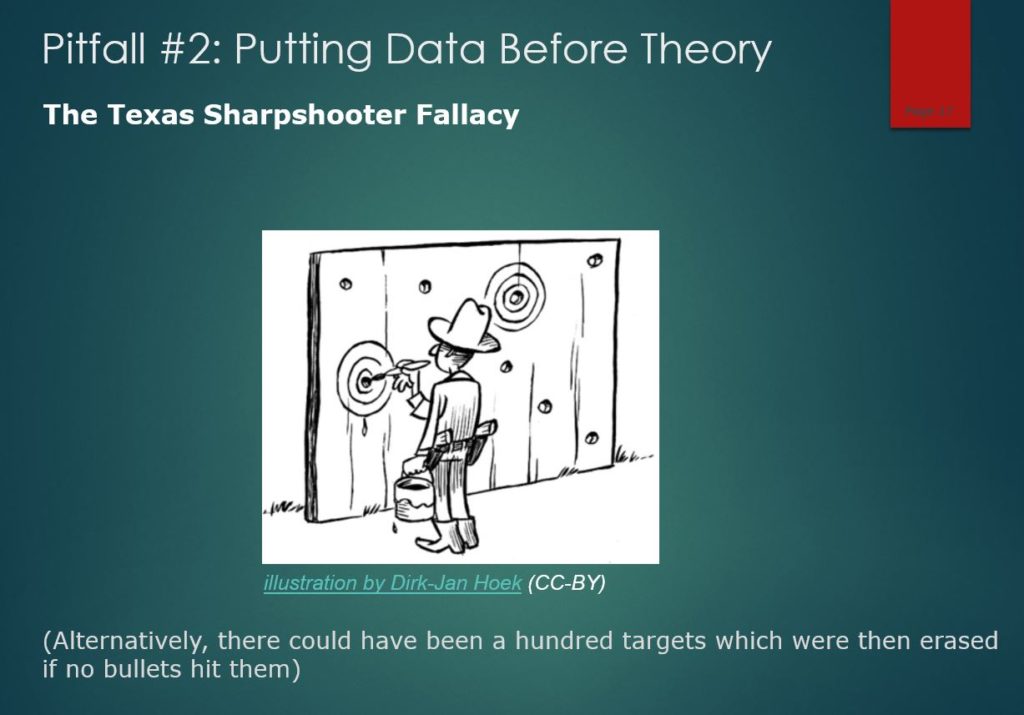
evidence of failures”. There are actually two versions of what’s called the
Texas Sharpshooter Fallacy. The first one is that in order to prove what a
great shot I am, I paint a thousand targets on a barn wall, fire my gun at it,
and what a surprise, I hit a target! And then I go and erase all the other
targets. And, of course, it’s meaningless, because, with so many targets, I’m
bound to hit something… So the Texas Sharpshooter Fallacy #1 is testing lots
and lots of different theories and reporting the one that seems confirmed by
the data and not telling anybody that you tested many other theories. This
fallacy contributes to the replication crisis in science, because there’s a
publication bias towards significant findings. You’ll see the hits but not the
misses.
Texas Sharpshooter Fallacy #2 is the picture here. You just fire your gun blindly at the wall and then you go and draw a target around the bullet hole and pretend that’s what you were aiming for. That’s like looking at the data and finding some coincidental little thing in there and pretending that’s what you were looking for in the first place.” I think there should be a third one, where there’s only one target, but you just keep shooting until you hit it. Then, you hide all of the bullet holes outside of the target and show what a good shot you are. This is what they call p-hacking, which is a reference to testing again and again until hitting that magical statistically significant p-value of 0.05.
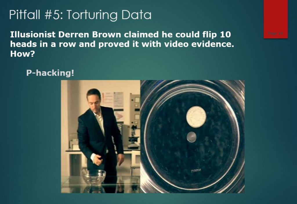
Here’s a simple example: Derren
Brown is a mentalist who said he could flip ten heads in a row with a fair
coin. This is an astonishing claim since there is only a 1 in 1024 chance of
doing that. Brown backed up his claim with a video filmed from two angles.
There were no cuts in the video, it wasn’t a trick coin, and there were no
magnets or other trickery involved. Is your Spidey Sense tingling?
In a later video, he gave away his
secret: he had simply filmed himself flipping coins for nine hours until he got
ten heads in a row. The video seemed magical, but it was a tedious trick.
Brown’s prank is a clear example of how our perception can be distorted by what
Nassim Taleb
called the “silent evidence” of failures. If we don’t know about the failures,
how can we evaluate the successes? As you develop your scientific Spidey Sense,
you’ll notice that a lot of evidence starts to look like videotaped hot
streaks.
So that was about interpreting evidence. Now I’d like to talk about creating compelling evidence. Suppose I want to convince you that poker is a game of skill and that you’re skeptical of my claim. Let’s say you think poker is a game of chance because the cards are randomly dealt and poker professionals often go broke. What evidence would convince you?
Well, regarding pros going broke, let me tell you about an interesting gambling experiment. Participants were given $25 and challenged to make as much money as they could in 30 minutes. They would do this by betting on a virtual coin that lands on heads 60 percent of the time. Clearly, betting on heads is a winning strategy, but how much should you bet? It turns out that something called the Kelly criterion gives an elegant answer: bet the “edge.” The edge is the difference between winning and losing chances so the edge for this game is 60–40, or 20 percent. If you bet 20 percent of your money on each flip, you can expect to make more money than you would by following any other strategy. I still remember the day Art Benjamin taught me that (he was in the audience). Most people in the study bet much more than this, and 28 percent lost all their money, even though they were winning 60% of the time. Despite the fact that the results of this experiment depend on coin tosses, I would consider this a game of skill because people who know what they are doing can expect to make more money than those who don’t. I would argue that broke poker pros are like the 28% who lost their money here. This experiment shows that betting on the right outcome is a different skill than knowing what stakes you can afford.
To create the strongest evidence that poker is a game of skill, I ran my own experiment. I predicted I could beat online poker and I put my own money on the line to prove it. I invested a whopping $50 into an online poker site and gathered data on how players respond to an immediate but small all-in bet. I downloaded the data from these experimental games and analyzed it. It turns out that people call too often. I used the data to determine which hands would win the maximum amount of money per hour assuming my opponents didn’t adjust. I called my strategy “the System”.
As you can see, when I started using the
system, my opponents were no match for data science and they probably wish
lucked played a bigger role in poker than it does.
This is not to say that the element of luck doesn’t shake things up once in awhile. It may not look like much on the chart, but at one point, my bankroll dropped $1800. Fortunately, I knew about the Kelly Criterion, so I never played at stakes that were so high that I could go broke. Of course, it was possible that my opponents had finally adjusted to my strategy so I analyzed the data again. I found out that it was just bad luck that had taken a bite out of my bankroll. I continued playing the System and my luck turned around as expected. By showing you results that would be exceedingly unlikely to happen by chance, now you almost haveto believe my claim that poker is a game of skill. Data science isn’t just about analyzing data correctly, it’s about presenting your findings in a compelling way. And nothing is more compelling than experimental results.
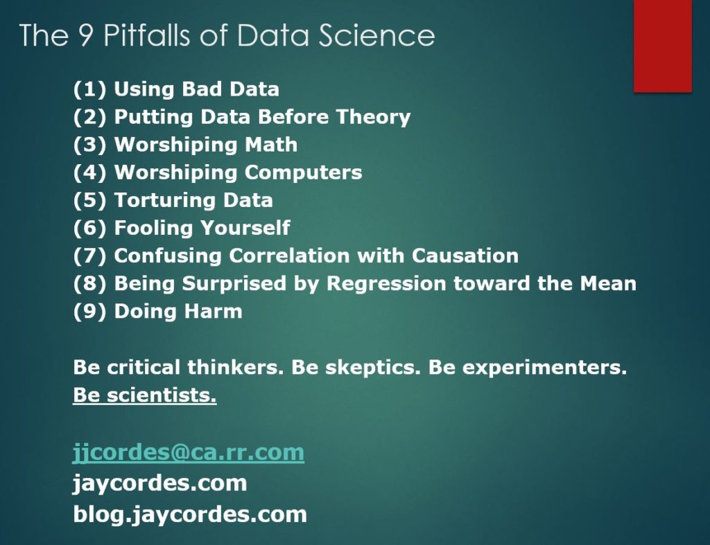
You’ve waited long enough, so here are
the 9 Pitfalls of Data Science. I want to you look down the list and notice
something they have in common. That is that these are problems that can’t be
solved by automation; they’re job security for data scientists! The Google Flu
and Wal-mart
Pop-Tarts stories describe different ways of analyzing historical data and show
that the less mindless the approach, the better. Analysis on auto-pilot doesn’t
work because data doesn’t speak for itself and up is not always up.
Similarly, the Retinator’s
autonomous AI system got approved by the FDA because it was more than a black
box stop sign identifier. People still have an important role in focusing
computers on the features that matter.
The final take-away is that the way around the pitfalls is to follow the path of scientists. Be critical thinkers because data and features don’t always make sense. Be skeptics, because anyone can torture data until it backs them up. Be experimenters, because the strongest evidence is the evidence that could have gone against you. Put the science into data science. Be scientists.
Thank you so much for listening!
(As an Amazon Associate I earn from qualifying purchases!)
I recently received an email from a financial advice firm about “rational decision making” that had a promising intro: “We’ve discovered five common investor biases and emotions that can lead to below-average returns.” Biases, I don’t like those. Emotions hurting returns, those aren’t good either. I’m listening!
It describes loss aversion (irrationally holding a losing security in hopes that
it will recover) and anchoring
(relying too much on an initial piece of information) before offering this
description of hindsight bias…
Hindsight bias
– Many investors believe that an asset will perform well in the near future
because it has performed well in the recent past. As a result, some investors
are constantly chasing returns. If we reflect on this, it is actually
counterintuitive. The number one rule of investing is buy low and sell high.
Take a look at the S&P 500 chart above. If you have not owned the S&P 500 Index over the last nine years,
is now the time to buy after it is 300 percent more expensive than it was nine
years ago?
Okay, how many problems can you find
in that last sentence?
I count three!
“If you have not owned the S&P
500 Index …” Why
mention this? It is a sunk cost fallacy to consider whether you bought
something in the past. It’s either a good investment or it’s not.
“…over the last nine years…” This is classic cherry-picking.
Where did the number nine come from? You can bet it came from the last time the
S&P hit a low point.
“…is now the time to buy after it
is 300 percent more expensive than it was nine years ago?” This is the gambler’s fallacy.
It’s rational to expect something that’s done extremely well to do less well
(regression toward the mean), but it’s not rational to imply that it’s now a
bad investment due to its recent history. There is no force of nature that requires
all good returns to be balanced out by bad returns. There is irony in providing
this comment after explaining the anchoring bias to the reader.
Beware of people advising to “buy
low and sell high” as if they know what low and high are. If it were that easy,
the firm should just send out an email that says “LOW” or “HIGH” in the subject
line so its customers can act accordingly and beat the market.
If you spotted the data science pitfalls in that financial advice, congratulations, you’re well on your way to becoming a skeptical and savvy consumer of data!
In response to my blog on Roundup, I received this email (and no, it wasn’t addressed “dear Wonk”)…
“This is an excellent article and presentation of how the desired outcome affects the stated conclusion of a study. Based on news headlines, I have vilified Roundup. This is a convincing reminder to dig deeper before taking a position.
What I see as a similar debate is the one about the risks and efficacy of vaccines. It is a particularly hot topic here in Oregon as the state legislature is working on a bill that removes the option for a non-medical exemption from vaccination for school children. If the child is not vaccinated and does not have a medical exemption, that child will not be allowed to attend public school.
I find this similar to the Roundup issue because I have been told that there are studies that support both conclusions: vaccines do cause autism and other auto-immune disease and vaccines do not cause these conditions. I have not done any research myself. I understand that the linchpin study supporting the harmfulness of vaccines has been retracted. What is the truth?
I have friends looking to move out of the state if this bill becomes law.
I would like to understand the science before addressing the personal liberty issue of such a law.
Thanks for waking up my critical thinking skills.”
The study referenced was indeed retracted, but only after 12 long years. Even after it became known that the lead author failed to inform anyone that the study “was commissioned and funded for planned litigation” and that he had falsified data, his report continued to cause a decline in the vaccination rates. While there is always a slight risk of some severe allergic reaction, there is no evidence for a link between vaccines and disease, and the dangers they prevent are far greater than any that cause. By creating a belief in a false link between vaccines and autism that have directly led to lost lives, the retracted study may go down as one of the most damaging cases of fraud in history.
By the way, if you’re ever in need of evidence for the efficacy of vaccines, look no further than these visualizations…
From a scientific standpoint, this issue looks like a slam dunk, so why are there still so many people trying to get out of vaccinations? For one, many are well aware of the evils of Big Pharma and profit-driven healthcare: the $30 billion budget for medical marketing in the US has brought us the opioid crisis, unaffordable drugs, and medication overload (40% of the elderly are taking five or more medications). It’s hard to imagine that public health is valued nearly as much as profit in this country. However, given the phony autism study above, created in the hope of winning lawsuits, maybe people who are watching out for Big Pharma simply need to learn to also watch out for Big Lawya.
I’m sure that awareness wouldn’t hurt, but it isn’t enough. Debunking studies misrepresenting the dangers of vaccines and ushering in piles of evidence about their benefits will probably have little effect on someone who wants to opt out. So what is it that’s actually causing these people to leave their kids and others vulnerable to potentially deadly diseases?
I’m thinking it’s the misguided fear of regret. In Michael Lewis’s book The Undoing Project, he mentions a paper about decision analysis called “The Decision to Seed Hurricanes.” There was a new technique available to the government (dumping silver iodide into storms) which could reduce the amount of damage done by hurricanes or alter their paths. However, while the government would not be given credit for what had been avoided (since nobody would know for sure), it would certainly be blamed for the damage the storm inflicted on its new path. This asymmetry between credit and blame causes a bias towards non-intervention, which struck me as similar to a parent’s decision for or against a vaccination. Their child may or may not have been on a path towards an infectious disease and if the vaccine turned out to be a life-saving factor later on, nobody would know.
Behavioral economists often model people as rational decision-makers who don’t seek risk or avoid risk, they weigh risk. They are expected to maximize their utility, which is a clever metric used to standardize the value of various outcomes so that math can be used to find the choices with the best expected value. However, psychologists Kahneman and Tversky found that rather than maximizing utility, people seek to minimize regret. In a memo to Tversky, Kahneman wrote “The pain that is experienced when the loss is caused by an act that modified the status quo is significantly greater than the pain that is experienced when the decision led to the retention of the status quo. When one fails to take action that could have avoided a disaster, one does not accept responsibility for the occurrence of the disaster.”
If you point out that people are irrational, they take it personally in a way that they don’t if you pointed out that they’ve been fooled by an optical illusion. What psychologists have discovered is that it’s normal to be irrational when faced with particular types of problems, so we shouldn’t take it personally. We should just learn when those times are, and resist the pull towards bad decision-making. We shouldn’t be angry when governments require us to become vaccinated, we should be thankful. They are saving us from our tendency to make bad decisions.
You may have read about the recent public health concern for moviegoers at a theater showing the Avengers a few weeks ago who may have been exposed to someone with measles. Here’s my takeaway idea to help people overcome their cognitive blind-spots on this: those who were at that theater and remained healthy should publicly thank their parents for vaccinating them. “I didn’t get measles the other day, thanks mom!” When we can, let’s make a point to acknowledge the moments when disaster didn’t strike and give credit where it’s due.
A little bird sent me this request: “How about an analysis
of the Roundup thing?”
I’d read about the multimillion-dollar lawsuits recently won against Monsanto, an agricultural biotechnology best known for its public relations challenges and questionable ethics. However, I wasn’t aware that Bayer had purchased the company last year and can now look forward to over 11,000 lawsuits! It certainly appeared as if the verdict was in about the dangers of Roundup, but jurors aren’t known for their ability to evaluate scientific evidence. While Monsanto has a financial incentive to try to influence studies, lawyers also do well in times of public hysteria (“mesothelioma” was the top-paying Internet ad at my last job). So let’s take a crack at getting beyond all of the perverse incentives at play and focus on the main question: Does Roundup cause cancer?
With controversial topics like these, it’s important to first look for a scientific consensus. In this case, the EPA, European Food Safety Authority, Food and Agriculture Organization, European Chemicals Agency, Health Canada, German Federal Institute for Risk Assessment and others have concluded that, at the levels people are exposed to glyphosate, the active ingredient in Roundup, it does not pose a risk of cancer. However, the consensus on glyphosate is not unanimous; there is one organization, the International Agency for Research on Cancer (IARC) which classified glyphosate as a “probable carcinogen.” Is this the only agency to escape Monsanto’s influence or is there another explanation?
It turns out that the IARC evaluates risk in a different way than the other agencies. It determines if the substance can cause cancer with exposure levels far more extreme than any that would be found in the real world. Practically everything is dangerous in high amounts, (including water) and the IARC, accordingly, has only found one out of the hundreds of agents they have evaluated as being “probably not carcinogenic.” I’m not accusing the IARC of practicing pseudoscience, but let’s just say that I’m sleeping better now that I know they’re the ones behind the California Prop 65 cancer warnings at fast food restaurants. I figure that as long as I don’t ingest 400 chalupas per day, I’ll probably be okay.
Due to the consensus of worldwide regulatory agencies (and with IARC’s conclusion put into context) I would already feel comfortable concluding that there is not sufficient evidence showing that Roundup causes cancer. However, let’s go down a level to the studies themselves and see what we find. The reason I didn’t start here is because individual studies can be very unreliable, especially when it comes to epidemiological studies (as opposed to controlled experiments). That said, one of the strongest experimental designs for these types of studies is the “prospective cohort study”, which follows a population of people with various exposure levels to the chemical over time and, only later, determines whether or not the groups show significant differences in health. While they can have their conclusions reversed due to unconsidered confounding variables (“Oops, people living close to power lines tend to be poorer and have less access to healthcare”), these types of studies at least avoid the problem of selective recall that plagues case-control studies: (“Hmm, I didn’t know what caused my tumor, but now that you mention it, I DO spend a lot of time on the cell phone!”). Following the surprising IARC conclusion, a study revisited and followed up on data from the large Agricultural Health Study (AHS). It found, in agreement with earlier conclusions, “no association was apparent between glyphosate and any solid tumors or lymphoid malignancies overall, including NHL and its subtypes.”
It certainly is looking like the evidence against Roundup is weak. However, a recent study in the journal Mutation Research threw a monkey wrench into things and associated weed killing products with non-Hodgkin lymphoma (NHL). It used the same AHS data above and combined it with a few less reliable case-control studies to conclude that people exposed to glyphosate have a 41% higher likelihood of developing NHL.
I’m a bit uncomfortable with the fact that it used the same data from a study that found no significant risk, added in less reliable data, and then concluded that there IS a risk. That seems like taking advantage of post-hoc wiggle-room. Another problem is that the 20-year time lag is the only one mentioned in the analysis. Why not report the results of the 15-year or 10-year lag since exposure? The 20-year lag was the only one that showed a relative risk greater than 0%. Coincidence? Read my upcoming book and you’ll suspect that this is Pitfall #5: Torturing Data. The study reports a 95% confidence interval as if they had a hypothesis, tested it, and found an increase in risk that would be unlikely if Roundup weren’t dangerous. In reality, when they skipped over data points that didn’t support their conclusion before landing on the one that did, the likelihood they would find something increased significantly. I can’t help but wonder if they would have even bothered to combine data from the less reliable studies if the AHS data showed significance on its own. I get the impression they found the result they did, because they went looking for it, and accordingly, their conclusion should be taken with a grain of salt. It would be analogous to asking “what are the chances I found an Easter egg in this particular place, given there were 20 possible places to search?” and not mentioning that you had searched a few other places before you found it. This may seem nit-picky when only a few results weren’t mentioned, but their whole conclusion of “statistical significance” hinges on it!
Observational studies like this are unreliable in the best of circumstances. They have the burden of showing that higher doses lead to a higher likelihood of illness (dose-response relationship). They have the burden of controlling for variables such as age, family history, body weight, and other things that may bias the results (confounding variables). For an extreme example, suppose there were a study that was much more compelling because it took blood samples of thousands of people and everyone with cancer had Roundup in their blood and everyone without cancer did not. A slam dunk case! Until later they find out that everyone with cancer also had DDT or some other chemical in their blood due to the fact that they were all farmers using a variety of insecticides. Suddenly, the case could fall apart.
Even if this study had carefully done everything possible and found that higher exposure to Roundup led to higher chances of developing NHL and also had a strong reason ahead of time that it would only show up after a 20-year lag, it would still be one observational study up against a consensus of health agencies around the world. People want to believe that science can confidently answer questions like “what causes cancer” by simply analyzing data. The truth is that, without randomized testing, science is severely hobbled. At best, it can draw tentative conclusions when data is carefully collected and analyzed by scientists trained in not fooling themselves and haven’t peeked at results before forming their hypotheses. Before you vote “guilty” in your next jury, remember that scientific consensus among multiple scientific organizations represents our best understanding of the world. In general, if you rely on “worldwide conspiracy and bribery” as the explanation for why scientific organizations are wrong, your argument is in trouble. No matter how compelling a conspiracy theory may be, the weight of scientific consensus should provide you with more than a reasonable doubt.
Disagree? Let me know what I got wrong and I’ll post updates. And keep those ideas coming for future blog entries!