So first of all, some good news: it looks like the daily death rates in Italy and Spain have finally reached a peak.
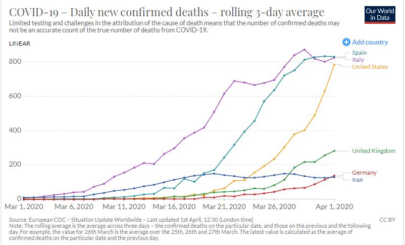
I’m not an epidemiologist, but just eye-balling the chart above, it looks like Italy took about a month to get there. So the estimate that the United States will hit its peak around April 15, a month after deaths started taking off here, looks very reasonable.
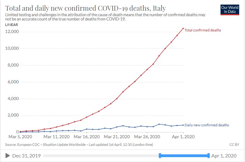
Here’s Italy by itself, reaching 100 total deaths on March 5 and seemingly hitting its peak now.
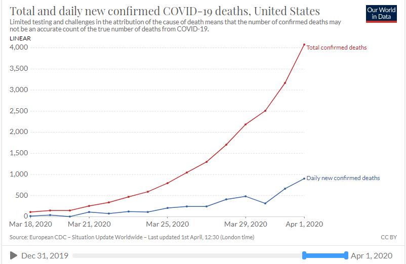
Here’s the United States, hitting 100 deaths 13 days later on March 18…
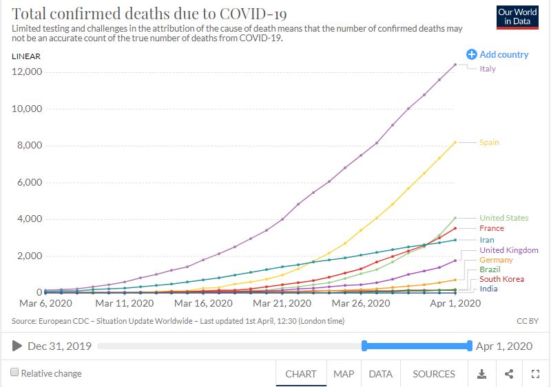
Below are the total confirmed COVID-19 deaths by country, with the United States skyrocketing and on its way to catch up to and surpass Spain and Italy (more on that below)…
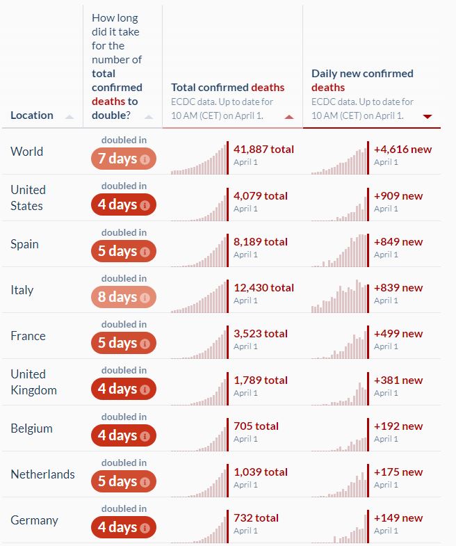
The bad news is that, in terms of the things getting worse in the last week, the United States is on top of the world. Below is a chart showing the increase in total deaths relative to one week ago (100% means the number of deaths has doubled since then). The United States had only 801 total deaths by March 25 and reached 4,079 today, so the relative increase is (4,079 – 810) / 810 = 409%.
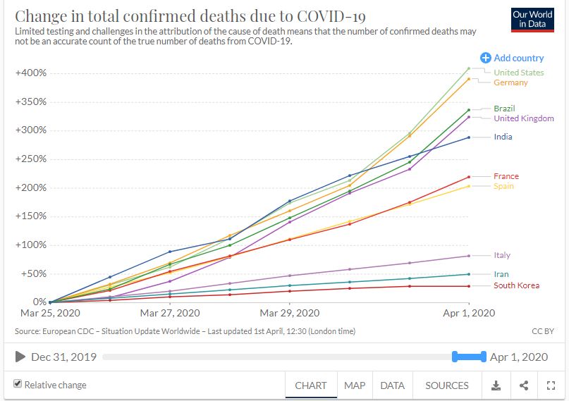
The appearance of Brazil and India on this list is also very concerning, given their huge populations. While India’s share of population over 70 is only 3.41% compared to the United States’s 9.73%, there are four times as many people living there. So, while it looks like the United States is on track to easily set the record in terms of the total number of deaths in the world, India could certainly surpass it if things get out of control.
The reason I expect the United States to set the bar for total death count is because not only is its daily death count increasing the most, it also posted the largest absolute number of deaths in the world yesterday, surpassing even Spain and Italy at their peaks.
So if we’re already losing 900 per day, how many people will be dying in the United States when we reach our peak around mid-April? At first, the estimated number of daily deaths in the United States of around 2,000 seemed low to me, since we have five times the population of Italy and it has 800 deaths per day right now. However, the experts are probably taking into account the fact that 16.24% of Italy’s population is over 70 compared to the United States 9.73%. You’ve probably seen why that fact is so important…
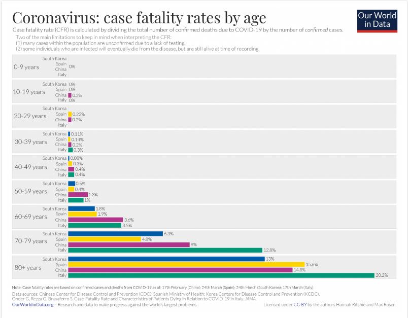
Also, the chart above shows that Italy’s elderly death rates are higher than anywhere else, presumably due to the over-crowded hospitals. It’s hard to believe that losing 2,000 people to COVID-19 on Easter could be a good thing for the United States, but it would probably be a sign that we’ve successfully stocked our hospitals with ventilators and will soon be on our way to recovery. It may be a long tunnel, but there does appear to be a light at the end of it.