The Vaccine Decision: Get It Right

Fortunately, there are very few decisions in life that can have truly catastrophic consequences if we get them wrong. The vast majority of choices we make are mundane and will not make any major difference either way. Whether or not the outcomes are predictable, let’s call these potentially catastrophic decisions “high variance” because they can have a major impact on your life. The high variance decisions are the ones you really need to get right.

In addition to categorizing decisions as high or low variance, you can also classify a decision by how simple or difficult it is. If you were to create pros and cons lists for a simple decision, it would have a clear imbalance in favor of one or the other, while difficult decisions have pros and cons lists that are balanced. The good news is that for the most difficult decisions, you can’t go very far wrong, no matter what you decide. Since the pros and cons are almost balanced, your expected happiness with future outcomes should be about the same either way. The simple decisions are the ones you really need to get right.

The outcome of a decision doesn’t make it good or bad – it is only a bad decision if the foreseeable consequences should have led you to make a different choice. If the consequences are not foreseeable, it wouldn’t count so much as a “bad” decision if things go badly, but rather as an “unfortunate” one. For example, you can’t really be blamed for riding the daily train to work, even if it ends up crashing. However, you CAN be blamed for driving drunk, even if you don’t crash, because it doesn’t take a crystal ball to see that the potential downside is much worse than the inconvenience of taking a taxi. You make good decisions if you reasonably consider the possible paths and follow the one with the best expected value, whether or not things pan out the way you’d hoped.

Passing up the COVID vaccine would be a very bad decision, because it is high variance, it is simple, and the potential devastating outcome is easy to foresee.

So how do we know it’s a simple decision? Let’s look at the cons list first: vaccination may have contributed to three deaths from a rare blood clot disorder. Oh yeah, and it might pinch a bit and lead to a few days of feeling under the weather. That’s it, that’s the list.

What about the vaccine causing COVID? Can’t happen. What about the unknown long-term effects? There’s no reason to believe this will be the first vaccine to ever have those. What about effects on fertility? That’s also nonsense. Where do you read this stuff? If you’ve come across these warnings, you may want to look into the reliability of your sources of information.

In order to fully appreciate the pros of vaccination, let’s get an intuitive feel for the risks involved by using the analogy of drawing specific cards from a deck of playing cards. Since there are 52 cards in a standard deck, the chances of drawing a particular card is about 2%. If you’ve ever tried to predict a specific card, you know that it’s very unlikely, but possible. I guarantee that you’ll fool Penn and Teller with your magic trick if you go up on stage, tell them to think of a specific card, and then just blurt it out. So, armed with a feel for how likely it is to draw cards from decks, let’s consider the risks you’ll face depending on whether or not you get vaccinated.

Option 1: Try Your Luck.

Let’s say you don’t believe that the universe is trying to kill you and you want to take your chances and see if you draw the hospital/death card from the deck. If you choose this path, it looks like a decent estimate for you catching COVID-19 at some point in the next year is about 1 in 10. Then, if you get infected, depending on your age and pre-existing conditions, the chances the disease lands you in the hospital, leaves you with long-term damage, or a slow agonizing death, is about 1 in 4. Since you multiply probabilities to find out the chances that two independent events both occur, your probability of drawing the hospital card should be approximately 0.10 * 0.25 = 2.5%, or a bit more than drawing one specific card from the deck. So, option 1 is to shuffle up that deck and try not to pull the hospital/death card, the Ace of Spades. You’ll probably be fine.

Figure 1: Good luck – Don’t draw the Ace of Spades!

Option 2: Trust Science.

The other option is to just do what the health experts say and get the shot. So what are the chances you go to the hospital for COVID-19 if you’re vaccinated? Well, if you’re under 65 and haven’t had an organ transplant or something that compromises your immune system, it’s effectively 0%. But that’s hard to visualize, so let’s just say you’re a truly random and possibly high-risk individual. As of July 12, there have been 5,492 vaccinated individuals hospitalized for COVID-19 symptoms out of the 159 million who have been vaccinated. So, about 0.003%. Let’s bump that up to 0.007% because we want to estimate the chances of landing in the hospital at some point in the next year. That’s 7 out of 100,000.

Figure 2: Okay, NOW try not to pick the bad card hidden in one of those decks!

You can do this same exercise if you’re under 65 and have a good immune system by just imagining that there’s no bad card.

Get this one right; you may never see a simpler, higher variance decision in your life.
Is New York the New Italy?

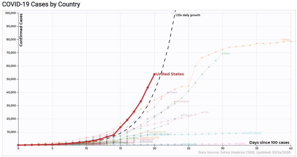
First things first. If you start counting days after the 100th confirmed cased of COVID-19, the United States is indeed skyrocketing past every country in terms of confirmed cases.

However, the number of confirmed cases is simply a function of the number of tests administered and the existing prevalence of the disease. We know that we got a late start and are catching up fast, so this probably isn’t the best measuring stick.

The more important number to watch is the number of deaths.

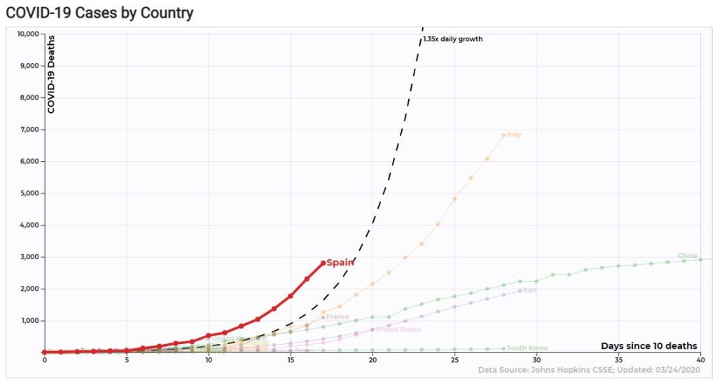
By this metric, Spain is far and away the country breaking the records, going from 10 deaths to 2,808 in only 17 days. It’s already about to pass up China in terms of total deaths. If Spain is the next Italy, the United Kingdom may be the next Spain…

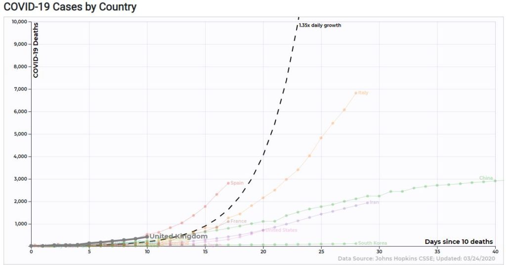
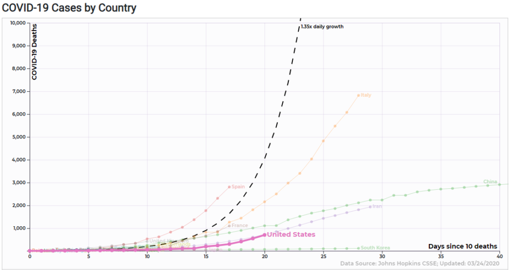
The UK is actually not far behind where Spain was at 10 days after 10 deaths. Meanwhile, the United States seems pretty quiet, relatively speaking…

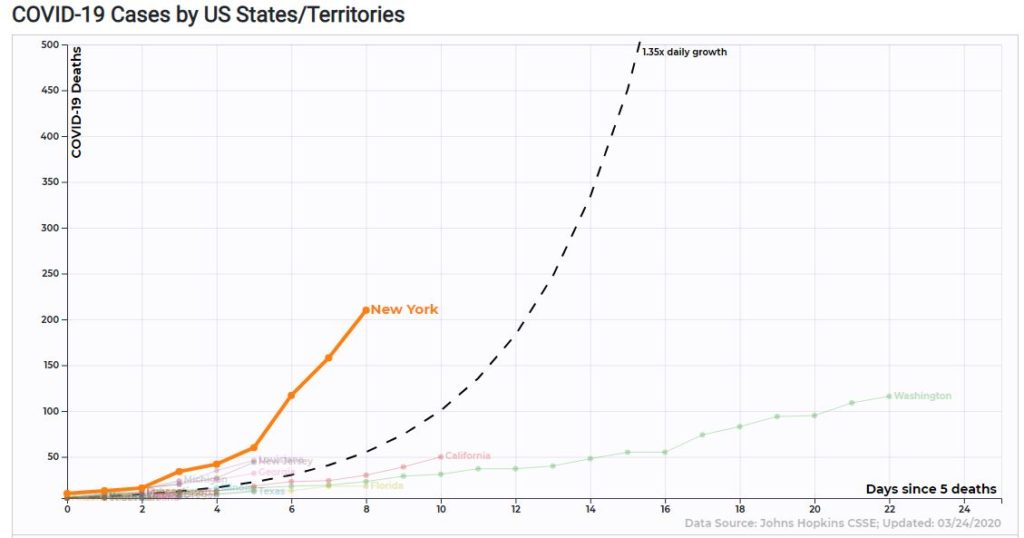
However, at the state level, you see a different picture…

If you count days since 10 deaths (the first data point for NY above is at 10, even though the chart says it’s counting days since 5), New York is at a whopping 210 deaths after only 8 days. Compare that to Spain’s 289 and Italy’s 107 at that point and you realize that this is very alarming. NY has less than half the population of Spain and a third of the population of Italy.

Given that Italy’s death toll has been rising 20 days longer than New York’s with no end in sight, I don’t think that this thing is going to clear up by Easter.

The Scary Index

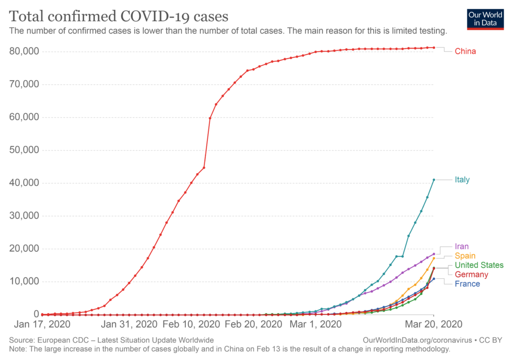
First, the bad news. Starting the day that 100 cases of COVID-19 were confirmed, the United States has reached 35,000 confirmed cases faster than any other country, even China.

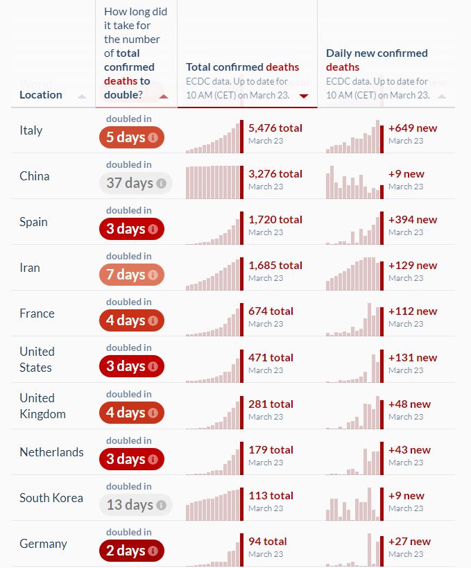
However, much of that is due to finally getting some testing done, which is a good thing. Probably a more important metric to watch is the number of deaths. Here are the top 10 countries sorted by total deaths.

Among these countries, the speed at which the U.S. has ramped up deaths since the first one is only average (it took 18 days to go from 1 to 100 deaths, 23 days to go from 1 to 400) . South Korea is given a lot of credit for their extreme testing and rightly so, it took them 29 days to get up to 100 deaths. Surprisingly, France did even better, staying under 100 deaths for 31 days after their first.

I expected to see Italy as the country that hit 100 and 400 deaths the fastest at 12 and 17 days, respectively. However, Spain is in even bigger trouble than Italy was, taking only 10 days and 14 days to get there.

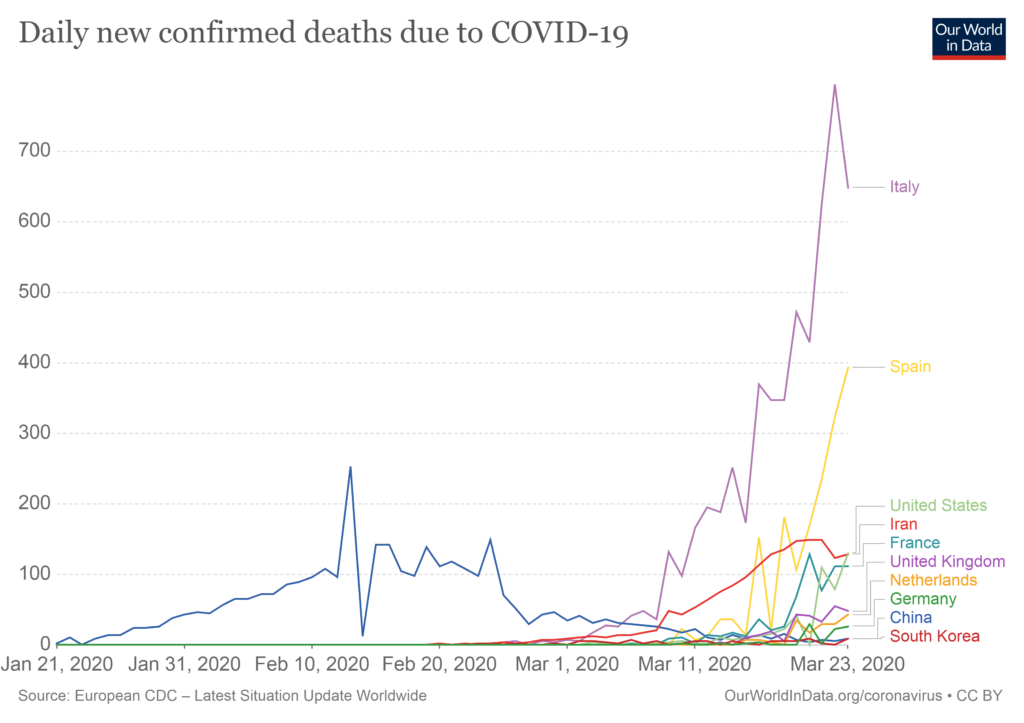
Italy is still the country with the highest daily number of deaths per day, however Spain is catching up fast.

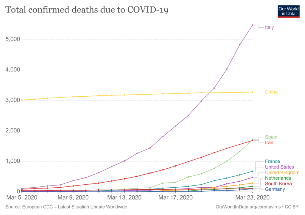
Below are the cumulative totals. Italy has passed China long ago and Spain is on track to become the second country to do so.

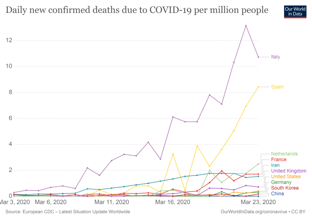
It’s even worse for Spain when you consider population sizes. It could be where Italy is in a matter of days.

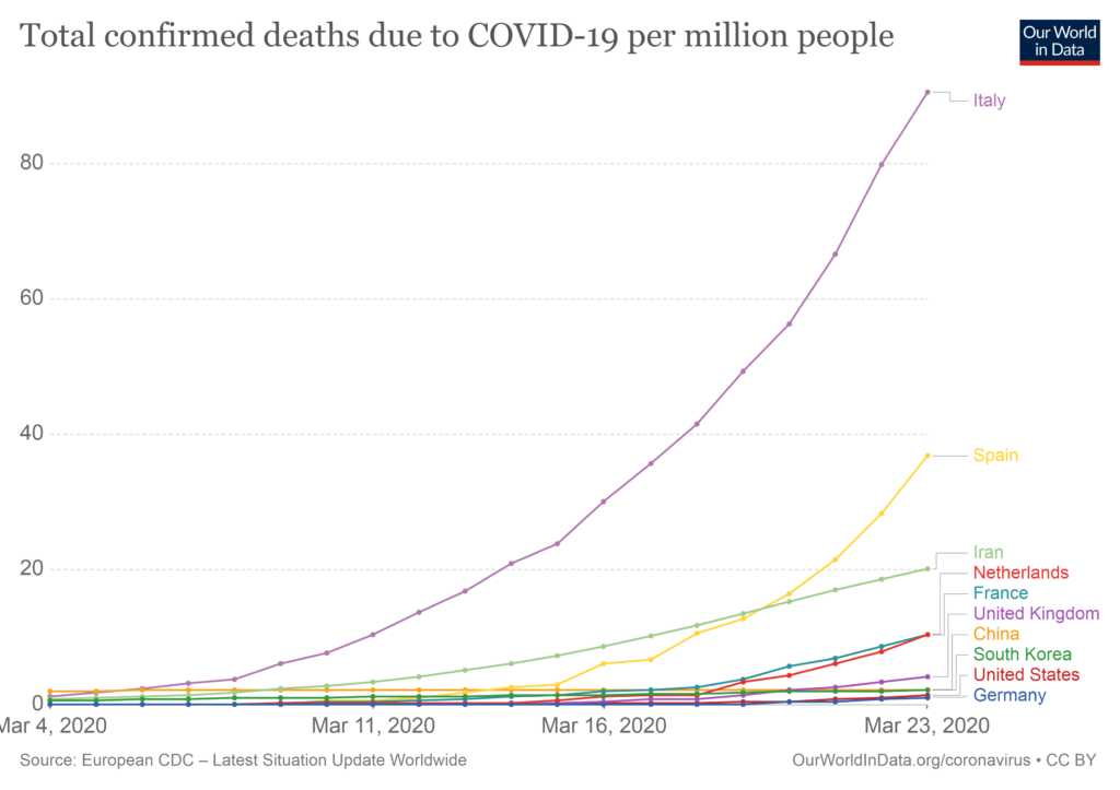
If you live in the United States, you can take comfort in the fact that, at least for the time being, the cumulative number of deaths per million population is barely on the chart. If total deaths per capita is the Scary Index, Italy and Spain are ones setting the bar.

All of these charts are available and interactive at this site.

COVID-19 “Game Changer”? Test it, but don’t bet on it.

According to a WSJ article, doctors in France, South Korea, and the U.S. are using hydroxychloroquine to treat COVID-19 “with success” and it says that we don’t have time to wait for confirmation. It refers to this study, stating “…researchers in France treated a small number of patients with both hydroxychloroquine and a Z-Pak, and 100% of them were cured by day six of treatment. Compare that with 57.1% of patients treated with hydroxychloroquine alone, and 12.5% of patients who received neither.” That sounds incredibly promising, and while the article does mention the potential downsides of the shortage of hydroxychloroquine and peddling false hope, it clearly recommends using the treatment now rather than waiting.

A shortage of the drug may not seem like a big downside until you realize that it’s actually being used by people (including my aunt) for conditions that the drug has actually been clinically proven to treat. (Update: it looks like Israel has got my aunt covered.) As for the French study, unfortunately, if you look at it closely, it is practically a poster child for the types of research that can’t be replicated. There’s no randomized control. There are a small number of treated patients (only twenty). It’s a hot field of study.

To see why these things matter, you may want to read one of the most downloaded papers in history from Dr. John Ioannidis titled “Why Most Published Research Findings Are False.” Its popularity is due to the fact that it addresses the replication crisis in science head-on and provides warning signs to watch out for before deciding to take new research seriously. In short, they are…

Small sample sizes. Have you ever noticed that if you rank cities by crime rate or cancer rate, that the ones at the top and the bottom of the list always have very small populations? This is because it’s much easier for small sets of data to show extreme results. In the same way you wouldn’t be convinced if someone says they’re the best shooter in basketball because they made 100% of their shots, your first response to the report that 100% of patients were cured of COVID-19 after 6 days with a combination of Z-Pak and hydroxychloroquine shouldn’t be “there’s a cure!”, it should be “wow, not many patients in that study.” If a study has a surprising result and a small sample size, be skeptical.

Small effect sizes. Effect sizes tend to be exaggerated, so if there’s a small effect size being reported, there’s a decent chance the real effect size is zero. In the case of the French study, the effect size is huge, perhaps suspiciously so. Only 2 of the 16 patients in the control group recovered in 6 days, while 14 of the 20 in the treatment group did. This seems overwhelmingly convincing until you see that the control group was not randomly chosen and are extremely different from the treatment group (on average, they were 14 years younger, so who knows how different they were on important features like how widespread the infection was on day one).

Also, even if we assume that the treatment and control groups were comparable, the claimed p-value of 0.001 is unlikely to be accurate. It’s calculated correctly, given the difference between control (12.5% recovering) and the treated patients (70% recovering), but ignores the fact that the treatment group had some patients removed from the analysis: “Six hydroxychloroquine-treated patients were lost in the follow-up during the survey because of early cessation of treatment. Reasons are as follows: three patients were transferred to intensive care unit…one patient stopped the treatment…because of nausea…one patient died…” Wait, what? Can we not assume that patients who went to the ICU or died would still have the virus if they were tested? Instead of just testing whether or not the drug removes the virus from patients still kicking, shouldn’t the question be whether or not the drug helps patients leave the hospital alive when all is said and done? There was also a patient counted as virus free who was found to have the virus two days later (presumably due to a false negative test). To be fair, even when I add back in the five patients I think should not have been removed from the treatment group, the p-value is still 0.01, but the filtering out of patients with clearly bad outcomes from the treatment group is not comforting.

Many tested relationships. If there are many failures that are disregarded, you can be pretty sure that the successes occurred due to chance alone. Fortunately, the French study doesn’t appear to be doing this. They mention that the combination of Hydroxychloroquine and Z-Pak had a 100% success rate, but also don’t hide the fact that it was only tried on a total of six patients. The overall focus remains on the big picture of hydroxychloroquine vs. COVID-19 as originally intended.

Flexibility in analysis. This one is very similar because it has to do with trying many different ideas before coming to a conclusion. Economist Ronald Coase summed this up nicely with the saying: “If you torture data long enough, it will confess.” There does seem to be a bit of data torture going on in the French study. These were described well and enumerated in an email from a friend, Dr. Adam Chapweske, yesterday…

  1. Any patient whose illness becomes severe during the trial is excluded from final analysis. So it seems that a study designed to determine viral clearance explicitly excludes anyone who ends up having a really high viral load at some point in the study (assuming severe illness indicates high viral load). This ended up excluding 4 patients receiving hydroxychloroquine from the final analysis (in addition to two others lost to follow up for other reasons) and none from the control group.
  2. Their registered secondary endpoints include clinical outcomes, but they don’t include these in their reported endpoints. As mentioned above, several patients receiving hydroxychloroquine either died or required transfer to an ICU, whereas no patients in the control group did. This makes me wonder about the other clinical data they originally planned on reporting but ad hoc decided not to mention. It’s particularly concerning since the authors themselves make very strong clinical recommendations based on their study.
  3. Best I can tell, their decision to report on results early (i.e., prior to completing enrollment or completing their registered primary endpoint) was also ad hoc.
  4. Their registered design does not mention azithromycin, yet they report on outcomes involving that drug and even include it in the title of their paper and in their results. Given they were not actually studying azithromycin, it would have been fine to mention the effect in the discussion section as a possible intervention for future study but they shouldn’t give the impression that it was in some meaningful sense “studied”. 
  5. The primary endpoint was virological clearance, but the baseline viral load for the control group is not given so we don’t know if the two groups are comparable with respect to this parameter. This is especially important in light of the small sample size, differences in disease (upper respiratory tract infection vs lower respiratory tract infection) and demographic and geographical differences between the two groups. 
  6. Virological measurements were reported differently for the two groups as well, which suggests to me that there were differences in the way they were tested. 

Financial incentives. We all know to watch out for this one. Financial incentives are incredibly powerful and unfortunately, many people value money more than their scientific integrity. I didn’t see any reason to suspect that the researchers would benefit personally by promoting their recommended drug. They’re just reporting what they truly believe is a promising result.

And the last one: A hot field of study. If the field is hot, there is a race to publish, and with enough researchers trying different things, it’s almost certain that someone will find something somewhere that is statistically significant. This is like collective p-hacking. Rather than one researcher trying many things, you have many researchers trying one thing, and the result is the same: unreliable results. Studying the effect of drugs on COVID-19 is clearly a hot field of study. So prepare yourselves for several false positives, even from more scientifically rigorous studies than this, before we find an effective treatment. In the meantime, keep experimenting. And I’m begging you: please use a randomized control.

Update (3/23/2020): WHO announced a megatrial that will test the four most promising treatments for COVID-19. The WHO scientific panel originally wasn’t going to include the “game changer” drug, but decided to test it due to the attention its getting. According to Susanne Herold, an expert on pulmonary infections, “Researchers have tried this drug on virus after virus, and it never works out in humans. The dose needed is just too high.” Even though it doesn’t seem likely to work, I am happy to see that it was included in the megatrial. Now that the rumors are out there and people are scrambling for it, some people are inevitably going to find out the hard way that hydroxychloroquine might do more harm than good. It’s better to give it a rigorous test and provide people with solid answers rather than speculation.

jaycordes.com

COVID-19 Stats to Watch

Of all of the statistics and numbers out there, the chart I’m most interested in watching is this one

This chart will make it clear when the spread of COVID-19 has ended its exponential growth in each country. When the number of new cases slows down, we can estimate what the final prevalence (spread of the disease) will be. In other words, when Italy’s curve levels out, we can see the light at the end of the tunnel.

Here’s the same chart with China included…

What I’m looking for is where it looks like Italy’s curve will flatten out like China’s did.

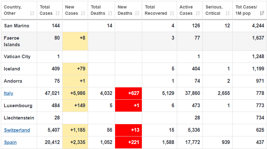
Many sources are using mathematical models estimating that 50% of the population will become infected, but I think this is much too pessimistic, given the drastic measures being taken around the world to slow down the spread (please stay home!). More specifically, there are only a couple of very small countries where the prevalence has passed 1% (see the top four below)…

Notice the final column, showing the total number of cases per million population. San Marino, a tiny country within Italy (population 33,000) has the highest percentage of infected people at 4.2% (144 cases). Because of the small population size, tiny countries like this will be the most extreme, and the numbers should be taken with a big grain of salt. Hence, the importance of watching Italy in the first chart. Because of its large population size and massive spread of the disease, it will give us a good indication of the final infection rate we can expect.

The reason prevalence is so important is because if you want to estimate your probability of dying by the disease, you need to multiply it by the fatality rate. A disease with a 100% fatality rate that only spreads to 0.01% of the population (0.01% die) is much less scary than a disease with a 1% fatality rate that spreads to half of the population (0.50% die).

John Ioannidis, the most careful thinker I’ve ever talked to, recently wrote an article suggesting that the fatality rate of COVID-19 (based on admittedly thin data) is more likely in the range of 0.05% to 1%. That would be good news compared to the current higher estimates. Also good news to me is that the estimated final spread of the disease is based on mathematical models and not what’s actually happened in other countries. Mathematical models are very useful, particularly if they motivate people to stay home and stop a pandemic in its tracks. However, if you really want to estimate your chances, watch the real world data.

Note: a reader pointed me to a very well argued opposing view to Ioannidis. I need to reiterate that that my somewhat optimistic view above is based on the assumption that the dramatic shutdowns around the world continue. I can appreciate the opposing view that “the exact numbers are irrelevant” and that we don’t want to be lulled into a “false sense of security by Ioannidis.” We should indeed continue to act in ways that avoid the worst case scenario, because in a situation like this, the cost of being too optimistic is much higher than the cost of being too pessimistic (stocks can rebound and people can eventually find jobs again). In summary, if you’re in a position of authority, please continue closing everything until this is behind us! It is this dramatic action which makes me optimistic about the future.

Link to table here.

BTW, in case you’re looking for a good book to enjoy during the Apocalypse, there are only 13 copies left on Amazon!