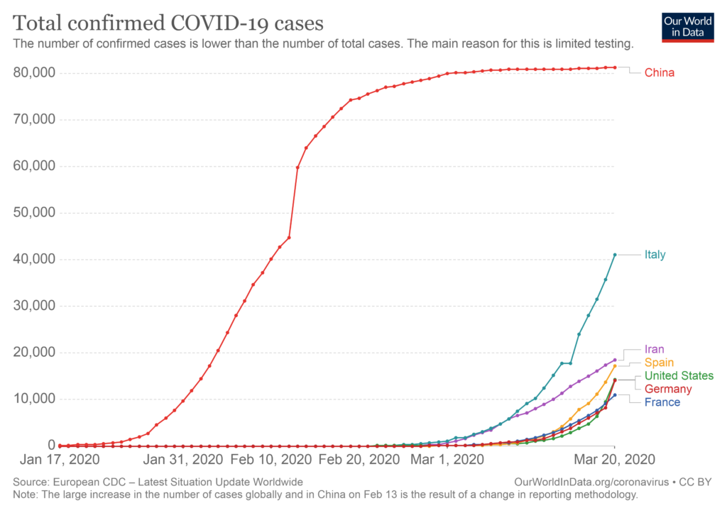
Of all of the statistics and numbers out there, the chart I’m most interested in watching is this one…

This chart will make it clear when the spread of COVID-19 has ended its exponential growth in each country. When the number of new cases slows down, we can estimate what the final prevalence (spread of the disease) will be. In other words, when Italy’s curve levels out, we can see the light at the end of the tunnel.
Here’s the same chart with China included…

What I’m looking for is where it looks like Italy’s curve will flatten out like China’s did.
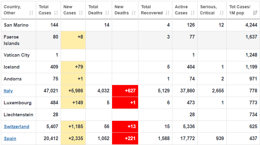
Many sources are using mathematical models estimating that 50% of the population will become infected, but I think this is much too pessimistic, given the drastic measures being taken around the world to slow down the spread (please stay home!). More specifically, there are only a couple of very small countries where the prevalence has passed 1% (see the top four below)…

Notice the final column, showing the total number of cases per million population. San Marino, a tiny country within Italy (population 33,000) has the highest percentage of infected people at 4.2% (144 cases). Because of the small population size, tiny countries like this will be the most extreme, and the numbers should be taken with a big grain of salt. Hence, the importance of watching Italy in the first chart. Because of its large population size and massive spread of the disease, it will give us a good indication of the final infection rate we can expect.
The reason prevalence is so important is because if you want to estimate your probability of dying by the disease, you need to multiply it by the fatality rate. A disease with a 100% fatality rate that only spreads to 0.01% of the population (0.01% die) is much less scary than a disease with a 1% fatality rate that spreads to half of the population (0.50% die).
John Ioannidis, the most careful thinker I’ve ever talked to, recently wrote an article suggesting that the fatality rate of COVID-19 (based on admittedly thin data) is more likely in the range of 0.05% to 1%. That would be good news compared to the current higher estimates. Also good news to me is that the estimated final spread of the disease is based on mathematical models and not what’s actually happened in other countries. Mathematical models are very useful, particularly if they motivate people to stay home and stop a pandemic in its tracks. However, if you really want to estimate your chances, watch the real world data.
Note: a reader pointed me to a very well argued opposing view to Ioannidis. I need to reiterate that that my somewhat optimistic view above is based on the assumption that the dramatic shutdowns around the world continue. I can appreciate the opposing view that “the exact numbers are irrelevant” and that we don’t want to be lulled into a “false sense of security by Ioannidis.” We should indeed continue to act in ways that avoid the worst case scenario, because in a situation like this, the cost of being too optimistic is much higher than the cost of being too pessimistic (stocks can rebound and people can eventually find jobs again). In summary, if you’re in a position of authority, please continue closing everything until this is behind us! It is this dramatic action which makes me optimistic about the future.
BTW, in case you’re looking for a good book to enjoy during the Apocalypse, there are only 13 copies left on Amazon!