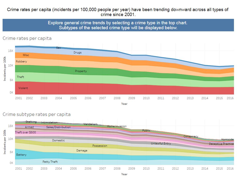
There have been conflicting reports about the US crime rate in the media. On one hand, President Obama said last year that “there’s been an incredible drop in violent crime” and “our crime rate today is substantially lower than it was five years ago, 10 years ago, 20 years ago, 30 years ago.” On the other hand, the then presidential candidate Donald Trump stated that “violent crime has increased in cities across America. The New York Times described ‘the startling rise in murders,’ in our major cities.” So which is it?
It is true that the New York Times reported that “data … based on reports from more than 60 cities, showed notable increases in murders in about two dozen cities in the first three months of the year compared to last year and about a 9 percent increase nationwide.” However, the long-term trend is undeniable. The murder rate is practically at an all-time low.
Crime Trends Chart
As the final project for my Data Visualization and Communication class in the Berkeley MIDS program, my team came up with some useful charts, fueled by data from the Chicago Police Department’s CLEAR system, where users can see for themselves what the trend is for a wide variety of crimes. We categorized the types of crimes according to what we felt would be in the public interest and adjusted for the recent decline in population in Chicago by calculating the crime rate per 100,000 residents per year. This also provides context so people can understand what the average risk of victimization is per year for any particular crime.
In addition to addressing the misleading statements made by politicians, we also wanted to provide a counterpoint to news broadcasting in this country, which has a financial incentive to focus on the sensational crimes that bring in viewers. News watchers receive a steady diet of stories about homicide and home invasions without proper context. Our chart also aims to dispel the perception that those are common types of crime and place them in perspective. The news is entertaining but not very informative, when it comes to communicating the likelihood of various crimes taking place.
Interactive Crime Maps
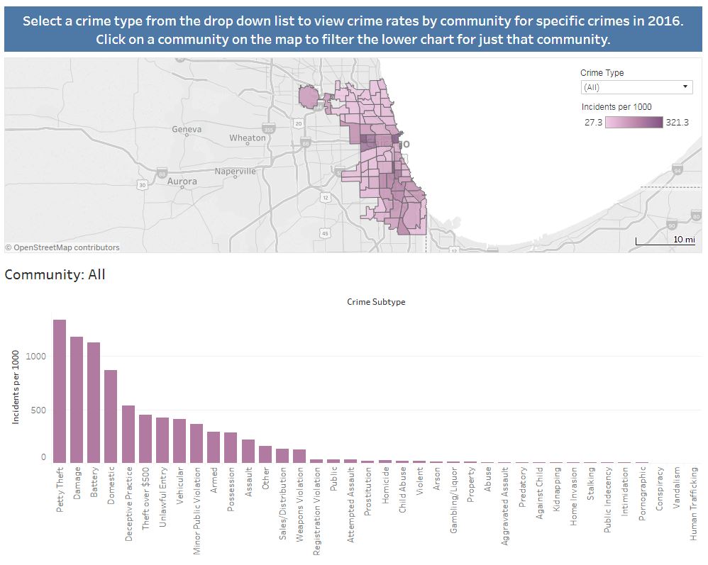
While the Crime Trends chart are of interest to the general public seeking information about crime trends, our interactive crime maps are of particular use to someone, such as a home-buyer, interested in crime rates in specific community areas within Chicago.
Users can also select and isolate statistics for communities if they want to quantify the safety of nearby areas or determine the relative safety of traveling through a particular series of communities. By toggling the selection of areas they wish to compare, they will be able to determine which places are best to avoid.
Enjoy!


